•
•

Crypto Exchange UX Best Practices for Sign-Up, KYC, Deposits, and Trading Entry
Key Takeaways
Great crypto exchange UX reduces anxiety, not just clicks.
The best sign-up flows set expectations before users commit.
KYC UX should be progressive, transparent, and resilient to failure.
Deposit UX must prevent expensive mistakes and explain what happens next.
First-trade UX should simplify the path to action without trapping advanced users in an oversimplified product.
Website UX and product UX should work as one trust system, not two disconnected experiences.
Crypto exchanges do not lose users only because of regulation or market complexity. Many also lose them because the experience feels uncertain, inconsistent, or intimidating at the exact moments that matter most — when someone is asked to share identity data, move real money, or place a first trade.
Crypto exchange UX is a trust-and-conversion system. The four moments that define it — sign-up, KYC, deposits, and trading entry — are not isolated screens. They are one connected activation journey, and every point of confusion in that journey compounds the one before it.
This guide is written for exchange founders, product leads, marketing teams, and operators who need practical guidance that balances conversion, compliance, and confidence-building. If you are building an exchange from scratch, redesigning an underperforming onboarding funnel, or trying to understand why verified users are not becoming active traders, this is your starting point.
For a broader view of fintech UX principles that apply across this entire journey, the WSA guide to fintech UX design best practices for 2026 covers trust architecture, passkeys, fee transparency, and friction-right design in more depth.
Why Is Crypto Exchange UX Different From Generic Fintech UX?
Crypto website UX is harder than standard fintech UX because users can face irreversible transfers, unfamiliar terminology, asset volatility, and stricter trust requirements — often in the same early session.
In many fintech products, confusing UX may lead to delays, support burden, or failed onboarding. In crypto, the same confusion can also send funds to the wrong address or network — and those transactions often cannot be reversed. That asymmetry should change how UX decisions are made.
The unique anxiety points are real and compounding:
Users may misroute deposits through the wrong network, omit a required memo/tag, or place the wrong trade because they misread the interface.
Exchanges ask for sensitive identity data and financial commitment during the same early journey.
Crypto audiences span complete beginners and experienced traders — a segmentation challenge that many single-interface products handle poorly.
Security expectations are high, but excessive friction at the wrong moment can drive abandonment as effectively as poor design.
The right goal is not "frictionless." It is confidence per step — making sure each moment in the funnel gives the user enough clarity, reassurance, and control to take the next action. That is the lens through which every design decision in this guide should be read.
How Should a Crypto Exchange Sign-Up Flow Work?
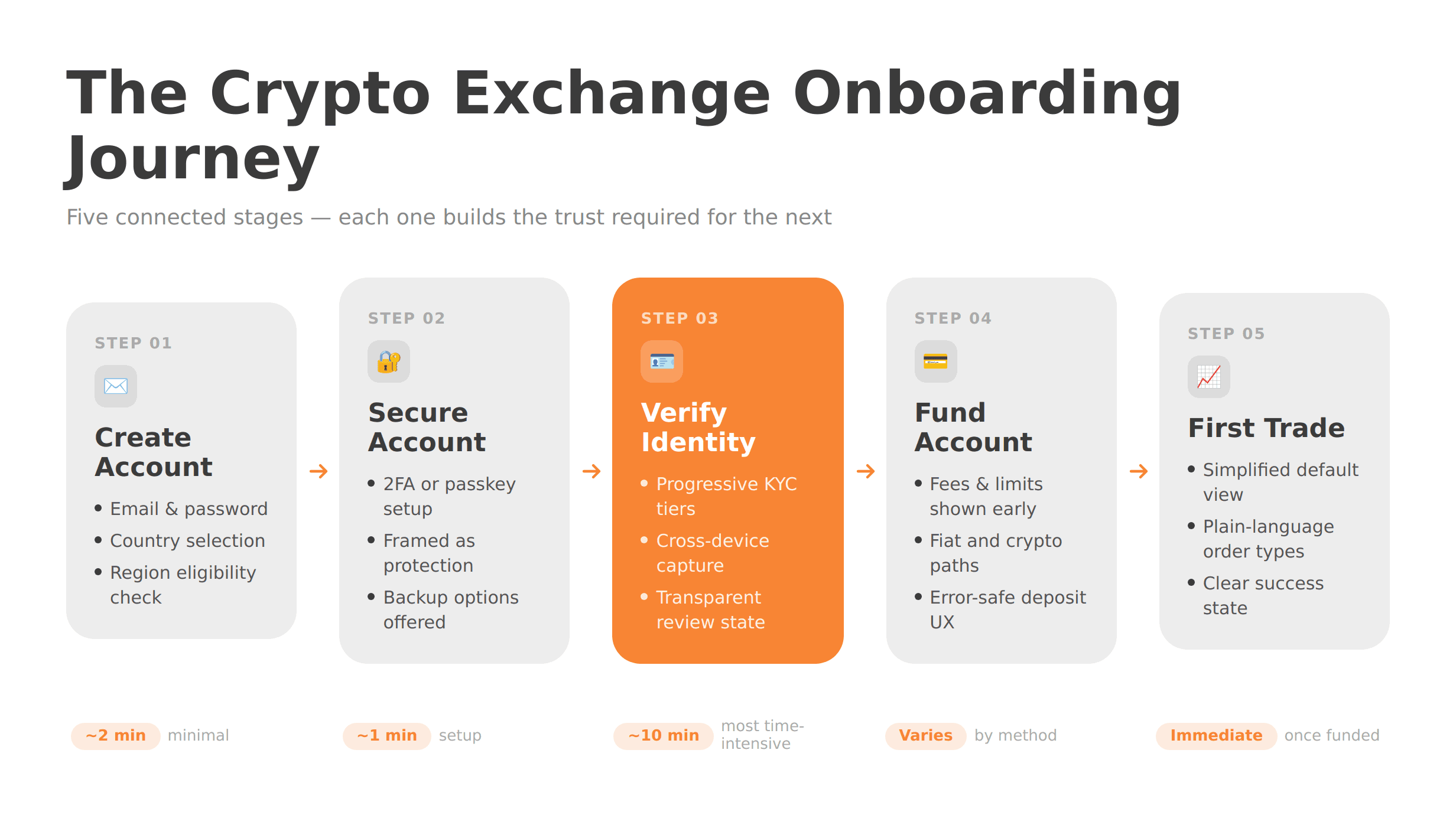
The best crypto exchange signup flow feels low-commitment at the start, clearly explains what comes next, and avoids asking for more than is necessary before trust has been established.
A sign-up form is not where users first decide whether to trust your platform. That judgment usually starts on the website, and the sign-up step either confirms or undermines it. If the first screen is overloaded with fields, dense legal text, or no explanation of what comes next, trust erodes before it has a chance to build.
What good exchange onboarding UX looks like at sign-up:
Minimal first-step fields — typically an email address, password, and country, nothing more
An explicit journey overview near the top: create account → secure account → verify identity → fund account → first trade
Estimated time or effort for each stage
Region or residency checks early, before users invest time in a flow they are ineligible to complete
Security setup (2FA, passkeys, or authenticator apps) framed as protection, not bureaucracy
Save-and-resume functionality so mobile users are not punished for switching devices
Inline validation with clear, specific error messages — not generic red outlines
Visible access to support, FAQs, or live chat throughout registration
The best crypto exchange signup flow is not the shortest one. It is the one that makes users feel they understand what they are signing up for. Hiding KYC until after account creation often creates avoidable abandonment and support friction. Transparency at sign-up is not a liability — it is part of the conversion strategy.
What Are the KYC UX Best Practices for a Crypto Exchange?
Good KYC UX for a crypto exchange explains why each piece of information is required, asks only for what is necessary at each stage, and never leaves users without a clear next step when verification pauses or fails.
KYC is often the point where a crypto onboarding flow either builds lasting trust or triggers permanent abandonment. It may involve asking users for government-issued identity documents, a face scan or selfie, and sometimes proof of address — and then asking them to wait for review. Handled badly, it feels like interrogation. Handled well, it feels like a normal part of opening a secure financial account.
Progressive KYC is often one of the most user-friendly models available. Rather than collecting everything upfront, tiered verification matches requested information to what the user is trying to do. Someone making a small initial deposit may complete a basic identity check, while higher limits, fiat services, or certain trading and withdrawal features can trigger additional verification steps. This approach can reduce early abandonment while still supporting AML controls as account activity expands.
KYC UX best practices for a crypto exchange:
Explain-before-you-ask microcopy on every data-collection screen — one sentence on why the information is needed and how it will be protected
Document-preparation guidance before camera capture begins — supported document types, lighting conditions, and what counts as a usable capture
Real-time capture feedback and clear retry guidance when image quality is insufficient
Cross-device continuation via QR code, SMS, or email — many users start on desktop but are better positioned to complete document capture on mobile
State persistence so that a user who exits mid-flow does not restart from the beginning
Transparent pending and manual-review states — tell users what is happening, the expected timeline, and what they can and cannot do in the meantime
A thoughtful escalation path for stuck reviews: a contact mechanism, a realistic timeline, and a non-alarming tone
A progressive KYC approach can also align better with risk-based compliance models than collecting everything upfront. FATF's guidance for virtual asset service providers is built around understanding and mitigating risk, so tiered verification often maps more naturally to a user's limits, funding methods, and product access.
Not sure which option fits your business?
From startup brokerages to established platforms, WSA delivers websites that convert traders, satisfy regulators, and scale across markets.
How Should Deposit UX Reduce Fear and Prevent Expensive Errors?
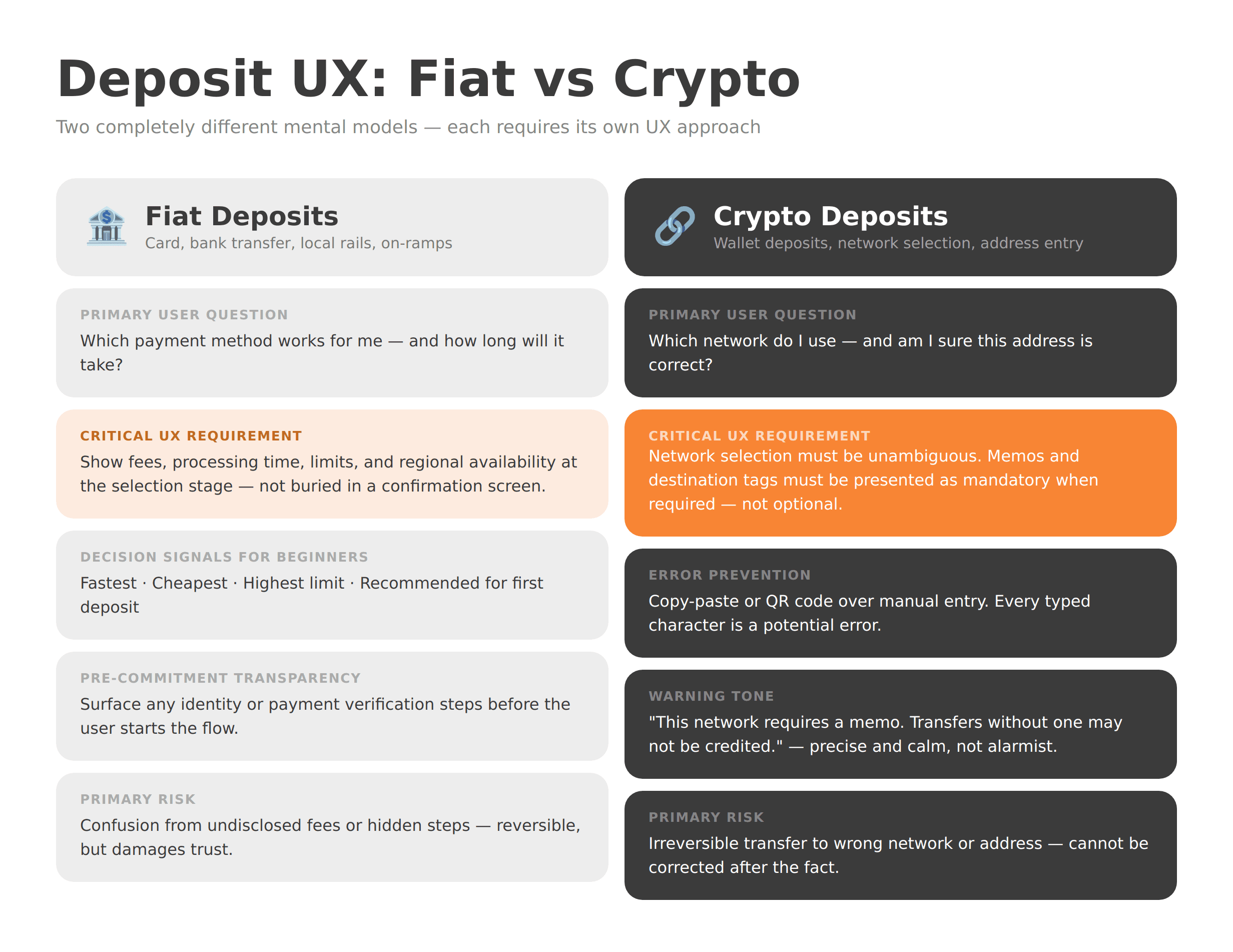
Deposit UX should help users choose the right funding method, avoid preventable mistakes, and understand exactly when their funds will be available — before they commit to any action.
Deposit surfaces can become some of an exchange's costliest UX failure points. The costs are not limited to abandoned deposits. They also show up in support ticket volume, user distrust, public complaints about 'lost' funds, and users who simply never return.
Fiat deposits and on-ramp UX require clarity about options before commitment. Separate methods cleanly — card, bank transfer, local payment rails, and third-party on-ramps should never be presented in a way that forces users to guess which applies to them. For each method, show fees, processing times, deposit limits, and regional availability at the selection stage, not buried in a confirmation screen. Beginners benefit from simple decision signals: fastest, cheapest, highest limit, or recommended for first deposit. Surface any identity or payment verification steps that may be triggered before the user starts.
Crypto deposits and wallet deposit UX require an even more disciplined approach. The primary risk — irreversible transfer to the wrong network or address — must be addressed through design, not just warnings.
Network selection must be unambiguous. Display network names, token standards, and, where relevant, brief explanations of what the difference means for transfer success
Memos and destination tags should be presented as mandatory, not optional, when they are genuinely required for a successful deposit
Encourage copy-and-paste or QR code scanning over manual address entry — every character typed is a potential error
Show confirmation requirements, minimum deposit amounts, and unsupported routes before the user leaves your platform
Warnings should be precise and calm, not alarmist — "This network requires a memo. Transfers without one may not be credited" is usually clearer than "WARNING: FUNDS MAY BE LOST"
Pending states and confirmation progress should be visible, with an explanation of what triggers the next status change
Fiat on-ramp UX and wallet deposit UX are among the most trust-sensitive surfaces in the entire exchange. Design them as if users are handling irreversible decisions — because they are.
What Does Good Trading-Entry UX Look Like for First-Time Users?
Good trading-entry UX helps new users take their first action with confidence while preserving a clear path to more advanced tools for experienced traders.
The moment a funded user reaches the trading interface is also the moment many exchanges lose them — not because the product is broken, but because it is designed for someone further along the learning curve.
Dropping a retail-first user into a full professional trading terminal — with order books, depth charts, multiple order types, and dozens of active markets — is the UX equivalent of handing someone a flight manual when they asked for directions to the airport.
What good first-trade UX and crypto trading dashboard UX look like:
A simplified default view focused on one clear action: buy, convert, set a recurring purchase, or place a first spot trade
Plain-language explanations of order types — market and limit orders should be explained in user terms, not only in trading jargon
Estimated totals, fees, and execution implications surfaced before confirmation
Sensible defaults pre-filled — such as a default market, order size, or relevant warning
Empty states, starter watchlists, and contextual educational nudges that help users explore without feeling lost
A clear, satisfying success state after the first trade, followed by a logical next step: portfolio view, price alert setup, or a prompt that helps the user decide what to do next
Trading entry is not just the interface. It is the decision architecture around what a new user sees first. That architecture should default toward confidence, not capability demonstration.
How Should Website UX and Product UX Work Together on a Crypto Exchange?
Exchange teams that treat the marketing site and the product as separate experiences create an avoidable gap — and users experience both as one continuous funnel.
Crypto exchange trust signals begin forming before sign-up. A user who reads about "instant deposits," "simple verification," and "beginner-friendly trading" on your homepage carries those expectations into every screen that follows. When the product experience does not match the website promises — when verification takes longer than implied, when deposits require steps that were never mentioned, or when the trading interface is nothing like the screenshot on the landing page — trust does not just dip. It erodes quickly.
Website UX as trust infrastructure means:
Consistency between landing-page claims and in-product reality
Pre-sign-up education about supported regions, verification requirements, deposit methods, and security features — so users arrive informed, not surprised
Security credentials, compliance disclosures, FAQs, help-center access, and status-page links treated as conversion assets, not afterthoughts
CTA sequencing that sets accurate expectations: "Create your account" sets different expectations from "Start your 10-minute verification"
Shared language across homepage, sign-up flow, KYC screens, deposit interface, and trading dashboard — if your website says "fund your account," your product should not say "make a deposit"
If you are thinking about the relationship between your website and your product, the WSA guide to AI-first fintech website structure covers how modern fintech websites are being architected for trust, SEO, and GEO visibility simultaneously.
Common UX Mistakes Crypto Exchanges Make
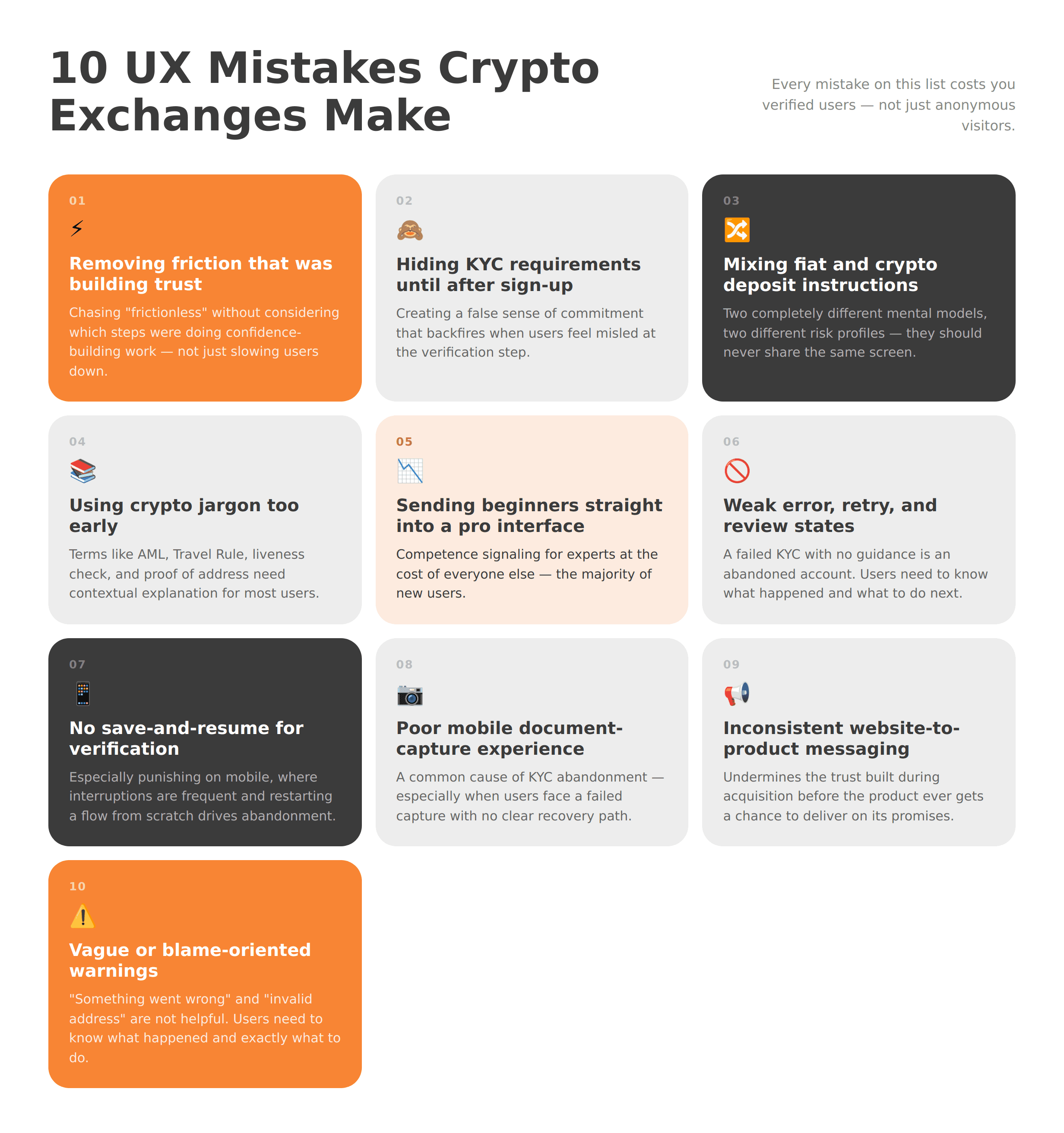
Chasing "less friction" without considering trust — removing steps that were doing confidence-building work, not just slowing users down
Hiding KYC requirements until after sign-up — creating a false sense of commitment that backfires when users feel misled
Mixing fiat and crypto deposit instructions together — two completely different mental models, two different risk profiles, two different sets of user questions
Using crypto jargon too early — terms like AML, Travel Rule, liveness check, and proof of address need contextual explanation for most users
Sending beginners straight into a pro trading interface — competence signaling to experts at the cost of everyone else
Weak error, retry, and manual-review states — a failed KYC with no guidance is an abandoned account
No save-and-resume for verification — especially punishing on mobile crypto onboarding UX where interruptions are frequent
Poor mobile camera and document-capture experience — a common cause of KYC abandonment, especially when users have no clear recovery path
Inconsistent messaging between website and app — undermines the trust built during acquisition before the product ever gets a chance
Vague or blame-oriented warnings — "something went wrong" and "invalid address" are not helpful; users need to know what happened and what to do next
Crypto Exchange UX Checklist Before Launch
Sign-up flow displays all steps and indicates expected time commitment
KYC states are tested for pass, fail, retry, and manual review — including edge cases
Deposit methods clearly disclose fees, processing times, limits, and any verification requirements
Crypto deposit instructions are network-safe, memo/tag-aware, and easy to verify before submission
First-trade experience is understandable and actionable for a user with no trading background
Mobile onboarding UX is tested end-to-end on real devices, not just in browser emulators
Support and FAQ access is available at every high-friction point in the funnel
Analytics events are mapped across every meaningful funnel stage
Website copy accurately reflects the in-product experience at every step
Transactional emails and SMS notifications reflect the same journey states users see on-platform
Next Steps: Why Fintech-Specialized Partners Improve Exchange Onboarding UX
Strong exchange onboarding UX does not emerge from a design sprint. It emerges from understanding how regulated financial products earn trust, where compliance requirements intersect with conversion, and how website architecture and product design reinforce each other across the full activation funnel.
WSA is a specialist agency with work across brokers, exchanges, and fintech platforms. Its site highlights conversion-ready websites, UX-focused case studies, and related articles on SEO, AI search visibility, and regulated-industry website strategy.
The practical value is in the specifics: aligning website messaging with what users actually experience in your product, reducing UX ambiguity in regulated verification and deposit flows, improving trust signals before a single account is created, and building the content and site architecture that support long-term discoverability alongside near-term conversion.
If you are building or improving a crypto exchange and want to review your sign-up, KYC, deposit, or first-trade experience with a team that works at this intersection, book a discovery call to talk through your specific goals.
FAQ
What is the best crypto exchange signup flow?
The best crypto exchange signup flow starts with minimal required fields, presents the full verification and onboarding journey upfront, and gives users a clear sense of expected time and effort before they commit. It does not front-load identity requirements before basic trust is established, and it uses save-and-resume, inline validation, and progress indicators to reduce abandonment across devices.
How do you reduce drop-off during crypto KYC?
Reducing KYC drop-off requires progressive verification (matching requirements to user activity), explain-before-you-ask microcopy at every data-collection point, real-time capture feedback, save-and-resume functionality, cross-device continuation options, and clear manual-review states with realistic timelines. Common causes of KYC abandonment include poor capture experiences, unexplained failures, and users not knowing whether their application is still active.
Should a crypto exchange ask for full KYC upfront?
It depends on the product access model, jurisdiction, and risk profile. Progressive KYC crypto exchange design can outperform full upfront collection for retail audiences — it can reduce early abandonment while still supporting compliance, because verification depth is matched to transaction risk. The key principle is to collect only what is required for the user's current intended action, not everything possible at first contact.
What makes crypto deposit UX harder than regular fintech deposit UX?
Crypto deposit UX is harder because transfers are irreversible, network selection errors can cause permanent fund loss, memos and destination tags add complexity that most users do not encounter elsewhere, confirmation times are variable, and the range of funding methods — card, bank transfer, on-chain, third-party on-ramp — each carry different fees, timelines, limits, and risk profiles. Users bring high anxiety to deposit screens, and design needs to match that.
Should beginners see a simplified trading interface or a pro trading dashboard first?
Most retail-oriented exchanges benefit from a simplified first-trade path — a clear, guided action (buy, convert, or first spot trade) before any exposure to order books, depth charts, or advanced order types. Advanced users should always have a clear route to full tools, but defaulting to a professional terminal creates cognitive overload for many new users and is a common reason funded accounts never place a first trade.
Why is website UX part of crypto exchange UX?
Users form trust judgments before they create an account. The website sets expectations around verification requirements, deposit methods, security, and product complexity. When the in-product experience contradicts those expectations — in either direction — it creates avoidable drop-off at the very stages where the funnel is most sensitive. Website UX and product UX are experienced as one continuous journey, and they should be designed that way.
What should teams measure in a crypto exchange onboarding funnel?
Key metrics include: sign-up completion rate, KYC submission rate, KYC pass rate, KYC retry rate, manual-review rate, time in manual review, deposit completion rate, time to first funded account, time to first trade, support ticket volume by funnel stage, and funnel drop-off by device type. Each of these metrics corresponds to a specific UX problem that can be diagnosed and improved.
Whether you’re launching something new or improving an existing platform, we’re ready to discuss your goals and explore the best way forward.


