•
•

Top 10 Fintech UX Design Best Practices for 2026
Fintech UX design in 2026 goes beyond visual polish.
It manages trust, reduces anxiety, and clarifies risky moments.
Users risk money, identity, and sensitive financial data daily.
Your UX must guide decisions with clarity and confidence.
Three shifts define fintech UX expectations in 2026.
Each shift changes how teams design onboarding and payments.
The European Accessibility Act (EAA) took effect on 28 June 2025.
It covers banking and digital financial services across EU-facing products.
Accessibility now signals compliance readiness, not optional design maturity.
The EU’s Digital Operational Resilience Act (DORA) applies from January 2025.
It raises expectations for outage messaging and disruption communication.
Users expect clear status updates, not silent failures.
PSD3/PSR discussions push clearer fee disclosure and fraud signals.
These shifts reshape confirmation screens, receipts, and payment messaging.
This guide targets fintech founders, product leads, and design teams.
It highlights what strong products ship, and weak products miss.
Key Takeaways
Great fintech UX reduces anxiety as much as it reduces clicks.
“Frictionless” fails; friction-right wins with clear, timely explanations.
Fee transparency and confirmation UX drive conversion and long-term trust.
Accessibility now strengthens competitiveness and signals compliance maturity.
Passkeys improve security and UX when flows feel predictable.
Strong teams measure UX through funnels, risk, and support load.
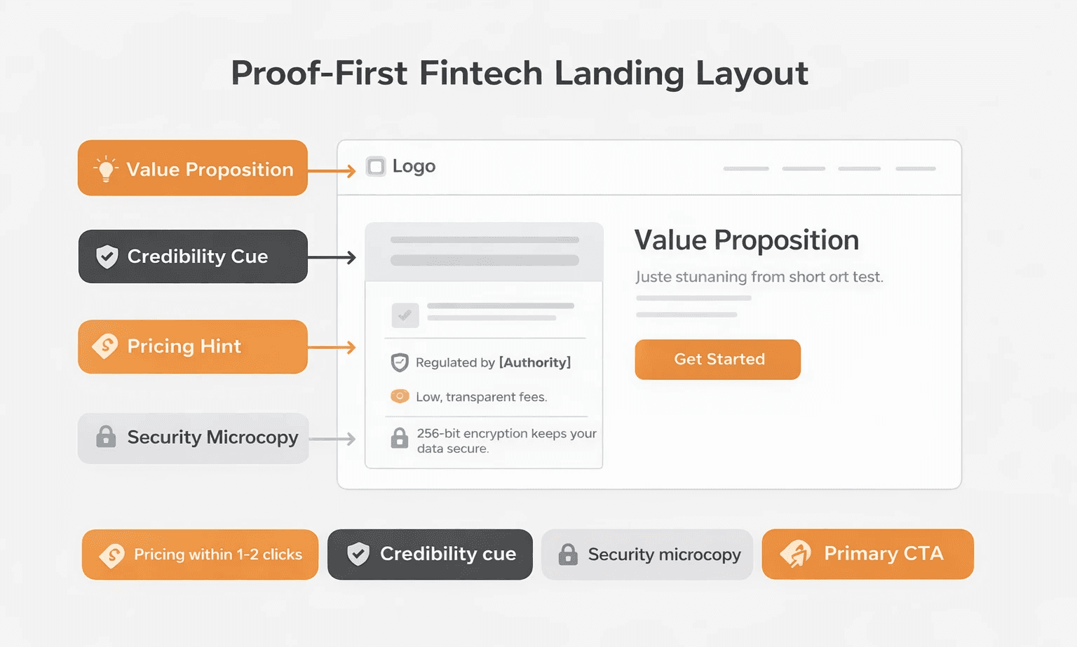
1. Design for Trust With “Proof-First” Information Architecture
Definition: Proof-first IA puts legitimacy cues before persuasion or conversion.
It answers trust questions before it asks for signups.
New users ask one question first: “Can I trust this?”
Your IA must answer fast, then invite the next step.
Why it matters in 2026: Users notice fraud, misuse, and opaque fees.
If you bury proof, qualified visitors leave without exploring.
Implementation checklist:
Put value, one credibility cue, and one CTA above-the-fold.
Explain “How it works” in 3–5 plain, concrete steps.
Keep pricing and fees within 1–2 clicks everywhere.
Explain security in plain language with practical specifics.
Avoid modals that block product basics or pricing details.
Common mistakes:
Lead with slogans, then hide substance behind vague sections.
Bury regulatory context in footers and low-visibility pages.
Show security badges without explaining what they actually mean.
KPIs to track:
Homepage-to-signup conversion rate and CTA click-through rate.
Time-on-page before first CTA click or navigation action.
Scroll depth on landing pages and “How it works” views.
2. Make Onboarding Friction-Right With Progressive KYC and Clear “Why We Ask”
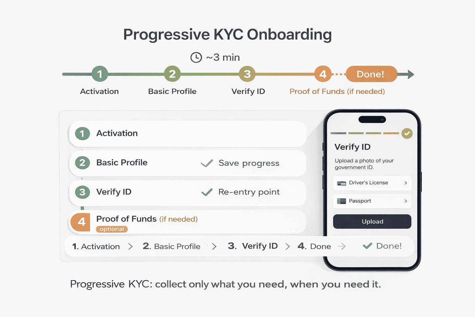
Definition: Friction-right onboarding collects minimum data for activation first.
It stages KYC when users need it, not earlier.
Why it matters in 2026: KYC causes some friction by design.
Your UX must make each step feel purposeful and explained.
Implementation checklist:
Show step count and time estimate before users begin.
Save progress automatically and support smooth re-entry later.
Offer explore mode where regulations allow limited access.
Explain sensitive asks with simple, direct compliance microcopy.
Validate inputs inline with specific, actionable error messages.
Provide recovery steps when verification fails or stalls.
Common mistakes:
Front-load every compliance step before showing any value.
Use vague errors like “invalid input” without guidance.
Remove re-entry points after abandonment or verification failure.
KPIs to track:
Completion rate per step and total KYC drop-off rate.
Time-to-verified and time-to-first-value after signup.
Re-entry rate after abandonment and completion after re-entry.
3. Make Fees, FX Rates, and Total Cost Visible Before Commitment
Definition: Transparent pricing UX shows total cost before confirmation.
It includes fees, FX rates, and settlement timing upfront.
Why it matters in 2026: PSD3/PSR debates emphasize clearer disclosures.
Users punish surprises at confirmation with abandonment and distrust.
Implementation checklist:
Show “You send / They receive” before the confirm step.
List fee line items and show the exchange rate timestamp.
Include amount, recipient, ETA, and total fees on confirmation.
Offer receipts that users can download, export, or share.
Label spreads clearly for cross-currency transfers and conversions.
Common mistakes:
Show fees only at the final confirmation moment.
Hide FX margin inside an unlabeled combined number.
Omit receipts or bury them behind support flows.
KPIs to track:
Transaction completion rate and pre-confirmation abandonment rate.
Support queries about fees and rates after transfers.
Repeat usage rate for transfers and FX conversions.
4. Use Modern Authentication UX: Passkeys, Biometrics, and Trustworthy Recovery
Definition: Modern auth UX prioritizes passkeys and biometrics over passwords.
It treats recovery as a core flow, not a forgotten edge.
Why it matters in 2026: Passkeys support phishing resistance and lower friction.
They reduce password resets and prevent many credential-based attacks.
Read more on the WebAuthn/FIDO standard.
Implementation checklist:
Offer passkeys during onboarding or right after first login.
Keep fallback paths clear and avoid parallel, confusing options.
Design recovery with transparency, time estimates, and clear outcomes.
Explain step-up checks for high-risk actions with plain language.
Limit OTP prompts to moments that genuinely increase safety.
Common mistakes:
Hide passkeys inside settings with weak adoption prompts.
Forget device-loss recovery paths and escalation options.
End recovery flows without clear next steps or re-entry routes.
KPIs to track:
Login success rate and average time-to-login completion.
Recovery completion rate and authentication-related support tickets.
Passkey adoption rate after prompts and repeat login success.
5. Design Resilient Transaction States: Status, Reversals, and Disputes
Definition: Resilient transaction UX explains every state and next action.
It removes ambiguity during pending, failed, or disputed moments.
Why it matters in 2026: DORA raises resilience expectations across platforms.
Users expect proactive, honest messaging during delays and disruptions.
Implementation checklist:
Use the same status labels and meanings across web and mobile.
Show timestamps and clear settlement windows users can understand.
Explain next steps for failed, pending, or stuck transactions.
Place dispute entry points inside transaction details, not menus.
Communicate degraded states in-app, not only on status pages.
Common mistakes:
Show “Processing” forever without guidance or escalation paths.
Hide disputes behind generic help flows and unclear categories.
Leave users guessing during outages and partial failures.
KPIs to track:
Support tickets per transaction and failure-related contact volume.
Recovery rate after failed payments and time-to-resolution.
NPS or CSAT after payment failures and dispute interactions.
6. Build Accessibility Into Core Flows, Not Just Marketing Pages
Definition: Accessible fintech UX supports critical tasks for everyone.
It works across screen readers, keyboards, low vision, and cognition.
Why it matters in 2026: The EAA covers banking services from 28 June 2025.
The W3C published WCAG 2.2 in October 2023.
Teams should treat WCAG 2.2 as a practical baseline.
Implementation checklist:
Use visible labels and link them correctly to inputs.
Write error messages that explain fixes, not only failures.
Meet minimum target sizes, including WCAG 2.2 guidance.
Maintain strong focus visibility across interactive states.
Support full keyboard navigation in auth, KYC, and payments.
Add text alternatives and summaries for charts and tables.
Avoid authentication that depends on memory or cognitive recall.
Common mistakes:
Make homepage accessible, then ignore core transaction flows.
Rely on third-party screens without accessible alternatives.
Ship vague errors that leave users stuck or anxious.
KPIs to track:
WCAG 2.2 audit results and regression counts over time.
Task success rate for keyboard-only and screen-reader testing.
Accessibility-related support contacts and qualitative user feedback.
Need a conversion-focused fintech landing page?
Get a trust-first layout with clear fees, speed, and accessibility.
7. Add AI Features With Guardrails: Explainability, Consent, Override
Definition: Responsible AI UX keeps recommendations explainable and controllable.
Users can verify reasoning, correct outcomes, and override suggestions.
Why it matters in 2026: Fintech teams ship AI fast across products.
Bad AI UX overpromises accuracy and erodes trust quickly.
Implementation checklist:
Add “Why am I seeing this?” for every recommendation.
Communicate limitations and avoid absolute certainty language.
Provide clear consent controls for personalization data sources.
Require user confirmation for high-stakes suggested actions.
Offer human escalation with clear routing and response expectations.
Common mistakes:
Present probabilistic output as factual advice or certainty.
Ship personalization without opt-out or clear controls.
Hide escalation behind loops and dead-end chatbot flows.
KPIs to track:
AI feature adoption and repeat usage across cohorts.
Override rate, correction rate, and escalation-to-human rate.
Trust score from surveys focused on AI reliability.
8. Turn Complex Financial Data Into Calm, Decision-Ready Dashboards
Definition: Calm dashboards prioritize comprehension before detailed exploration.
They support scanning, then reveal depth through progressive disclosure.
Why it matters in 2026: Users manage more accounts, assets, and activity.
Overloaded dashboards create confusion, not actionable confidence.
Implementation checklist:
Map default views to user intent, not raw data availability.
Use progressive disclosure: summary first, detail on demand.
Replace jargon with plain language and clear definitions.
Add tooltips, glossary links, and short “learn more” cues.
Design charts for scanning with highlights and meaningful labels.
Write helpful empty states that explain what appears next.
Common mistakes:
Show every metric by default and overwhelm new users.
Use technical labels without helpful plain-language alternatives.
Leave empty states blank and provide no onboarding direction.
KPIs to track:
Time-to-primary-action from dashboard landing across cohorts.
Engagement depth by feature and drill-down completion rate.
Clarity score from usability tests and interviews.
9. Use a Fintech-Ready Design System Across Platforms and Handoffs
Definition: A fintech design system standardizes high-risk interaction patterns.
It governs auth, verification, payments, confirmations, and disclosures.
Why it matters in 2026: Products add third-party screens as they scale.
Without consistency, seams become trust liabilities at critical moments.
Implementation checklist:
Encode spacing, typography, and accessibility in design tokens.
Build components with WCAG 2.2 defaults and documented rules.
Standardize confirmations, receipts, errors, loading, and empty states.
Define entry and exit patterns for third-party handoffs.
Add governance so components stay consistent while teams grow.
Common mistakes:
Cover marketing pages but ignore transactional flow components.
Skip guidance for third-party handoffs and context switching.
Treat accessibility as an audit, not a component standard.
KPIs to track:
Cross-platform consistency score and UI defect rate trends.
Time-to-ship new flows using system components only.
Onboarding speed for new designers and developers.
10. Measure What Matters: Funnel Drop-Off, Trust, Support Load
Definition: Fintech UX measurement connects outcomes to risk and cost.
It tracks conversion plus trust, failure, and recovery experiences.
Why it matters in 2026: Funnels capture growth, but trust drives retention.
Support volume often reveals hidden UX debt and risk hotspots.
Implementation checklist:
Track activation: visit → signup → verified → first transaction.
Instrument anxiety events: errors, failures, and verification stalls.
Review support logs weekly and turn themes into fixes.
Run usability tests regularly and validate task completion rates.
A/B test responsibly and avoid deceptive conversion patterns.
Include compliance and support stakeholders in review cadences.
Common mistakes:
Measure only top-of-funnel conversions and ignore downstream cost.
Optimize confirmation copy while obscuring fees and timing.
Ignore support insights and repeat failures release after release.
KPIs to track:
Activation completion rate per step and first-transaction rate.
Support contacts per 1,000 users and per 1,000 transactions.
Task completion rate from moderated testing and replay audits.
Common Fintech UX Mistakes in 2026
Teams repeat these mistakes, even with strong resources.
Fixing them usually unlocks immediate trust and conversion gains.
Hide fees until the final screen and trigger last-second doubt.
Front-load compliance steps instead of using progressive disclosure.
Add security theater that punishes legitimate users with friction.
Skip recovery UX for auth, payments, and verification failures.
Bolt on accessibility late and risk core-flow breakdowns.
Ship AI without explainability, control, and human escalation.
Fintech UX Audit Checklist
Use this checklist before launch and after major releases.
Use it during audits and while prioritizing UX debt.
Onboarding and KYC
Show step count and time estimate at the start.
Auto-save progress and support re-entry after abandonment.
Explain sensitive data collection with clear microcopy.
Validate inline and write actionable error messages.
Authentication and Recovery
Offer passkeys or biometrics at onboarding or post-login.
Provide clear recovery, timeframes, and visible outcomes.
Use step-up checks only when risk increases materially.
Fees and Confirmation
Show full cost breakdown before confirmation.
Display FX rates with timestamps and clear spread labeling.
Confirm amount, recipient, ETA, and total fees clearly.
Transaction Status and Receipts
Standardize status labels across web and mobile surfaces.
Explain next steps for pending, failed, and stuck states.
Expose disputes inside transaction details, not menus.
Accessibility
Label every input clearly and link labels correctly.
Test keyboard flows for auth, KYC, and payments.
Add text alternatives and summaries for charts.
Support and Escalation
Provide human support access from any error state.
Communicate chatbot limits and always offer human escalation.
Performance and Mobile
Keep core flows fast on mid-tier mobile connections.
Prevent layout shifts during confirmations and receipts.
Analytics
Track funnels across signup, verification, and first transaction.
Capture errors across auth, KYC, and payment flows.
Ready to launch a fintech website that builds trust fast?
WSA designs landing pages and websites for regulated fintech brands.
FAQ
What makes fintech UX design different from “normal” UX?
Fintech UX carries higher stakes during every interaction.
Users share identity data and authorize irreversible money movements.
Fintech UX must optimize trust, clarity, and risk communication simultaneously.
How do you reduce KYC onboarding drop-off without increasing risk?
Use progressive KYC and stage verification when it becomes necessary.
Explain each request and show value before deep compliance steps.
Auto-save progress and design strong recovery paths after failures.
Are passkeys worth it for fintech products in 2026?
Yes, most fintech products benefit from passkeys immediately.
Passkeys reduce phishing risk and lower login friction significantly.
Design clear fallback and recovery flows for device loss scenarios.
What UX patterns improve trust in payments and transfers?
Show full fees, rates, and timing before users confirm transactions.
Use clear status labels and proactive messaging during delays.
Place dispute entry points inside transaction details for fast access.
What accessibility standard should fintech teams follow in 2026?
Follow WCAG 2.2 as your practical baseline for accessibility.
Prioritize authentication, onboarding, payments, and support experiences first.
Treat accessibility as a system standard, not a one-time audit.
Which fintech UX metrics matter most for growth teams?
Track activation completion, first transaction rate, and support contact rate.
Instrument errors, failed payments, and verification failures as risk signals.
Use moderated tests to validate task completion and perceived clarity.
How should fintech teams design AI assistants without losing trust?
Explain recommendations, communicate limits, and keep users in control.
Require confirmation for high-stakes actions and suggested transactions.
Offer human escalation clearly, with reliable routing and response times.
Whether you’re launching something new or improving an existing platform, we’re ready to discuss your goals and explore the best way forward.


