•
•

Fintech Website Trust Checklist: 10 Proven Elements That Increase Demo Bookings
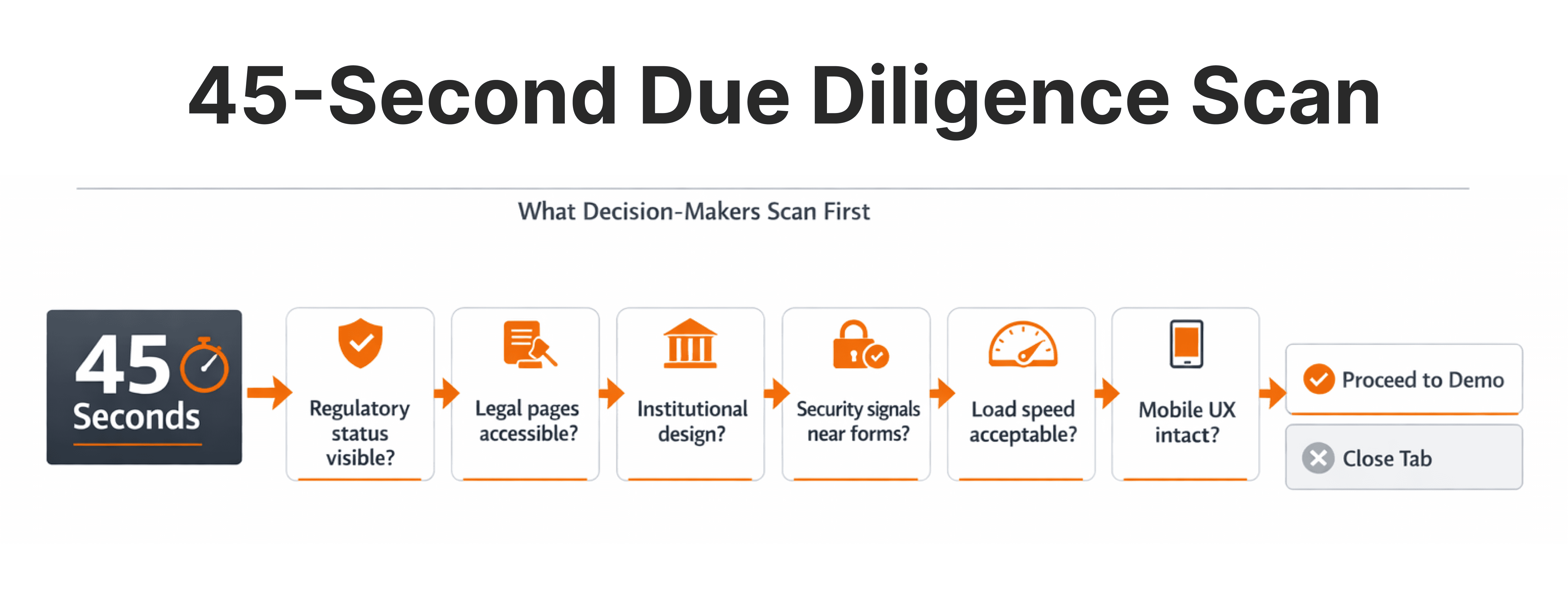
Picture this: a fund manager receives your company's name from a colleague, opens your website on their phone between meetings, and has 45 seconds. They're not reading your feature list. They're scanning for signals — is this company licensed? Does it look institutional? Can I find a legal page without hunting for it? If the answer to any of those is "I'm not sure," they close the tab. You never find out they were there.
Most fintech companies invest heavily in driving traffic — ads, SEO, partnerships, events — and very little in what happens when that traffic arrives. A website in this industry is not a brochure. It is the first layer of due diligence a prospect runs on your business. If it increases perceived risk rather than reducing it, no amount of traffic spend will fix the conversion problem.
This checklist breaks down exactly what fintech website design needs to get right — structurally, visually, and operationally — before a qualified visitor will commit to a demo.
Key Takeaways
A fintech website must reduce perceived risk before it asks for anything in return.
Trust signals are structural decisions — not decorative add-ons applied at the end of a build.
Compliance pages must be visible, complete, and regulator-ready — not buried in footers.
UX clarity directly affects how many qualified visitors convert to demo bookings.
Performance and mobile responsiveness are credibility signals, not just technical metrics.
Decision-makers evaluate fintech vendors differently than retail consumers.
Why Is My Fintech Website Not Converting? Trust Is the Real Answer.
In fintech, the primary barrier to conversion is not awareness — it is perceived risk.
Financial services buyers evaluate risk first, features second. Before they consider whether your platform does what they need, they're asking: Can I trust this company with my clients, my capital, or my compliance framework?
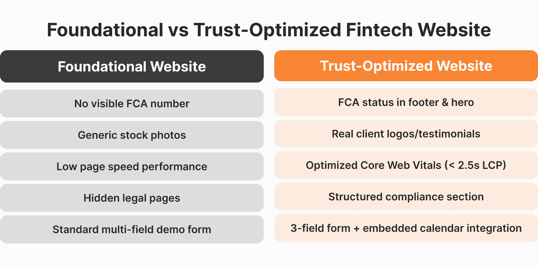
Consider two scenarios. A neobank targeting SME clients runs paid campaigns to a site that loads in 4 seconds, has no FCA registration visible, and uses stock photography. They get 3 demo requests per month. A competing platform with half the traffic — but a fast, compliant, professionally designed site with visible licensing and real client logos — gets 22. The product is comparable. The website isn't.
Trust is a conversion multiplier. And for fintech companies preparing for growth or fundraising, a trust-optimized website is a commercial asset — not a design project.
The Fintech Website Trust Checklist
1. Clear Value Proposition Above the Fold
The first screen must immediately answer: who this is for, what it solves, and why this company is credible.
Vague statements like "Powering the future of finance" communicate nothing to a decision-maker with a specific problem. Above-the-fold content should name the audience, state the outcome, and include a credibility anchor — a jurisdiction, a client count, or a recognizable integration.
Poor fintech UX above the fold is one of the biggest contributors to high bounce rates on otherwise well-trafficked websites. Clarity is a trust signal.
2. Visible Regulatory & Compliance Information
Regulatory transparency is the single most important trust signal for fintech companies operating in regulated markets — and the most commonly neglected.
Your website must display:
Licensing status and license numbers
Jurisdiction of registration
Regulatory body oversight (FCA, CySEC, ASIC, MAS, SEC, FINRA — whichever applies)
Risk disclaimers appropriate to your product
Links to regulatory registers for verification
The FCA's guidance on financial promotions requires regulated firms to clearly communicate their regulatory status in all public-facing communications, including websites. Compliance information belongs in the footer on every page, on a dedicated legal page, and in context on product pages where regulated features appear.
3. Structured Legal Pages (Not Hidden)
Legal documentation signals operational maturity — and its absence signals the opposite.
Every fintech website must include: Terms & Conditions, GDPR-compliant Privacy Policy, AML/KYC Policy, Risk Disclosure, and (for EU-facing products) a Cookie Policy. These pages shouldn't require three clicks to access. They belong in the main footer, linked from all forms, and cross-referenced on relevant product pages.
A compliance officer running due diligence will click those links before they ever click "Book a Demo." Legal page structure is a proxy for how seriously a company takes its obligations.
4. Professional Fintech Website Design Quality
Visual quality is interpreted as organizational quality by decision-makers evaluating a financial services website.
Fintech website design standards have matured. Companies like Stripe, B2BROKER and Revolut have set a standard for what "professional" looks like. Business decisions are based on the quality of a website as a proxy for scale, product development, and brand stability.
One broker worked with website agency was running paid campaigns to a site last updated in 2021. Demo bookings were near-zero despite solid traffic. Following a complete redesign, including a new visual design, a compliance-focused layout, and structured product pages, their demo conversion rate was tripled in just 60 days. The product hadn't changed. The credibility signal had.
5. Trust Signals Integrated into UX (Not Scattered)
Website trust signals are most effective when placed near conversion actions — not relegated to a footer.
This includes: client testimonials near CTAs, partner and integration logos on product pages, security badges near forms, press mentions in the hero section, and regulatory affiliations above the fold for regulated firms.
Visitors completing a demo form feel the highest perceived risk at that exact moment. An FCA licensing badge or a recognizable client logo next to the form reduces that friction where it matters most. Scattering trust signals across a single testimonials page wastes their potential.
6. Transparent Product & Pricing Information
Unclear pricing signals that something is hidden — and increases friction before a demo booking.
Brokers should clearly state spreads, leverage limits, and fee structures. SaaS fintech providers should explain pricing tiers and what a demo includes. Investment platforms should disclose fee structures before a prospect reaches sales. If full pricing isn't appropriate to publish, a clear "pricing on request" statement with a rationale keeps the prospect moving rather than bouncing.
7. Security and Data Protection Visibility
A secure fintech website should provide visibility into its security status before it asks users to provide any information.
The following are key indicators of security on a fintech website: the presence of active SSL (HTTPS on all pages), mentions of encryption standards (AES-256), security compliance certifications (ISO 27001, SOC 2, PCI-DSS), and high availability of hosting infrastructure (AWS, Google Cloud Platform, Azure). Data residency statements are also required for products targeting the EU market.
These elements should appear near all forms and sign-up flows — not only in a separate security page.
8. Performance & Speed (Core Web Vitals)
Fintech website performance is a trust factor, and a slow website will indicate that reliability is not a concern.
The technical requirements for a good user experience are defined by Google's Core Web Vitals, which are:
LCP under 2.5 seconds,
INP under 200 milliseconds,
CLS under 0.1.
In other words, your website should load in less than 3 seconds on desktop and mobile devices in the main operating regions. CDN infrastructure is not optional for multi-region fintech companies.
Research from Google shows bounce probability increases by 32% as load time goes from 1 to 3 seconds. For high-intent traffic that has already invested effort in finding you, a 1-second delay is a conversion leak.
9. Mobile UX That Mirrors Desktop Quality
UX for fintech websites must perform equally on mobile — a significant share of B2B evaluation happens on mobile devices.
According to LinkedIn data, the majority of B2B content consumption happens on mobile. Decision-makers scan vendor sites between meetings, on planes, during commutes. A mobile experience that breaks navigation or makes forms hard to fill out communicates operational incompetence—and halts the evaluation process right there.
Mobile-first fintech UX needs a thoughtful adaptation: readable fonts at smaller scales, touch-friendly navigation, and forms that don’t require pinch-and-zoom.
10. Clear, Friction-Optimized Demo Booking Flow
The demo booking flow is the final conversion checkpoint. Friction at this stage kills the trust built by everything leading up to it.
An effective flow includes: minimal required fields (name, company, email), calendar integration via Calendly or Cal.com, an immediate confirmation email and calendar invite, automated pre-demo follow-up, and CRM integration with HubSpot or Salesforce. Every extra field reduces completions. Every moment of post-submission uncertainty increases doubt.
Red Flags That Prevent Prospects from Booking a Demo
Decision-makers will disengage when they encounter:
outdated design,
heavy use of generic stock photography,
hidden or missing legal pages,
slow load speed,
broken links,
aggressive popups,
overpromising claims ("guaranteed returns," "risk-free")
no visible team.
In fintech, each of these is a risk signal — not a minor UX flaw.
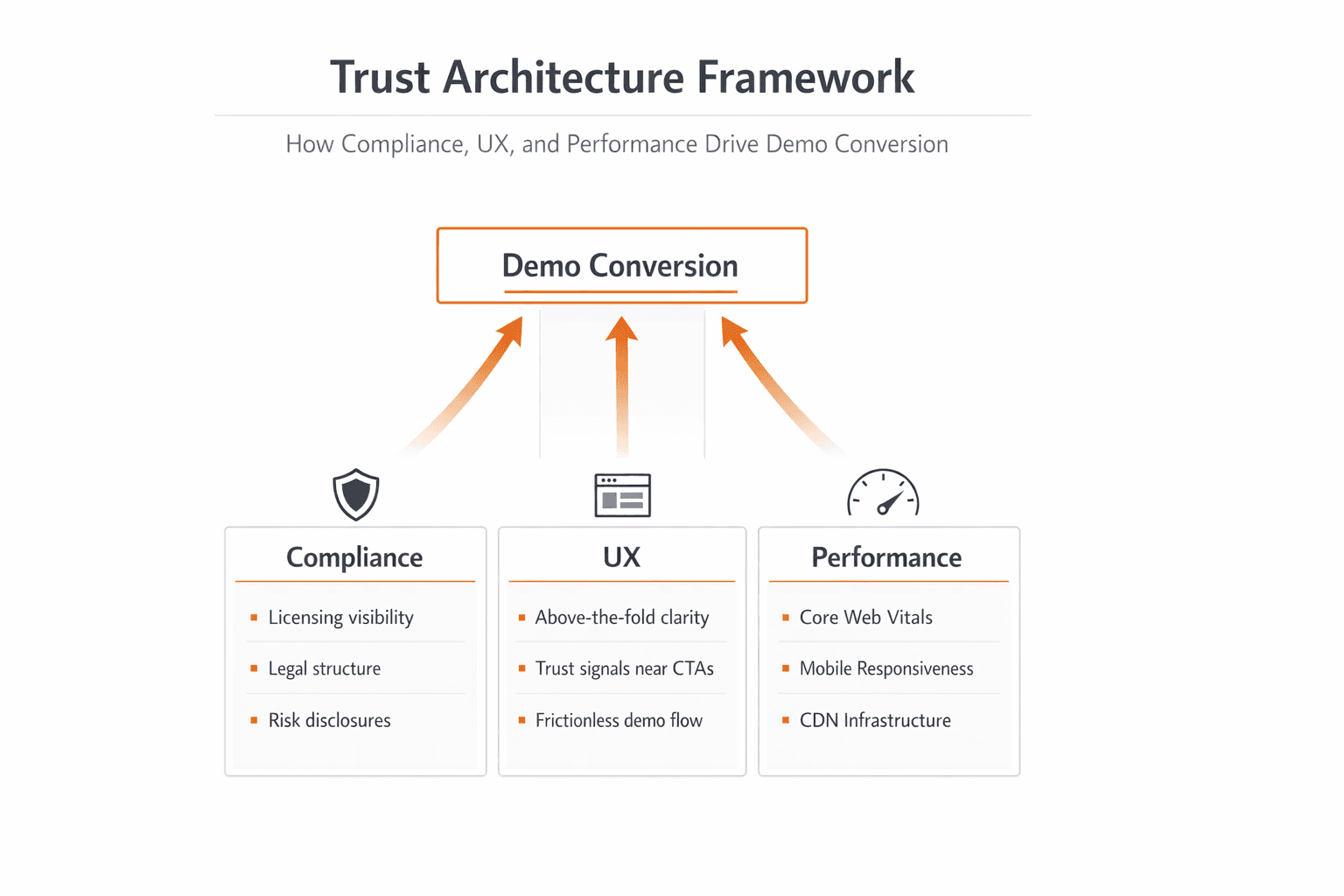
How Compliance, UX, and Performance Work Together
Trust architecture is built from three interdependent layers — compliance, UX, and performance — each reinforcing the others.
Compliance establishes legitimacy. UX builds clarity. Performance builds confidence. These are not parallel checklists — they operate as a system. A website that is compliant and fast but confusing in its UX will still lose prospects. One with exceptional UX but no regulatory information will fail institutional due diligence. All three must be present and integrated.
Before You Invest in Traffic, Fix Trust
Paid advertising amplifies whatever your website already communicates — including its weaknesses.
Investing in traffic before your website is conversion-ready leaks value at every step. A fund manager, liquidity provider, or enterprise client who arrives via a LinkedIn ad and finds a slow, non-compliant site doesn't just leave — you've spent money to expose your credibility gap to the highest-value prospect in your funnel. Fixing the website first is not a delay. It's the decision that makes scaling viable.
Why Fintech-Specialized Website Partners Deliver Stronger Results
Fintech-specialized partners and general design agencies approach a financial services website differently — and the difference shows in conversion.
A general designer optimizes for aesthetics. A fintech specialist optimizes for compliance architecture, financial buyer journeys, multi-region scalability, and the performance requirements of institutional audiences. Fintech website development requires knowing which compliance elements are mandatory by jurisdiction, where trust signals convert best in a fintech page flow, and how to build for scale without sacrificing design quality.
Fintech-specialized website agencies, like WSA, build websites for trading platforms, brokers, crypto projects, and SaaS fintech providers — with compliance awareness and institutional credibility built into the architecture from day one.
Next Steps: Audit Your Website Before Your Prospects Do
Does the homepage value proposition immediately identify your audience and outcome?
Are licensing details, registration numbers, and regulatory body visible without searching?
Do you have complete, accessible pages for T&Cs, Privacy Policy, AML/KYC, and Risk Disclosure?
Does your visual design reflect the operational scale you're positioning?
Are trust signals placed near CTAs — not only in the footer?
Is pricing or pricing logic clearly communicated?
Does your site show visible security signals near all forms?
Does your website load in under 3 seconds across regions?
Is your mobile experience equivalent in quality to desktop?
Does your demo booking flow minimize fields, confirm instantly, and integrate with your CRM?
If you're answering "no" or "not sure" to more than two of these, your website is likely costing you demos from qualified prospects.
Is Your Website Ready for High-Value Prospects?
Before your next growth push, get an expert review of your fintech website's trust architecture, compliance structure, and conversion flow.
FAQs
Why is my fintech website not converting visitors into demo bookings?
The answer is likely a lack of trust, rather than a lack of quality traffic. Visitors are scanning for trust indicators such as regulatory information, legal pages, security icons, and aesthetics, and will abandon if they are not found. Check your site for the above checklist before making changes to targeting or copy.
How can I increase demo bookings on a financial services website?
Start by reducing perceived risk before the booking step. Ensure compliance information is visible, UX is low-friction, trust signals appear near the CTA, and the booking flow is simple. Fintech website UX should guide prospects toward booking with confidence — not create additional questions.
What are the fintech website compliance requirements I need to display?
Minimum requirements: Terms & Conditions, Privacy Policy, Risk Disclosure Statement, and AML/KYC documents. In addition to the above, if you offer products to the EU, you must also display a Cookie Policy. Licensed entities are required to display their licensing information, registration numbers, and affiliations with regulatory bodies in the footer and legal pages. These requirements differ by region, with FCA, CySEC, ASIC, and MAS having their own sets of rules.
How fast should a fintech website load?
Under 3 seconds total load time, with LCP under 2.5 seconds, on both desktop and mobile across key regions. Below this threshold, bounce rates rise and conversion drops. CDN usage, image optimization, and clean code are standard prerequisites. Measure your current scores with Google PageSpeed Insights.
Is professional fintech website design necessary before running ads?
Yes. Paid ads send qualified traffic to your site — if the site doesn't convert, the spend is wasted. Professional fintech website design ensures visual quality, compliance visibility, and UX clarity are in place when high-value prospects arrive. Running ads before fixing trust signals means paying to expose your weaknesses to the prospects most likely to evaluate you rigorously.
Whether you’re launching something new or improving an existing platform, we’re ready to discuss your goals and explore the best way forward.


