•
•

Best Fintech Websites: 20 Examples and What They Do Right
You open ten competitor tabs the week before a redesign kickoff. Every homepage promises speed, security and scale, and after twenty minutes they blur together. Which of these fintech websites is actually doing something worth copying?
This guide answers that with evidence, not taste. We read 20 live homepages in October 2026, grouped them by segment (brokers, neobanks, payments and crypto), and noted what each one puts in front of a first-time visitor: the promise, the call to action, the proof and the disclosure. Skip the blur. Take the patterns.
Key Takeaways
The best fintech websites lead with one promise and one primary action. Crowded heroes lose to focused ones.
Compliance is a design element. Risk warnings, license badges and "not a bank" notes work best when they are visible, not buried.
Each segment solves a different trust problem: brokers show risk, neobanks show deposit protection, payment companies show scale, crypto brands show security and regulation.
Proof beats adjectives. Dated numbers, named regulators and customer logos persuade faster than "trusted by millions."
You do not need to copy any one site. Pick the pattern that fits your segment and your regulator.
What Makes a Good Fintech Website?
A good fintech website lets a visitor judge safety, product and next step within seconds. It earns trust before it asks for money, and it makes regulatory facts easy to find. The same qualities show up again and again in strong fintech website design:
Clear promise: one headline that says what you do and for whom.
One primary action: a single sign-up, demo or contact path in the hero.
Visible proof: licenses, customer logos, ratings or volume figures with a date.
Honest disclosure: risk warnings and partner-bank notes where visitors see them.
Fast, accessible pages: passing Core Web Vitals and meeting WCAG basics.
What this means in practice: a visitor who cannot tell who regulates you will assume the worst, and they will leave before they read your features.
Trust Comes Before Features
Nielsen Norman Group names four ways a site communicates trustworthiness: design quality, up-front disclosure, comprehensive and current content, and connection to the rest of the web. Fintech raises the stakes, because visitors are deciding whether to hand over money or identity documents.
Here's where most teams lose clients: they open with a feature tour. The sites below open with proof, then features. If you want a deeper checklist, our trust checklist breaks the signals down page by page.
Compliance Is Part of the Design
In regulated markets, disclosure is not optional, so the design question is where it lives. ESMA's 2018 CFD measures introduced a standardized risk warning that states the percentage of a provider's retail accounts that lose money. Several brokers below show that kind of figure near the top of the page.

For the visual side of the craft, see our roundup of fintech web design trends. This article stays focused on examples, not trends.
How We Picked These Fintech Websites
We wanted fintech website examples that are useful, not just pretty. Each site had to be live, reachable and readable in October 2026, and it had to belong clearly to one segment. We grouped the list by segment so you compare like with like.
Two notes on method:
We read homepages only. Pricing pages, apps and onboarding flows may differ.
Four of the 20 are WSA client sites: B2BROKER, B2PRIME, Coinsbuy and EQWIRE. We describe them with the same factual method as the rest.
Sites change often, so treat every detail as accurate at the time of writing.
Best Fintech Websites for Brokers and Institutions
Broker sites carry the heaviest disclosure load. A visitor must see the product, the license and the risk in one scroll, without feeling lectured. The five examples below solve that in different ways.
1. B2BROKER
B2BROKER opens with "Prime of Prime Liquidity Provider" under the line "Institutional Trading Infrastructure." The subhead names its audience outright: Forex, CFD, metals and crypto brokers, banks, exchanges and financial institutions.
There is one primary call to action, "Get started," and a "30+ awards" line gives early proof. Client and volume figures sit further down.
The lesson: name your buyer in the subhead and keep a single hero action.

2. B2PRIME
B2PRIME headlines "Connecting Traders to Markets" and lists tradable products right under it. Tabs for Personal, Professional, Corporate, Institutional and Partners let each visitor self-identify.
Compliance is built into the page. A regional notice offers services for the visitor's country, an entity banner names the regulated company, a risk warning cites the share of retail accounts that lose money, and license logos from several jurisdictions follow.
The lesson: route visitors by client type and show the regulated entity early.

3. IG
IG's hero claims "the world's No.1 provider" of CFDs, with a footnote explaining the revenue basis. Two buttons cover both intents: "Create live account" and "Create demo account."
The risk warning, "70% of retail client accounts lose money when trading CFDs," appears at the top and again in the footer. Proof is concrete: 17,000+ markets, 50+ years and a FTSE 250 listing.
The lesson: repeat the risk warning where it will be seen, and back superlatives with a footnoted basis.
![IG homepage hero]](https://framerusercontent.com/images/hg73WRQZXnWDxdMI2k9Vpqk.png?width=1440&height=900)
4. Saxo
Saxo keeps the promise soft ("Discover a better way to invest") and lets the proof do the work. It states that it is a regulated institution with a banking license, that deposits are protected up to EUR 100,000 by the Danish Guarantee Fund, and that 1.5 million clients use it.
The two hero buttons are "Open account" and "Check our pricing," which answers the question most visitors have before signing up. The CFD warning cites 66% of retail accounts losing money.
The lesson: put pricing next to sign-up for cost-conscious buyers.

5. eToro
eToro sells an idea rather than a feature list: "A window into what millions of investors are doing." The call to action is a single "Start investing," followed by headline fee claims and the line "Your capital is at risk."
Scale proof is specific: 40M+ users in 75 countries and a Nasdaq listing.
The lesson: a community-led headline can work if risk language and scale figures sit close by.

Not sure which option fits your business?
From startup brokerages to established platforms, WSA delivers websites that convert traders, satisfy regulators, and scale across markets.
Best Fintech Websites for Neobanks and Wealth Apps
Neobank sites must answer one question fast: is my money safe? Some are banks, some are not, and the best homepages say which in plain language.
6. Monzo
Monzo's headline is warm and human: "Spend your money on life, not your life on money." The hero button reads "Open a free Monzo account," and three trust badges sit beside it: Which? Recommended Provider (November 2025), the Current Account Switch Guarantee and FSCS protection.
A Personal and Business toggle sits top left.
The lesson: place deposit-protection badges in the hero, next to the button they support.
![Monzo homepage hero]](https://framerusercontent.com/images/zNvHQPyANV5Kb9RgdI6Z3gn7U.png?width=1440&height=900)
7. Mercury
Mercury promises "Radically different banking" and "Apply online in 10 minutes." An email field and an "Open account" button sit in the hero, and a "Launch demo" link lets visitors explore the dashboard before signing up.
The disclosure is precise. Mercury states it is a fintech company, not an FDIC-insured bank, and names its partner banks, with a footnote marker tied to the subhead.
The lesson: offer a product demo and attach the "not a bank" note to the claim it qualifies.
![[Screenshot: Mercury homepage hero]](https://framerusercontent.com/images/VKPjzyEuleWGHqpwx3wvGs0SbA.png?width=1440&height=900)
8. Chime
Chime leads with a bold claim, "America's #1 Choice for Banking®," then lists benefits: fee-free banking, early pay, cash back and a savings APY. Proof includes app-store reviews and a NerdWallet recognition.
The regulatory note is clear: Chime is a fintech, not a bank, and deposits are FDIC insured through partner banks. One caution: the qualifier for the headline APY sits in the disclosures, not beside the number.
The lesson: keep the qualifier close to any rate you advertise.

9. N26
N26 says "The first bank you'll love" and describes one app for banking, saving and investing. The button is "Open bank account."
The strongest trust facts, a full German banking license and deposit protection up to €100,000, appear lower down in an FAQ. That leaves room to move them higher.
The lesson: if you hold a banking license, show it early. It sets you apart from competitors that are not banks.

10. Betterment
Betterment pairs the promise "Build wealth with confidence and ease" with dated proof: $70B+ in assets under management (as of 5/10/2026), a 4.8 app rating and $10 to get started.
Disclosures are thorough. It names itself an SEC-registered investment adviser, lists its FINRA and SIPC brokerage status, and states it is not a bank.
The lesson: dates on your numbers make them believable.

Best Fintech Websites for Payments and Infrastructure
Payment brands sell to businesses and developers. Their homepages prove scale and reliability, then split visitors into self-serve and sales paths.
11. Stripe
Stripe's headline is "Financial infrastructure to grow your revenue." Two audiences are served at once: "Get started" for self-serve users and "Contact sales" for larger teams. A scrolling strip of customer logos follows.
The headline numbers (135+ currencies, 99.999% uptime) appear just below the hero, not inside it. A footnote states Stripe is not a bank and names the partner bank behind its accounts.
The lesson: serve both buyer types without adding clutter to the hero.

12. EQWIRE
EQWIRE leads with "Multi-currency accounts that make global payments easy." Its trust strip is regulatory: FCA authorized Electronic Money Institution, client funds safeguarded, a firm reference number, and the payment rails it supports (Faster Payments, SEPA and SWIFT).
The single button is "Create Account."
The lesson: show your regulator, reference number and payment rails in the first screen.

13. Wise
Wise makes the product the hero. A live transfer calculator shows the exchange rate and the fee for a EUR-to-USD transfer, with a "Send money" button beside it.
Visitors see the cost before they see a pitch. Regulation, ratings and customer counts appear lower on the page.
The lesson: if your product has a price, show a working example above the fold.

14. Adyen
Adyen writes "Fintech you can bank on" and offers a single action, "Talk to our team." That fits an enterprise buyer who will not self-serve.
Proof is stacked: US, UK and EU banking licenses, 99.999% historical uptime, €1.4T processed annually, and case studies from Adobe, Prada Group and Meta.
The lesson: when buyers are enterprises, one sales CTA with heavy proof beats a sign-up form.

15. Checkout.com
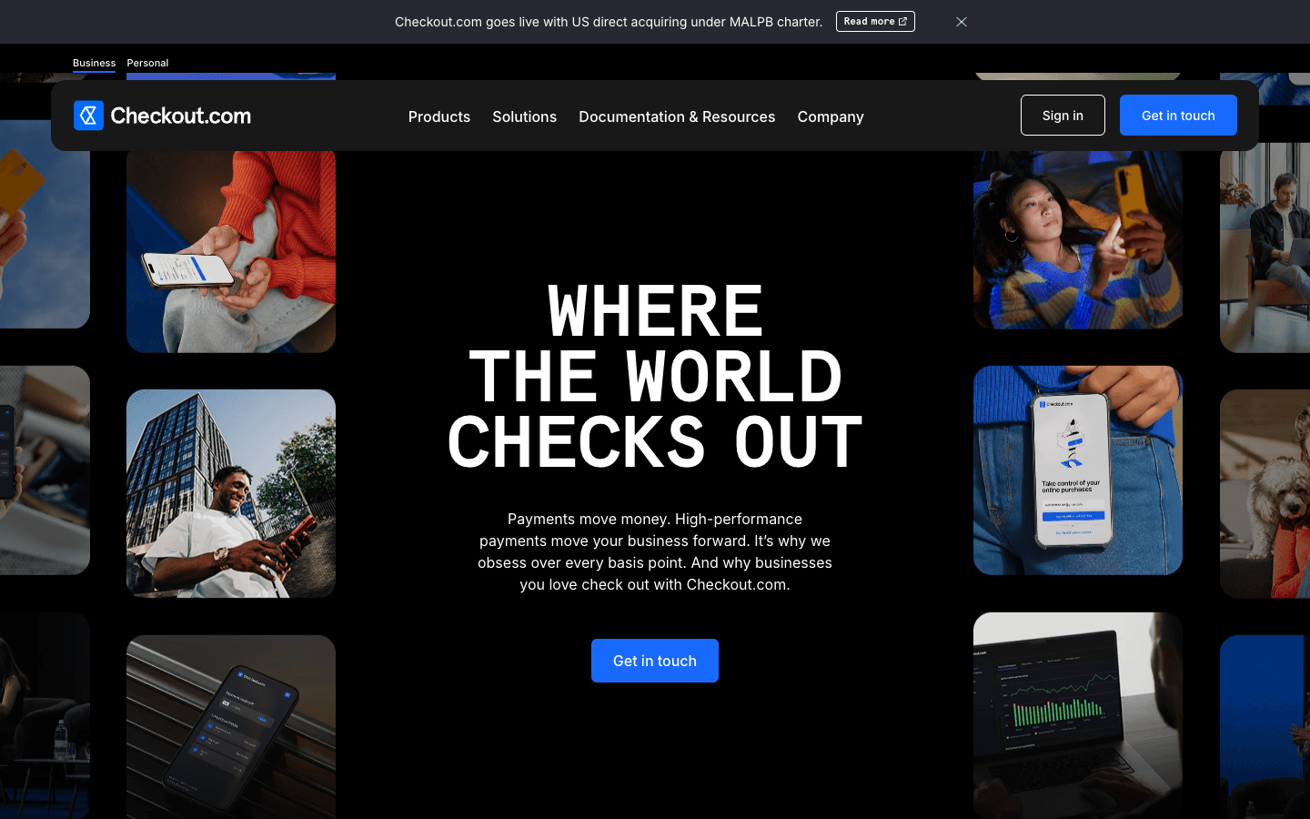
Checkout.com uses a lowercase brand line, "where the world checks out," with a single "Get in touch" button and a Business and Personal toggle.
Customer logos from eBay, Pinterest, Spotify, ASOS, Sony and Uber sit directly beneath the hero, so social proof is immediate. Two promotional banners also appear above the fold.
The lesson: place logos right under the hero, and watch how many banners compete with your main action.
16. Plaid
Plaid's European homepage calls it "Europe's leading open banking platform" and splits its actions by intent: "Start building" for developers and "Talk with our team" for buyers.
Figures such as 12,000+ financial institutions across 20 countries appear immediately below the hero.
The lesson: give developers and decision-makers separate doors.


Plan Your Fintech Homepage With WSA
Tell us your segment and your regulatory constraints, and we will map your hero, proof and disclosures.
Best Fintech Websites for Crypto and Digital Assets
Crypto visitors worry about two things: regulation and theft. The best homepages answer both with short, specific badges and plain security language.
17. Coinsbuy
Coinsbuy headlines "Digital assets processing. Built for scale." and sums up the product in five verbs: Send, Exchange, Swap, Store, Accept. The call to action is "Create Account."
The trust layer leans on security, with an SSL encryption mark, more than on licenses.
The lesson: five verbs can explain a product quickly. Add regulatory proof where it applies.

18. Kraken
Kraken's headline is "Own the power of your money," and the subhead lists crypto, stocks and futures. Regulatory labels are short and sit in the hero: MiFID II regulated in the EU, MiCA licensed, and "Since 2011."
Buttons are "Try Kraken" and "Create account."
The lesson: compress regulation into scannable badges, not paragraphs.

19. Bitpanda
Bitpanda's promise is wide: "The app for all your investments," with 650+ cryptos and 10,000+ stocks, ETFs and metals. The only hero action is "Start investing."
It lists licensing by the FMA in Austria and BaFin in Germany, MiCAR compliance, and 7+ million users.
The lesson: pair one action with a named set of regulators.

20. Ledger
Ledger sells hardware, so its trust problem is security. A top banner warns that Ledger will never ask for your 24-word recovery phrase. The hero offers two paths: the wallet app or the new signer.
Proof comes as scale: 20%+ of global crypto secured and 8+ million signers sold.
The lesson: a short anti-phishing warning shows you understand what your customers fear.

What the Best Fintech Homepages Put Above the Fold
The best fintech homepages put one promise, one primary action and one proof point above the fold. Nielsen Norman Group's 2018 eye-tracking study found that users spend about 57% of their viewing time above the fold, so that first screen carries more weight than the rest of the page.
Across the 20 sites, the same pattern repeats with segment-specific twists:
Segment | Typical hero action | Typical proof | Typical disclosure |
|---|---|---|---|
Brokers | Open account, Get started | Awards, client counts, licenses | Risk warning with losing-account percentage |
Neobanks and wealth | Open account | Badges, ratings, assets | Deposit protection or "not a bank" note |
Payments | Get started plus Contact sales | Customer logos, uptime, volume | License or partner-bank note |
Crypto | Create account, Start investing | Regulation labels, user counts | Security or phishing warnings |
Three patterns stand out:
Most heroes carry one primary action. Where there are two, they serve different audiences or intents.
Proof is specific. Named regulators, dated figures and logos beat vague claims.
Disclosure is visible. The strongest sites tie it to the claim it qualifies.
What this means for you: if your hero has three buttons and no regulator, you are asking visitors to trust you on faith.
How to Apply These Lessons to Your Fintech Website
Start with your segment's trust problem, then copy the pattern, not the pixels. A broker needs the risk warning visible. A neobank needs the protection badge beside the button. A payments company needs scale proof and two paths.
Choose the Pages Your Fintech Website Needs
Most fintech website design projects need the same core set:
Home, with the hero pattern above
Product or solutions pages by audience
Pricing or fee transparency
About, team and licenses
Security and compliance
Legal pages, including risk disclosures
Help center or documentation
Contact or demo request
Check Performance and Accessibility
Strong proof does not help if the page is slow. Google's Core Web Vitals thresholds call for a Largest Contentful Paint of 2.5 seconds or less, an Interaction to Next Paint of 200 ms or less and a Cumulative Layout Shift of 0.1 or less, measured at the 75th percentile of real visits. Meet WCAG basics too, so every visitor can read your disclosures.

How WSA Designs Fintech Websites
WSA is a web design agency that specializes in fintech, building on Framer and Webflow. Our experience is that the hardest part of a fintech site is not the visual style. It is deciding what goes above the fold, and where compliance lives, before a single layout is drawn.
That is why we start from your segment and regulator, then design the hero, the proof and the disclosures together. Framer lets us ship these pages quickly and keep them easy for your marketing team to edit, though the right platform depends on your content model and team.
Conclusion
The best fintech websites share a simple habit: they decide what a nervous visitor needs to see first, and they put it there. One promise, one action, one proof point and an honest disclosure beat any amount of animation.
Take the pattern for your segment, test it on a real visitor, and refine from there. If you want a second set of eyes on your homepage, WSA can help you turn these lessons into a site that earns trust quickly. Start at WSA Design.
FAQ
What makes a good fintech website?
A good fintech website communicates safety, product value and the next step within seconds. It has a clear promise, one primary action, visible proof such as licenses or customer logos, and honest disclosures. It also loads quickly and meets accessibility basics. Nielsen Norman Group's trust factors, including design quality and up-front disclosure, are a useful test.
Which fintech companies have the best websites?
Stripe, Wise, Monzo, Kraken and Betterment are strong examples in their segments, and this article covers 20 across brokers, neobanks, payments and crypto. "Best" depends on the job: Wise shows its product in the hero, Monzo puts protection badges beside its button, and IG repeats its risk warning at the top and bottom.
What pages does a fintech website need?
A fintech website needs a home page, product or solution pages, pricing, an about page with licenses, a security and compliance page, legal pages with risk disclosures, a help center or documentation, and a contact or demo page. API businesses also need developer documentation.
How do fintech websites show trust and compliance?
Fintech websites show trust with named regulators, license badges, deposit protection notes, customer logos, dated figures and security messaging. They show compliance with risk warnings, entity banners and "not a bank" notes. The strongest sites place these next to the claims they qualify, near the top of the page.
What should a fintech homepage show above the fold?
A fintech homepage should show one promise, one primary action and one proof point above the fold. Add the disclosure that matters most for your segment: a risk warning for brokers, deposit protection for neobanks, a partner-bank note for payments or a regulation badge for crypto.
Launch Your Licensed Brokerage with Confidence
We support brokers and fintechs through licensing, launch planning, and everything a regulated brand needs to go live.