•
•
Modern Fintech Web Design Trends in 2026
A fintech website in 2026 is no longer a marketing surface built on top of a product. It operates as regulated digital infrastructure — evaluated simultaneously by users making financial decisions within seconds, compliance officers reviewing licensing documentation, investors conducting due diligence, and AI systems extracting structured data for generative search engines.
Every design decision now influences regulatory timelines, conversion rates, search visibility, and long-term scalability. Organizations that treat their website as mission-critical infrastructure — not a visual refresh — gain measurable competitive advantage over those that don't.
Trend 1. Trust-Centered Architecture: Credibility Before Features
In financial services, trust is conversion. Users assess legitimacy within the first few seconds — long before they read about product features. Investors scan for governance signals before initiating contact. Regulators examine public-facing messaging during licensing reviews.
The most common mistake is burying regulatory references (FCA, SEC, ASIC, CySEC) in footers, where high-intent users never reach them. Oversight signals need to appear in decision zones: near onboarding forms, within pricing sections, and adjacent to primary CTAs — exactly where users decide whether to proceed.
Regulatory transparency goes beyond mentioning a license number. It means structured disclosure of which authority governs the company, in which jurisdictions the license is valid, and how client funds are protected. The FCA's financial promotion rules and the SEC Marketing Rule both set enforceable standards for how financial services are presented publicly. Non-compliance isn't just a legal risk — it's a visible credibility failure that users increasingly recognize. The specific disclosure requirements vary significantly across CySEC, FCA, and ASIC jurisdictions.
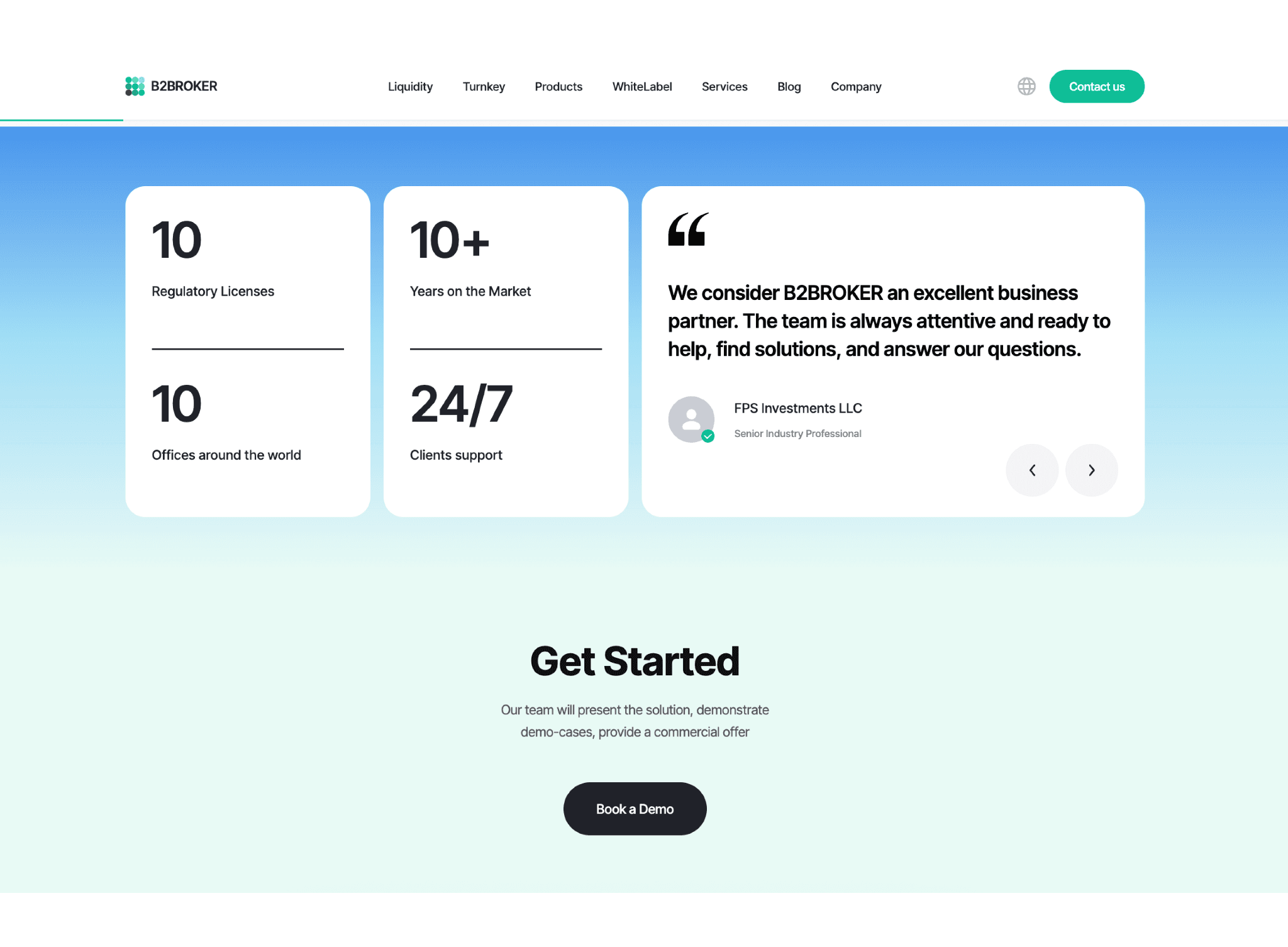
Real-world example: B2BROKER embeds client testimonials directly within product and feature pages rather than consolidating them on a standalone reviews section. Quotes from clients like Riston Capital and Neomarkets Group appear alongside regulatory credentials — 10 active licenses, offices across 10 jurisdictions — creating a layered trust architecture where social proof and compliance signals reinforce each other in the same viewport. Justworks takes a comparable approach in a different vertical, leading with G2 ratings and contextual testimonials from the homepage entry point. Both demonstrate that trust signals work best when they're embedded in the decision zone, not appended after the fact.
Trend 2. Performance as Competitive Positioning
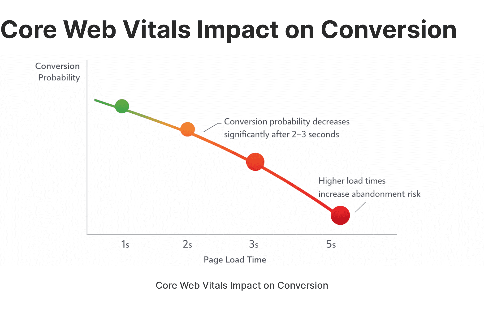
Site performance is no longer a technical requirement — it's part of the brand. Slow load times in fintech signal instability in the product itself, and the business consequences are direct: a 2–3 second delay on an onboarding screen can reduce completed registrations by 20–30%.
Google's Core Web Vitals — LCP, CLS, and INP — directly affect search rankings, but in financial services the stakes extend beyond SEO. Mobile experience is especially critical in emerging markets, where fintech products often replace traditional banking infrastructure entirely.
In practice, performance-first design means:
Modern image formats (WebP, AVIF)
JavaScript minification and deferred loading
CDN distribution for global audiences
Optimized font loading strategies
GA4 configured with custom event tracking — not just default pageviews
Performance is also an AI-crawl efficiency issue. Generative search engines index faster and more accurately on structurally clean, fast-loading pages — making slow architecture a visibility disadvantage across multiple dimensions simultaneously. The conversion impact of performance optimization is especially pronounced in brokerage environments, where user intent is high and hesitation windows are short.
Real-world example: Wise loads an embedded live currency calculator within the first viewport — product value demonstrated instantly, no speed trade-off. B2PRIME, an institutional Prime of Prime liquidity provider, scores 100/100 on desktop and 99/100 on mobile in Google PageSpeed Insights. For a platform serving brokers and exchanges across multiple jurisdictions, that score isn't cosmetic — it signals the same execution precision clients expect from the liquidity infrastructure itself.
Trend 3. AI-Ready Content and Generative Engine Optimization (GEO)
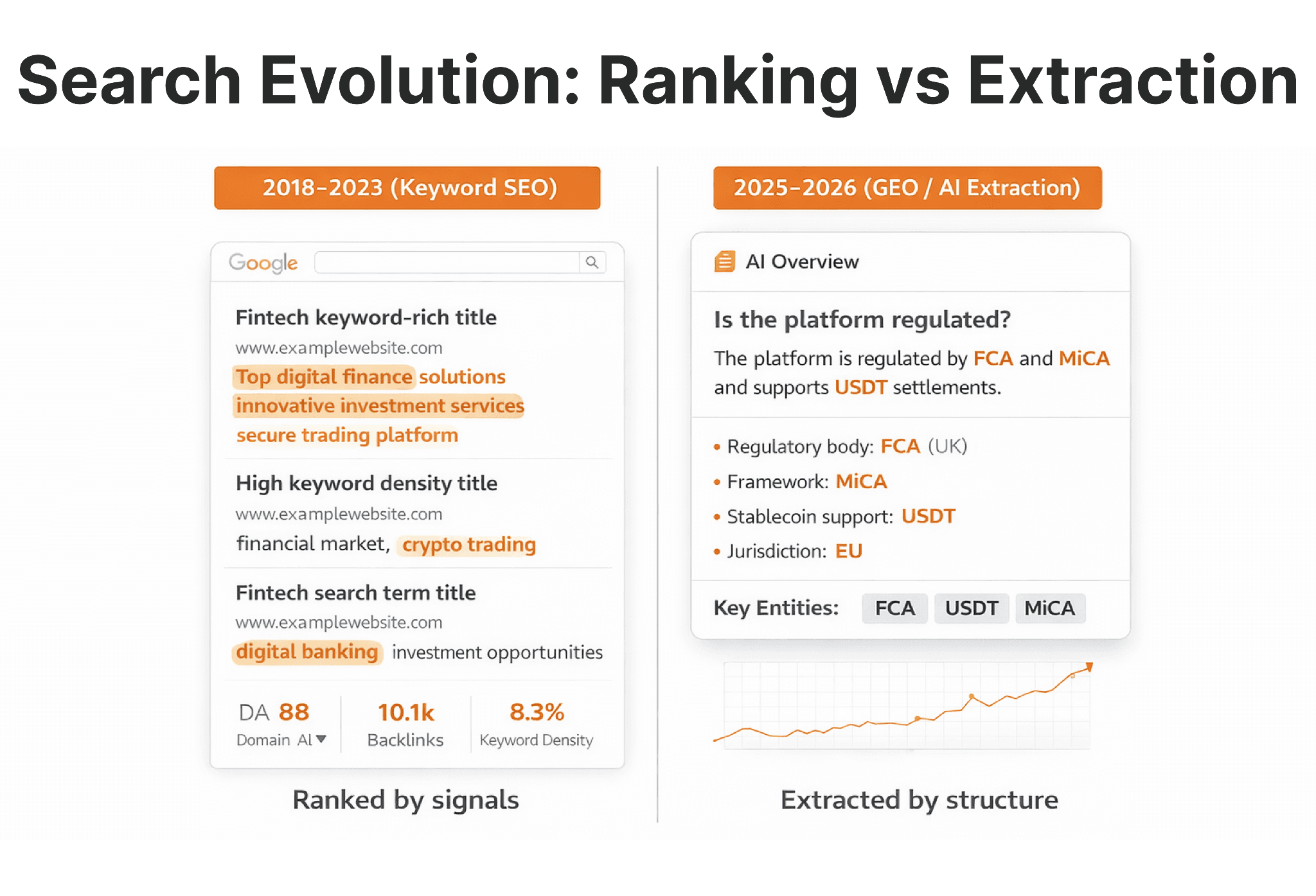
Search behavior is shifting. Google AI Overviews and competing generative engines don't rank pages — they extract answers from them. Fintech websites that aren't structured for extraction lose visibility regardless of their domain authority or backlink profile. What this means for AI-first fintech website architecture goes well beyond heading structure — it touches content depth, entity coverage, and schema implementation throughout the site.
AI systems prioritize content that is structured, concise, and entity-rich. Practically, this means:
H2 headings framed as questions
Short definitional paragraphs immediately below each heading
Explicit mentions of regulated entities and jurisdictions
FAQ blocks with direct, specific answers
Schema markup that clarifies page type and content relationships
Abstract marketing language — "empowering financial futures," "next-generation solutions" — is invisible to AI extraction. Specific, factual, plainly structured content is not. The shift from keyword density to structural clarity is the defining SEO transition of 2025–2026.
Real-world example: B2BINPAY— a crypto payment platform serving merchants across 10 blockchains — runs a consistently updated editorial blog covering regulatory developments, product updates, and crypto infrastructure topics. Each article follows a clear heading hierarchy with factual, entity-rich content: specific blockchains named, regulatory frameworks cited, transaction volumes stated. That structural discipline — rather than keyword stuffing — is what makes the content extractable by AI systems and indexable at scale. B2BROKER applies the same approach across its library, with articles organized around precise industry terms that match how institutional clients actually search.
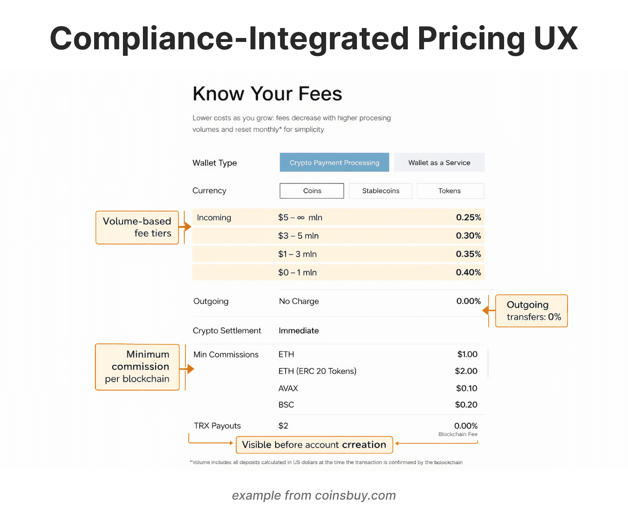
Trend 4. Compliance-Integrated UX
Compliance is now a UX problem, not just a legal one. Regulators assess websites for fee transparency, risk disclosure accuracy, claims substantiation, and jurisdictional clarity. But beyond regulatory requirements, users themselves have become more financially literate and more skeptical — vague pricing, hidden fee structures, and buried risk warnings read as red flags to the people you're trying to convert, not just to compliance officers.
Effective compliance-integrated UX follows a straightforward placement logic:
Risk disclosures appear near the claims they qualify — not on a separate legal page three clicks away
Fee structures are presented with full cost clarity, not compressed into tooltip microcopy
Jurisdictional limitations are disclosed before a user invests time in an onboarding flow that will ultimately reject them
Embedding compliance early reduces licensing delays and reputational exposure. More practically, it reduces support volume from users who felt misled — one of the highest-cost operational outcomes in fintech. Handling compliance updates during a structural redesign without losing search equity is one of the more technically demanding aspects of the process.
Real-world example: Coinsbuy breaks down fee tiers by volume, lists minimum commissions per blockchain, and marks outgoing transfers as zero charge — all before account creation. Stripe applies the same logic: one URL, every fee visible, no asterisks leading to buried footnotes. Both treat pricing transparency as a conversion tool, not a compliance obligation.
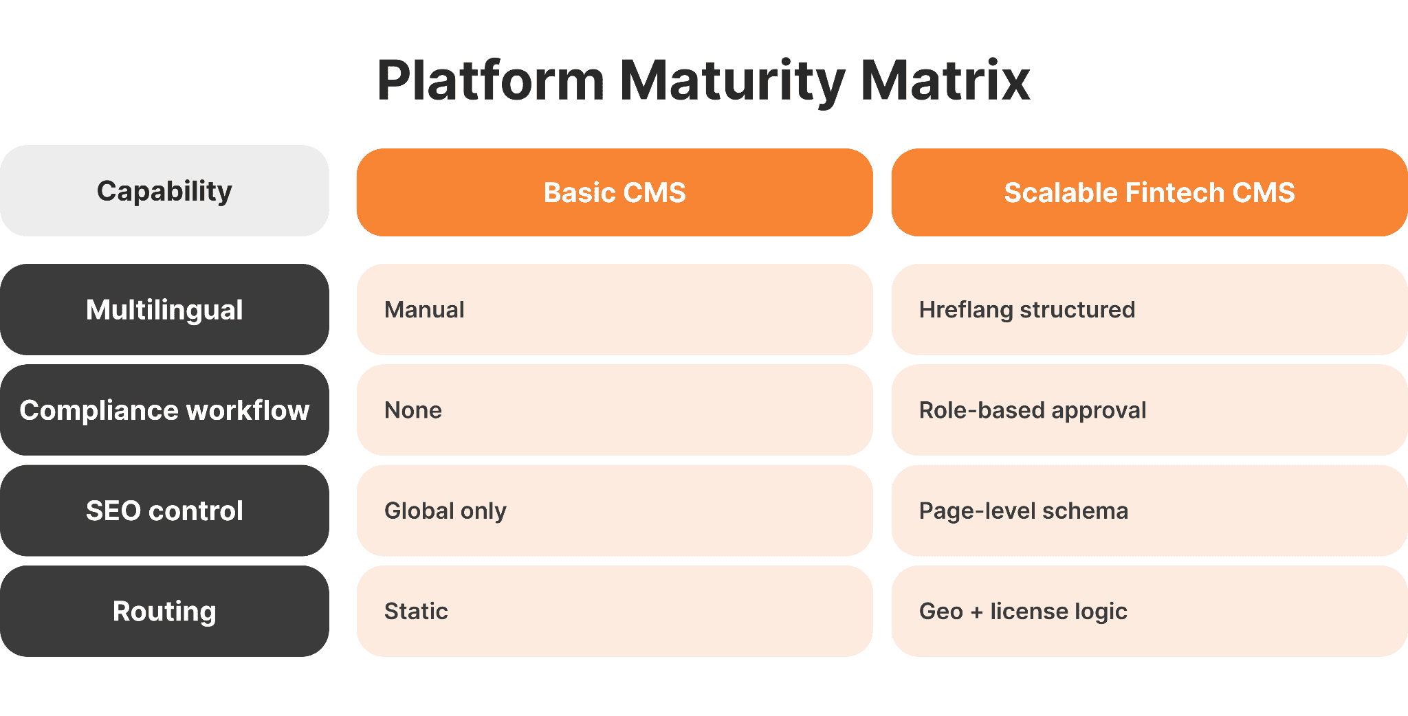
Trend 5. Modular and Scalable CMS Architecture
CMS selection is a strategic decision, not a technical preference. Poor infrastructure choices made at launch routinely constrain fintech companies 18–24 months later — when they need multilingual deployment, multi-jurisdictional compliance updates, or parallel product lines running simultaneously.
The selection criteria that matter most: multilingual content management with hreflang support, structured permission controls for compliance review workflows, SEO configurability at the page level, and integration capability with CRM and analytics infrastructure. The gap between a specialized fintech team and a generic web studio becomes most visible at the CMS architecture stage — not in the visual design.
Platform fit by use case:
Use Case | Recommended Architecture |
|---|---|
Marketing site, single product | Webflow or Framer, structured correctly |
Multi-product or multi-jurisdictional | Webflow (with structured logic) or Headless CMS for complex custom needs |
Regulated content with audit trails | Enterprise CMS with versioning and approval workflows |
Generic web studios frequently underweight these dimensions because they don't encounter the operational consequences downstream.
Real-world example: B2PRIME, built on Webflow, serves four client segments (Personal, Professional, Corporate, Institutional), detects residency on entry, and routes users to the correct licensed entity — CySEC, FSC, DFSA, FSA, or FSCA — each with its own regulatory disclosures. Wealthsimple takes a comparable approach across two markets, maintaining separate regulatory content layers for Canada and the US from a shared product infrastructure. Both show that compliance-aware content architecture is a CMS planning decision, not an engineering one.
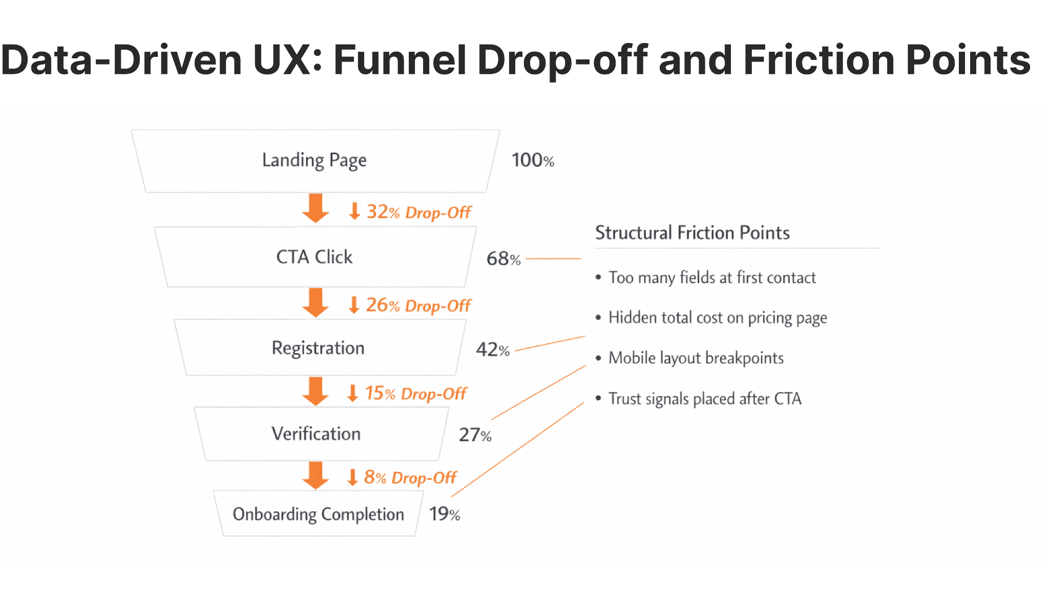
Trend 6. Data-Driven UX and Conversion Optimization
Modern fintech websites function as measurable acquisition systems. Without embedded analytics, redesign decisions are based on assumptions — and assumptions in regulated, high-stakes environments carry real cost.
Core infrastructure means GA4 with meaningful event tracking, funnel mapping that identifies where users abandon onboarding flows, behavioral analytics tools like Hotjar or FullStory for qualitative signal, and CRM integration that connects web behavior to downstream revenue attribution.
The most common structural friction points in broker and fintech sites follow a predictable pattern:
Registration forms with too many fields at first contact
Pricing pages that obscure total cost of service
Mobile layouts that break on mid-range Android devices
Trust signals that appear after the conversion action rather than before
Real-world example: B2TRADER leads with two clear CTAs — "Open Demo Account" and "Book a Demo" — without overloaded forms or walls of text at first contact. Robinhood applies the same discipline on investment decision screens: minimal whitespace, restrained color use, primary action always visible.
Trend 7. Interactive Product Demonstrations
Complex financial products are difficult to explain through static copy. Interactive demonstrations — calculators, sandbox dashboards, scroll-based product walkthroughs — reduce cognitive load and accelerate decision-making by letting users experience the product before committing.
The design principle here is clarity, not novelty. Interactions should answer specific user questions: What will my returns look like at different risk levels? What does the trading interface actually feel like? How does the fee structure change with account size? Animations and micro-interactions that don't answer a question add friction, not value — and they carry a performance cost that conflicts directly with Trend 2.
Real-world example: Ramp uses animated video demonstrations to show spend management features in action — real-time tracking, automated expense flows, budget controls — rather than relying on static screenshots. B2CORE goes further with a free live demo accessible straight from the homepage, letting prospective brokers walk through the full CRM and back office interface before any sales conversation. All three demonstrate interactive clarity as a conversion mechanism, not a design flourish.
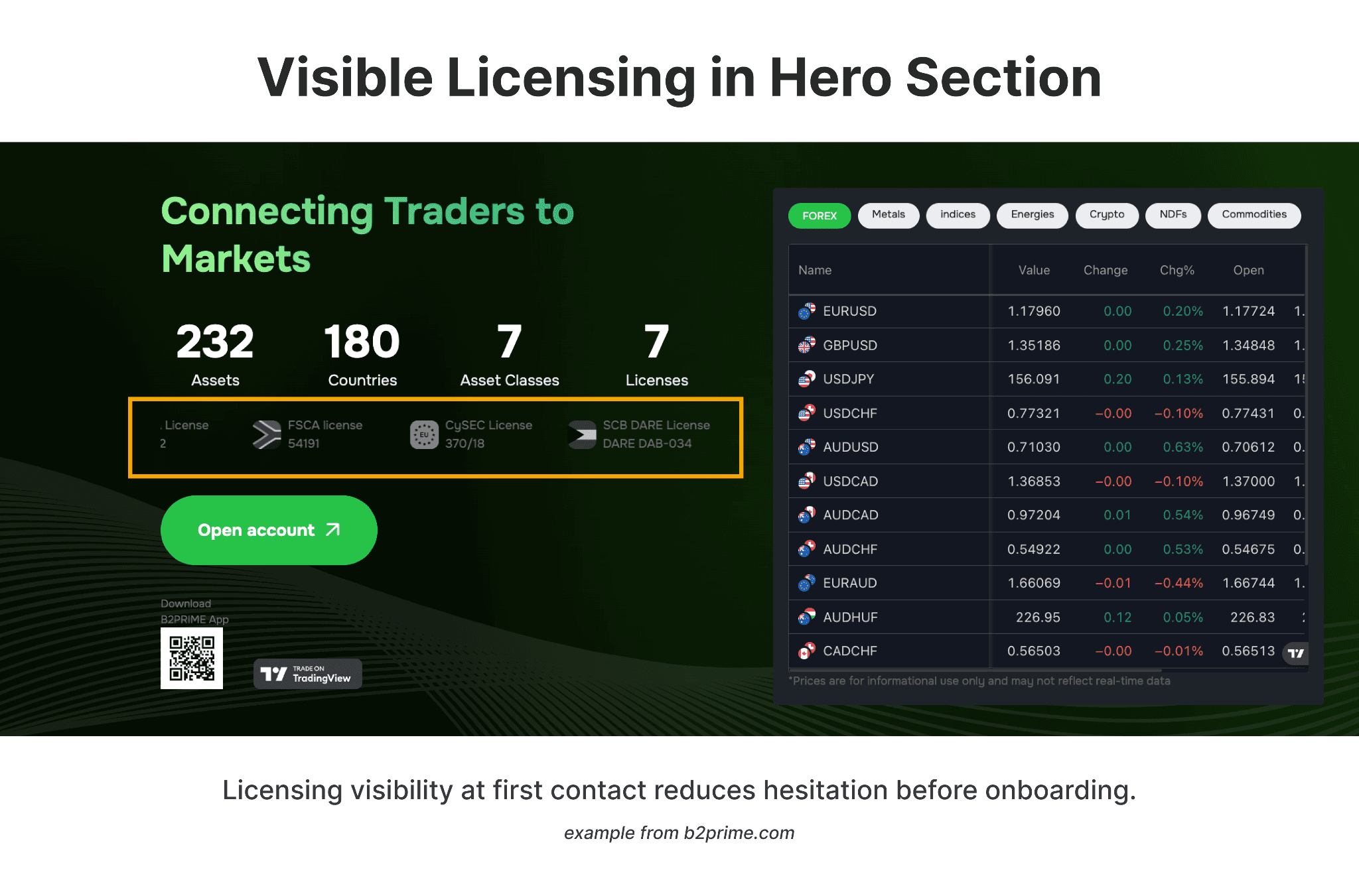
Trend 8. Security-Visible Design
Users in 2026 expect visible evidence of security, not implied protection. "Your data is safe with us" is not a security signal — it's a placeholder.
Security transparency means:
Explicit SSL encryption references
Two-factor authentication explanations presented before onboarding, not after a breach
Clear data storage and retention policies
Referenced certifications: ISO/IEC 27001, PCI-DSS
Fraud monitoring disclosures positioned near onboarding forms
Every unresolved security question in a user's mind is a conversion loss waiting to happen. Visible security evidence near high-intent areas measurably improves completion rates by reducing the hesitation that undefined risk creates. Security visibility is also one of the core levers for client acquisition that fintech companies most consistently underinvest in.
Real-world example: B2PRIME displays all seven active licenses — CySEC, DFSA, FSC, SFSA, FSCA and others — directly in the hero section of the homepage, with each number visible and verifiable on the spot. Mercury takes the same principle into the onboarding flow, explaining FDIC coverage, encryption standards, and fraud monitoring before asking users to connect financial accounts. Both reduce hesitation exactly where the trust decision is made.
Common Mistakes Fintech Companies Still Make
Most avoidable failures follow a predictable pattern. Teams copy SaaS design patterns without adapting them for the trust requirements of financial services. Animation is overused at the expense of Core Web Vitals scores. Compliance disclosures are hidden from user journeys. CMS infrastructure is selected without accounting for multilingual or multi-jurisdictional growth. And redesigns are treated as aesthetic exercises rather than structural interventions.
The underlying issue in most cases is treating the website as a branding artifact rather than as operational infrastructure. The cost of that mistake compounds over time.
Pre-Launch Checklist for 2026
A website is ready to launch when all of the following conditions are met:
Core Web Vitals pass on both mobile and desktop
Compliance copy reviewed by qualified legal counsel in each relevant jurisdiction
Structured data and schema markup implemented and validated
GA4 configured with meaningful event tracking beyond pageviews
CRM integration tested end-to-end
Mobile UX validated on mid-range devices, not just flagship hardware
Multilingual logic verified for content parity and hreflang accuracy
Formal security review completed
Backup and recovery systems active and tested
This is infrastructure quality control. Skipping steps creates operational debt that compounds at exactly the wrong moment — during a licensing review, a traffic spike, or a regulatory audit.
Building a Future-Ready Fintech Website
Organizations preparing for launch or structural redesign should work through a consistent planning sequence: benchmark the competitive set for trust architecture and performance; audit Core Web Vitals against current baselines; evaluate compliance transparency against regulatory requirements in target jurisdictions; map onboarding friction points with behavioral analytics; define 12–24 month growth scenarios that will stress-test the CMS; and assess scalability honestly against those scenarios.
The websites that will define fintech credibility over the next two years are being built now — on the assumption that performance, compliance, AI visibility, and growth architecture need to be aligned from the start, not retrofitted after launch.
In 2026, website design in financial services is less about visual differentiation and more about structural alignment with regulatory, performance, and AI visibility standards — a shift reflected in how specialized fintech agencies now approach infrastructure planning.
FAQs
What defines modern fintech web design in 2026?
The integration of trust-centered UX, performance engineering, AI-ready content structure, compliance integration, and scalable CMS infrastructure — treated collectively as regulated digital infrastructure rather than a marketing layer.
Why is performance critical for fintech websites specifically?
Performance affects trust perception, conversion rates, search visibility, AI crawl efficiency, and mobile onboarding completion — all simultaneously. In fintech, slow load times also signal operational instability, which directly undermines credibility.
How does generative AI search change fintech website structure?
AI systems extract answers from structured, entity-rich, concise content. Abstract marketing language is invisible to extraction. Clear formatting, question-based headings, FAQ blocks, and schema markup improve visibility in AI-generated search responses.
Which CMS platforms work best for fintech?
Webflow and Framer work well for scalable marketing sites when structured correctly. Headless architecture — Contentful or Sanity paired with a custom frontend — suits multi-product ecosystems where content operations need to scale independently of engineering.
How often should a fintech website be structurally redesigned?
Structural redesign typically occurs every 2–3 years. Conversion optimization, compliance updates, and performance tuning should be continuous — not project-based.
Whether you’re launching something new or improving an existing platform, we’re ready to discuss your goals and explore the best way forward.


