•
•

Fintech Website for Fundraising: What Investors Need to See
When a fintech investor receives your pitch deck, one of the first things they often do is look up your website. Not to admire the design, but to verify the story. They want to know whether the product is real, whether the messaging makes sense, and whether the company looks worth a second conversation.
That makes your website much more than a marketing asset. During fundraising, it functions as a credibility check. And in fintech specifically, where trust, compliance readiness, and product clarity can materially affect perceived investment risk, the stakes are higher than in most sectors.
This guide explains how to create a fintech website for fundraising that stands up to that kind of scrutiny. You’ll learn what investors expect to find, how to structure the site so it supports your pitch deck, and what to keep off the public web entirely. Whether you’re preparing for pre-seed, seed, or Series A, the goal is the same: a fintech fundraising website that makes your company easier to understand, easier to trust, and easier to act on.
Key Takeaways
A fintech fundraising website needs to explain what your company does, who it serves, and why it matters quickly, without relying on jargon or hype.
Investors do not need a public data room, but they do expect product clarity, traction signals, team credibility, and visible trust markers.
A strong startup website for investors should reinforce the same narrative as your pitch deck and demo, not contradict or undermine it.
Fintech startups usually need stronger credibility signals than generic SaaS companies because the bar for perceived safety and legitimacy is higher.
Clear site structure and thoughtful content matter as much as visual quality. A well-organized, honest site will outperform a beautiful but vague one.
Why Your Website Matters During Fundraising
Your website will not close the round, but it can absolutely weaken momentum. Investors use it to round out the picture, confirm the story, and decide whether to go deeper.
Think about the typical investor journey. They receive your deck, have a short call with a partner, and then share the link internally before the next meeting. At every stage, someone may be pulling up your website and asking a simple set of questions: Does the product look real? Does the story hang together? Does this team look like it knows what it’s doing?
A strong fintech fundraising website handles each of those moments well. It explains the company quickly, makes the product feel tangible, surfaces early proof, and builds the kind of trust that makes investors comfortable moving to the next step. A weak one raises questions that should not exist, about clarity, maturity, or execution.
In fintech, there’s an extra layer. Financial products carry inherent risk perception. Whether you’re building embedded finance infrastructure, a consumer lending platform, or open banking middleware, investors look for signs that your team takes compliance seriously, that the product has been designed thoughtfully, and that the company is operating with an appropriate level of maturity. None of that needs to be spelled out in a compliance manifesto. But it does need to be visible.
How to Structure a Fintech Website for Fundraising
The best way to think about how to structure a fintech website for fundraising is to map it to the questions investors are actually asking. Not design preferences. Investor questions.
Those questions are straightforward: What exactly does this product do? Who is it built for? Is it real, and does it work? Why is now the right time? And why is this team the one to build it?
A well-structured startup website for investors answers all five clearly and credibly, without making the visitor dig. Here’s what that looks like in practice:
Homepage — Your most important page. Lead with a precise value proposition, identify the target audience immediately, surface your strongest proof point, and give investors a clear next step.
Product / How It Works — Show the product in action. Use real interface screenshots, a workflow walkthrough, key integrations, and the core mechanics that make it work. This page should make the product feel real and well considered.
Use Cases / Solutions — Break down the segments you serve, the industries you operate in, and the specific customer personas who benefit most. This helps investors place your ICP and understand the scope.
Why Now / Market Context — Frame the market shift that makes your timing compelling. Whether it’s regulatory change, infrastructure maturity, or category emergence, investors want to understand what has changed and why now is the right time to build.
Traction / Proof — Include milestones, customer logos where approved, selected metrics or ranges, case studies, and early growth signals. This section does a lot of work. It is where you move from “interesting idea” to “this is actually happening.”
Security / Compliance / Trust — For any fintech company, this section signals maturity. You do not need to over-explain, but showing awareness of AML/KYC obligations, PCI DSS requirements, SOC 2 readiness or audit status, and data-handling practices tells investors you are not operating naively.
About / Team — Include founder credentials, relevant domain expertise, previous wins, and key hires. Investors back teams as much as ideas. This page should make that case clearly.
Resources / Blog / News — Product updates, thought leadership, and press mentions signal that the company is active, thoughtful, and building in public.
Contact / Demo — Give warm inbound interest a clear, working call to action. Do not make it hard to reach you.
One note worth making: many early-stage companies do not need a dedicated investor page. A strong, well-structured investor-ready fintech website usually does more for fundraising than a thin “For Investors” section tacked onto an otherwise generic site.
What Investors Need to See in the First 10 Seconds
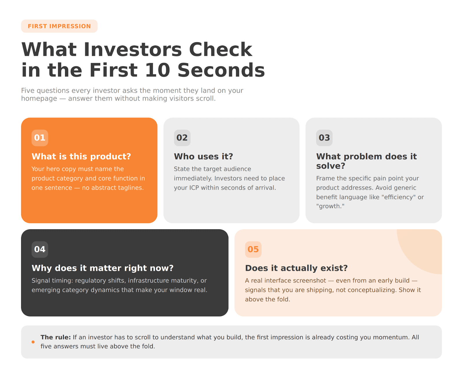
Clarity wins in the first 10 seconds, and in fintech, vague hero copy can sink a first impression fast. Investors should be able to land on your homepage and immediately understand what your company does, who it is for, and why it matters.
This is harder than it sounds. Many early-stage fintech sites fall into a few predictable traps: abstract category language that sounds smart but says very little (“The future of financial infrastructure”), buzzword-heavy positioning that overpromises (“AI-powered embedded finance ecosystem”), or product-first messaging that forgets to explain the benefit.
When an investor hits your site, they should be able to answer five questions without scrolling: What is this product? Who uses it? What problem does it solve? Why does it matter right now? And does it look like it actually exists?
That last question matters more than people expect. In fintech, where trust is core to both the product and the investment story, a homepage that looks credible, uses concrete language, and shows a real interface screenshot does a huge amount of work. It says: this is not just a concept. This is a company.
Show Proof Publicly — But Don’t Turn the Website Into a Data Room
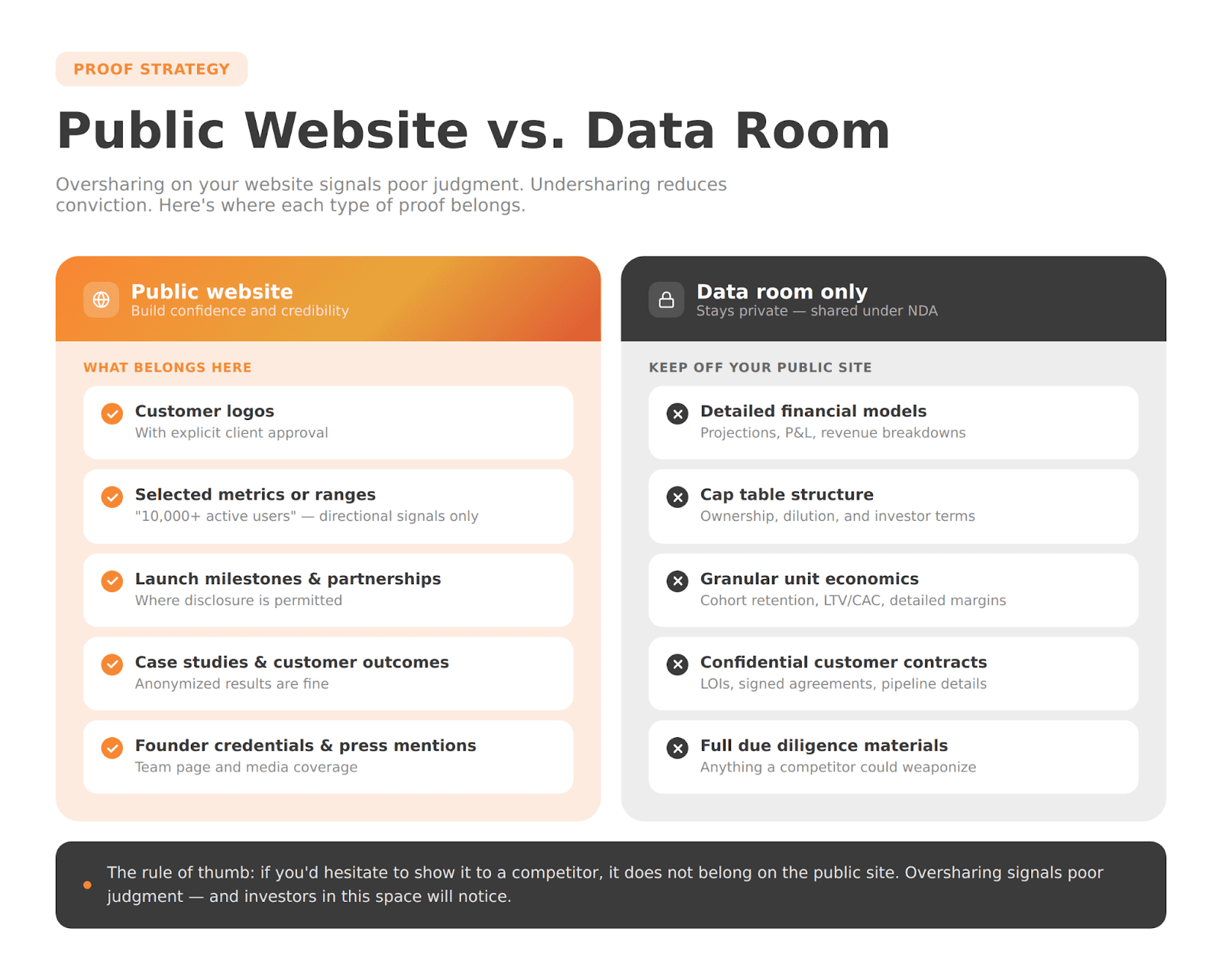
The goal of a strong startup website for investors is to create confidence, not to answer every due-diligence question. Knowing the difference is one of the most important decisions you’ll make when building a fintech fundraising website.
What typically belongs on the public website:
Customer logos, with approval
Launch milestones and partnership announcements
Selected metrics or ranges, such as “10,000+ active users” or “$2M+ processed monthly”
Case studies and customer outcomes
Press mentions and media coverage
Founder credentials and relevant past experience
Partner and ecosystem relationships where disclosure is permitted
What belongs in your deck or data room, not on your public website:
Detailed financial models and projections
Cap table structure
Granular unit economics, cohort retention data, or detailed revenue breakdowns
Confidential customer contracts or LOIs
Sensitive pipeline details
Full diligence materials of any kind
The rule of thumb is simple: if you would hesitate to show it to a competitor, it probably does not belong on the public site. Oversharing in an attempt to appear transparent can actually undermine investor trust because it signals poor judgment about what is confidential and what is not.
Not sure which option fits your business?
From startup brokerages to established platforms, WSA delivers websites that convert traders, satisfy regulators, and scale across markets.
Add the Trust Signals Fintech Startups Can’t Skip
Fintech investors are often especially sensitive to execution risk. They have seen companies struggle because of compliance gaps, security incidents, or sloppy product design. That makes trust signals, real and substantive ones, especially important on a fintech fundraising website.
Here’s what actually moves the needle:
Real product visuals. Mockups and concept art can work against you. Real screenshots, even from an early-stage product, signal that you are building something concrete. If the product is not ready to show publicly, show the workflow or architecture instead.
Precise, non-hyped messaging. Overstated claims about scale, market size, or capabilities trigger skepticism in experienced fintech investors. Use language that is confident but accurate. “We process cross-border payments in under 10 seconds” is stronger than “lightning-fast global payments” because it is specific.
Visible security and compliance awareness. You do not need to list every certification or control framework you are pursuing, but for a company operating in payments, lending, open banking, or any regulated space, acknowledging the compliance landscape signals maturity. A brief security section, or even a clear mention of relevant requirements or frameworks, tells investors you understand the operating environment.
Credible team bios. Investors read team pages carefully. If the founders have relevant fintech experience, financial-services backgrounds, or strong technical credentials, that belongs on the site in specifics, not just job titles.
Named partners and integrations. If you have permission to mention them, named banking partners, payment rails, or ecosystem integrations add significant legitimacy. These relationships are hard to establish. Show them.
Consistent, polished design. This is not about spending for aesthetics. It is about the impression that care has been taken. An outdated screenshot, a broken link, or inconsistent brand treatment suggests that quality control may be an issue.
One last point: fake trust badges and overstated compliance claims hurt more than they help. Investors in this space know what real compliance maturity looks like. If you imply certifications or approvals you do not have, it will be noticed.
Make Sure the Website Matches the Deck
When investors move between your pitch deck, website, LinkedIn, and demo, the story should feel like one continuous narrative, not three different companies.
Inconsistency is one of the most common problems with fundraising websites, and one of the most damaging. If your deck describes one ICP and your website addresses a different segment, investors notice. If the product screenshots on the website look different from what you showed in the demo, they notice that too. If the team page omits a co-founder who was prominent in the deck, that raises questions.
The alignment points that matter most are:
the same core positioning and value proposition
the same target customer profile
the same product framing and key differentiators
the same founder story and team narrative
the same proof points and traction claims
the same level of maturity signaled across all channels
A stale or inconsistent website does not just look disorganized. It creates doubt about whether the company really knows its own story. Before any fundraising push, walk through all your public-facing assets together and stress-test them for consistency.
Template vs. Specialist: What Makes Sense Before a Raise?
Whether a template or a specialist agency makes sense depends largely on how complex your product is to explain, and how much trust your fundraise needs to establish quickly.
Templates can work in a limited set of circumstances. If your product is simple enough to explain clearly in a few short sections, if your team can handle quality copy and design internally, and if compliance complexity is low, a well-executed template can give you a respectable online presence quickly.
But for many fintech companies approaching investors, especially those raising at seed or Series A, a template can create more problems than it solves. Fintech products are often technically sophisticated, category-defining, or operating in regulated spaces that require precise language. Generic design and pre-built messaging structures rarely do justice to a product like that. And investors can tell the difference.
A specialist makes clear sense when:
your product is hard to explain without real craft in the messaging
your brand needs to signal more maturity than a template conveys
fundraising is active or imminent
the site needs to serve investors, customers, and partners at the same time
trust signals need careful handling, especially around compliance language and product claims
Think of this as a business decision, not a design preference. A specialist agency with fintech experience, like WSA, does not just make the site look better. It can also help you communicate more clearly, signal more credibly, and avoid the missteps that erode investor confidence.
Common Mistakes That Hurt Investor Confidence
Even well-intentioned fintech founders make avoidable mistakes when building a fundraising website. Here are the ones that matter most:
Vague hero messaging that fails to explain what the product actually does
Buzzword overload, with terms like “AI-powered,” “next-generation,” and “disruptive” used without substance
No visible traction or proof, leaving the site looking like a pre-launch concept even when the product exists
A weak or thin team page that undersells the people behind the company
Outdated screenshots or milestones that make the company look dormant
Generic template design that signals low investment in the brand
A missing trust, security, or compliance section, especially for regulated or high-trust products
Too much sensitive information made public, including metrics, pipeline details, or financial projections that should stay in the data room
A website story misaligned with the deck, with different positioning, ICPs, or proof points across materials
Most of these are fixable. But they require someone to look at the site with the same eyes an investor would.
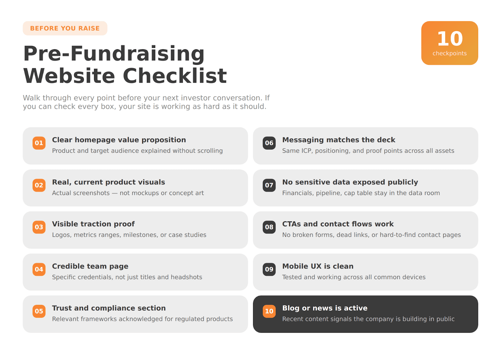
Pre-Fundraising Website Checklist
Before your next investor conversation, walk through this list. If you can check every box confidently, your website is working as hard as it should.
Homepage clearly explains the product and identifies the target audience
Product visuals are real, current, and representative of the actual experience
Proof is visible: logos, metrics, milestones, or case studies, as appropriate
Team page shows relevant expertise and builds founder credibility
A trust and compliance section is present where relevant to the product
Website messaging is consistent with the pitch deck and demo
No sensitive financial, operational, or confidential information is publicly exposed
CTAs and contact flows are functional and clearly marked
Mobile UX is clean and works across devices according to fintech UX design best practices
Resources, blog, or news content is current and active
Next Steps: Build a Website That Supports Investor Trust
A fundraising website is not what gets you to a term sheet. But a weak one can quietly close doors before you ever know they were open.
Investors use your website to confirm that the story they heard is real: that the product exists, the team is credible, the traction is genuine, and the company is operating with appropriate maturity. When all of that comes through clearly, your website accelerates the conversation. When it does not, it creates friction that should not be there.
If you’re preparing to create a fintech website for fundraising and need sharper messaging, better structure, or trust-first design built for investor audiences, WSA works with fintech companies at this stage. Explore their portfolio of fintech and startup work to see what that looks like in practice.
Ready to get started? Book a discovery call and build something that works.
FAQ
What do investors want to see on a fintech startup website?
Investors are looking for product clarity, team credibility, visible proof of traction, and signs that the company is operating with maturity. As a startup website for investors, your site should quickly convey what the product does, who uses it, and why this team is building it. Trust signals, such as real product visuals, relevant compliance awareness, and named partnerships, matter more in fintech than in many other categories.
How do you structure a fintech website for fundraising?
When thinking about how to structure a fintech website for fundraising, lead with a strong homepage that answers the core investor questions, then support it with dedicated sections for product, use cases, traction, trust and compliance, team, and contact. Each section should address a specific investor concern rather than exist for aesthetics or content volume.
Do I need a separate investor page?
Usually not. In most cases, a dedicated investor page does less than a strong core site. An investor-ready fintech website that explains the product clearly, shows real proof, and presents the team credibly will serve investors better than a thin standalone page linking to a data room.
What should stay off a public fundraising website?
Keep detailed financials, cap table information, granular unit economics, confidential customer contracts, and sensitive pipeline data off your public site. As a startup website for investors, the goal is to build confidence and credibility, not to publish everything you would keep in a data room. Oversharing signals poor judgment about what should remain confidential.
Can I use a template for a fintech fundraising website?
Yes, in limited cases, but most fintech products need more than a template can provide. A fintech fundraising website built on a generic template can work for very simple products at the earliest stages. But fintech products are often technically complex, category-specific, and operating in regulated spaces where messaging precision and trust design matter more than a template can usually deliver.
How long does it take to create a fintech website for fundraising?
A focused, well-scoped website can often launch in a few weeks if the content is ready. A more robust multi-page site, with thorough product pages, case studies, and trust content, typically takes longer depending on content readiness, stakeholder review cycles, and design scope. Starting earlier than you think you need to is almost always the safer call.
Whether you’re launching something new or improving an existing platform, we’re ready to discuss your goals and explore the best way forward.


