•
•

Website for Fintech Startup: Structure That Helps You Raise Funding
This article is for informational purposes only and does not constitute legal or regulatory advice. Regulatory requirements vary by jurisdiction. Founders should consult qualified legal counsel for jurisdiction-specific guidance on compliance disclosures and website obligations.
A VC opens your pitch deck. Before they read slide three, they open your website. In 20 seconds, they decide whether your team feels credible — or risky. That silent judgment shapes everything that follows.
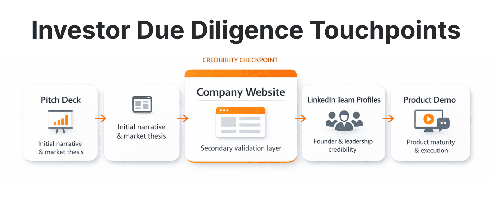
Your fintech startup website is not just a marketing asset. For most investors, it is the first informal due diligence checkpoint — before a single call is scheduled, before the pitch deck is reviewed, before term sheets enter the conversation.
Weak structure, unclear messaging, or missing compliance signals create perceived execution risk. Imagine a payments startup claiming enterprise readiness — but hiding its regulatory status in a PDF buried in the footer. That single friction point can end a funding conversation before it starts.
In competitive rounds, investors compare opportunities side by side. If your website signals uncertainty while another signals clarity, the decision is often made before the partner meeting.
This guide explains how to build a fintech startup website that supports fundraising, reinforces investor confidence, and scales with your company as you move through seed, Series A, and beyond.
Key Takeaways
A fintech startup website must serve fundraising goals alongside customer acquisition — it is a strategic asset, not just a branding exercise.
Financial technology website structure should prioritize clarity, trust signals, and due diligence readiness above visual aesthetics.
Investors evaluate compliance visibility, team transparency, and product clarity within seconds — often before reading your deck in full.
Strong fintech website architecture reduces friction at every stage of a funding round and directly shapes how investors perceive execution maturity.
The difference between a customer-facing site and an investor-ready site comes down to what you surface, where, and how quickly — not how much you spend on design.
Why Your Fintech Website Directly Influences Funding Outcomes
A fintech website that attracts investors communicates product value, market opportunity, and operational credibility within seconds — before any human conversation takes place.
According to DocSend's 2024 Startup Fundraising data, investors review pitch decks at a pace of approximately 2 minutes and 30 seconds — hitting an all-time low of 2 minutes and 24 seconds in Q4 2023. In that compressed window, your website often becomes the secondary validation layer that confirms — or undermines — the story in your deck.
What investors look for instinctively:
Does this team know their market? Messaging precision signals domain expertise.
Is the product real? Clear product descriptions, screenshots, and use cases signal maturity.
Can I trust this company? Compliance visibility, licensing information, and team transparency reduce perceived risk.
Does the deck match the website? Misalignment between pitch positioning and web messaging creates doubt.
Fintech companies like Stripe, B2BROKER, Revolut, and B2PRIME invest heavily in website clarity not only for user acquisition — but because their digital presence directly supports investor relations, partnership discussions, and media coverage. According to the Edelman 2024 Trust Barometer, only 62% of respondents globally say they trust financial services companies to do the right thing — the lowest baseline of any major sector. That is what your fintech startup website must overcome, not assume.
What Pages Does a Fintech Startup Website Need to Attract Investors?
A funding-oriented fintech website layout for funding must balance customer acquisition clarity with investor-specific information architecture.
Most early-stage fintech sites are built for one audience — potential users or clients. That is a mistake when you are raising capital. Investors need a different set of signals, and your fintech site structure for investors must serve both without creating a cluttered or confusing experience.
Here is the core page set for a funding-ready fintech startup website:
Page | Purpose | Investor Signal |
|---|---|---|
Homepage | Positioning, traction, primary CTA | Clarity of value proposition |
Product / Platform | Feature depth, technical credibility | Product maturity |
Solutions / Use Cases | Market application, vertical focus | Market understanding |
Technology / Infrastructure | Security, scalability, architecture | Operational credibility |
Compliance & Regulatory | Licenses, jurisdiction, legal disclaimers | Risk management |
About / Team | Leadership bios, advisor network | Execution capability |
Investors & Press | Funding history, media coverage | Social proof |
Blog / Insights | Thought leadership, SEO | Domain expertise |
Contact / Demo | Lead capture, outreach | Accessibility |
Fintech website navigation structure should follow a flat hierarchy — ideally no more than two levels deep. Investors should reach any critical page within two clicks from the homepage. Complex nested navigation is a trust signal problem: it suggests the company cannot organize its own story.
Fintech website information architecture principles apply directly here. Group pages by audience intent — product for users, about/compliance for investors, insights for both — and ensure the global navigation reflects those groupings without requiring the visitor to guess.
Fintech Website for Customers vs Investors: Structural Differences
The same page can serve two audiences — but only if the information hierarchy is deliberately designed for both.
Most fintech teams build their website around a single conversion goal: getting a user to sign up or request a demo. That structure works for customer acquisition. It fails investors, who are evaluating a different set of questions.
Element | Customer-Focused | Investor-Focused |
|---|---|---|
Hero section | Benefits + CTA | Value prop + market + proof metrics |
Navigation | Product, Pricing, Sign Up | Product, About, Compliance, Investors |
Proof elements | Testimonials, reviews | Volume metrics, enterprise clients, press |
Compliance | Minimal (footer links) | Dedicated page, prominent disclosure |
Team page | Optional | Required with professional backgrounds |
The structural fix is not building two separate sites. It is making the right information findable from a shared architecture — so a VC can reach compliance, team, and product detail without navigating a customer-conversion funnel.
Need a Fintech Website Built for Both Investors and Customers?
WSA designs and builds fintech startup websites that serve both audiences from day one — clear product messaging, compliance-aware architecture, and investor-ready structure.
How to Structure Your Homepage for Investor Confidence
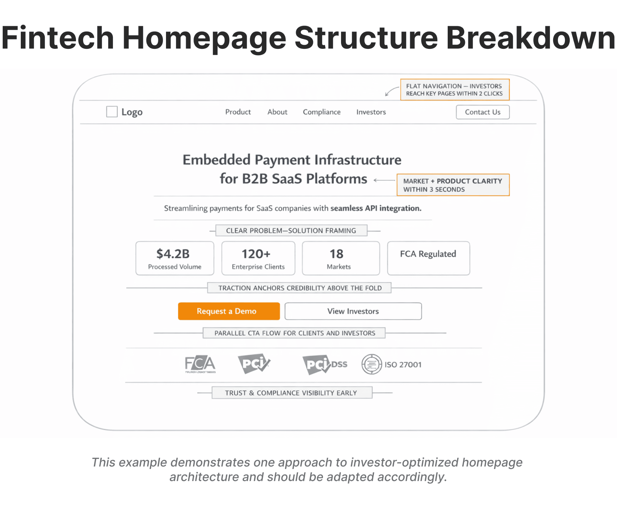
Your homepage is your highest-stakes page. It must communicate who you are, what you do, and why it matters — in the first two to three seconds of a visit.
Investors are not reading your homepage the way potential customers do. They are pattern-matching for credibility signals. Here is what the above-the-fold section of a well-structured fintech startup website must include:
1. A headline that names the market and the value. Avoid abstract or clever headlines. "The future of payments" means nothing. "Embedded payment infrastructure for B2B SaaS platforms" tells an investor exactly what you do and who you serve.
2. Problem–solution framing in the subheadline. One clear sentence that describes the pain and your solution. No jargon, no buzzwords.
3. Proof elements visible without scrolling. If you have traction metrics — processed volume, active users, enterprise clients, regulatory approvals — they belong above the fold. Numbers anchor credibility faster than any copy.
4. A fintech site conversion flow that serves multiple audiences. Consider parallel CTAs: "Request a Demo" for clients and "Learn More" or "View Investors" for investors and partners. This small structural choice prevents friction.
5. Trust elements placed strategically. Regulatory badges, partner logos, client logos, and security certifications all reduce perceived risk. Position them early — not buried in the footer.
Fintech Website Design for Seed vs Series A
The right level of website sophistication depends on your funding stage. Overbuilding too early wastes resources; underbuilding too late costs credibility.
At seed, investors back the team and the thesis more than the product. A two-to-four page site built on Webflow or Framer is sufficient — provided it clearly names the founding team, states the value proposition precisely, and discloses regulatory awareness even if a licence is not yet held.
By Series A, investors expect operational maturity to be visible. That means detailed product pages, use case breakdowns by vertical, a dedicated compliance page, a fully built team page, and press or investor content if the round history is public. The fintech startup websites that perform best at Series A were built with scalability in mind at seed — retrofitting structure after growth is expensive, and the seams show to experienced investors.
Trust and Compliance: What Investors Look For First
Trust is the primary currency of fintech. Without visible compliance and security signals, funding conversations stall — regardless of product quality.
Fintech operates in one of the most regulated sectors globally. Investors with fintech portfolio experience know exactly what compliance exposure looks like — and they look for signs that your team understands it too. Our fintech website trust checklist covers the full set of signals investors check before engaging further.
Fintech website trust signals investors evaluate include:
Licensing information: What jurisdiction are you regulated in? What licence are you operating under or applying for? State this clearly — in the footer, on a dedicated compliance page, or on the about page.
Regulatory framework disclosure: If you operate under MiFID II, FCA, SEC, or FinCEN, name it. As of 2026, crypto assets across the EU now fall under MiCA, adding a new disclosure layer for blockchain-related fintechs.
GDPR, AML/KYC visibility: Data protection and anti-money laundering posture should be referenced on a dedicated legal page. Fintech compliance page examples from B2BROKER and EQWIRE show how to structure this without overwhelming visitors.
Security standards: SOC 2 Type II, PCI DSS, and ISO 27001 certifications should be displayed with documentation available on request. These are table stakes for regulated fintech — not optional signals.
Transparent privacy policies: Policies written in plain language signal operational maturity. Legalese-only policies suggest the company is hiding behind complexity.
Startup website investor trust elements are not limited to legal content. Investors read websites the way journalists read press releases — with skepticism by default. Consistency in brand voice, absence of structural errors, and clear attribution of claims are all part of your fintech website trust design elements.
UX and Information Architecture That Reduce Perceived Risk
Modern fintech UX reduces perceived operational risk by making information effortless to find — and by demonstrating that the team thinks clearly about user experience.
A cluttered or confusing website tells investors something uncomfortable about your product team's judgment.
Fintech website UX best practices for a funding-ready site:
Clear content hierarchy: Investors skimming the page should understand your product by reading only the headings.
Mobile-first design: Across B2B sectors, mobile accounts for 55–65% of all global web visits according to StatCounter 2024 data. Investor browsing reflects this trend — especially during travel and conferences.
Load speed as a measurable trust signal: According to Google's Core Web Vitals research, improving page load performance correlates directly with lower bounce rates — some case studies show a 50% reduction in bounce after halving Largest Contentful Paint. Use PageSpeed Insights to benchmark your performance before a funding push.
Consistent fintech site conversion flow: Every page should have a clear next step. Investor-oriented pages should link to the investor/press section or a contact form.
Fintech website architecture should be built for scalability from the start. If you raise your Series A and need to add product pages, a compliance center, and a careers section — can your current structure accommodate that without a full rebuild? The founders who avoid that costly rebuild are typically those who treated site architecture as launch infrastructure, not a design deliverable.
The Investor Section: Should You Create a Dedicated Page?
Yes — if you are actively fundraising or have closed a round, a dedicated investor page communicates transparency and seriousness.
A fintech investors and press page typically includes current or previous funding information (if public), named investors (with permission), press coverage links, a media kit, leadership bios with LinkedIn links, and an investor contact route.
The fintech pitch deck website page concept works well post-announcement. Pre-announcement, a press page with coverage and a contact form is sufficient — and more credible than an empty IR section.
Fintech team and about page examples from Plaid and B2BINPAY show how to balance leadership transparency with appropriate corporate structure. Your about page should name co-founders with professional backgrounds, list key leadership hires, include notable advisors if applicable, and tell the founding story briefly and factually.
Common Mistakes That Undermine Fintech Startup Funding
Even well-funded teams make structural errors on their fintech startup websites. Each mistake below reduces perceived maturity:
Overly abstract messaging: "Revolutionizing financial infrastructure" tells investors nothing. Specificity signals domain expertise.
Copying fintech website examples without differentiation: Template designs signal a lack of identity — and investors recognize Webflow templates with a logo swap.
Hiding compliance details: If you are licensed, regulated, or pending authorization — say so clearly. Burying this suggests discomfort with regulatory scrutiny.
Cluttered fintech website information architecture: Too many navigation items, competing CTAs, and undifferentiated content blocks force investors to work harder than they should.
No visible traction metrics: Volume processed, client count, YoY growth. If metrics are confidential, reference "enterprise clients" or "partners across X markets."
Ignoring Core Web Vitals: According to Google's research, poor load performance measurably increases abandonment. A site that fails these benchmarks looks unfinished to a technically literate investor.
Fintech Conversion Checklist for Funding-Ready Websites
Use this fintech website conversion checklist as a pre-funding audit:
Messaging and Positioning
Value proposition is clear within 5 seconds of homepage visit
Headline names the market and the product category
Traction metrics are visible without scrolling
Compliance and Trust
Regulatory status is disclosed clearly (licensed, pending, exempt)
Privacy policy is current and footer-accessible
Security certifications are displayed (SOC 2, PCI DSS, ISO 27001 as applicable)
Team and Credibility
Founders and key leadership are named with professional backgrounds
LinkedIn profiles are linked from team pages
Technical Performance
Core Web Vitals pass (use PageSpeed Insights)
Site is fully responsive on mobile
Analytics and conversion tracking are configured
Investor-Specific
Investor or press page exists with media contact route
Website messaging matches investor narrative in the pitch deck
Press coverage is linked (if available)
DIY vs Professional Fintech Website Design for Fundraising
DIY or low-code approach makes sense if you are pre-seed, your compliance exposure is minimal, you have internal design capability, or you are validating a landing page concept.
Professional fintech website design makes sense if you are preparing for seed, Series A, or Series B; operating in a regulated market; managing a complex product requiring structured explanation; or expanding internationally with compliance-aware localization requirements.
The best fintech startup websites share three qualities: built for multiple audiences simultaneously, communicating trust through design discipline, and structured to scale without a rebuild. A fintech website that attracts investors is not the most expensive website. It is the most strategically designed one — and knowing how to promote a fintech company starts with getting that foundation right before any marketing spend begins.
Ready to Build Your Fintech Startup Website?
From seed-stage launches to Series A redesigns, WSA builds fintech websites that communicate credibility, pass regulatory review, and scale with your growth.
Next Steps: Building a Fintech Website That Supports Your Funding Strategy
Fintech-specialized agencies like WSA work with founders, product leaders, and growth teams across payments, crypto, neobanking, trading platforms, and API-based fintech products. The approach combines investor-ready architecture, compliance-aware design, Core Web Vitals optimization, and scalable CMS implementation — built around the specific due diligence signals that matter at each funding stage.
Founders preparing for a raise can review completed fintech website projects across regulated verticals, or book a discovery call to discuss structure, compliance positioning, and timeline.
FAQs
Why does a fintech startup website matter for investors?
Investors check your website alongside or immediately after your pitch deck. According to DocSend's 2024 data, the average VC spends around 2 minutes 30 seconds reviewing a deck — making your site a critical secondary signal. A structured fintech site structure for investors reduces perceived execution risk before the first call.
What is the ideal financial technology website structure for fundraising?
The ideal financial technology website structure includes a homepage with traction metrics, a detailed product section, a compliance and regulatory page, a team page with named leadership, and an investor or press section. Navigation must be flat — investors should reach any key page within two clicks.
Should a fintech startup include regulatory information before being fully licensed?
Yes. A fintech regulatory info section that clearly states licensing is in progress — with the relevant regulatory body named — signals operational awareness. Silence on this point raises more doubt than transparency does. Founders navigating this stage can find a full compliance framework in this guide to fintech company launch requirements.
How long does it take to build a fintech startup website?
Using Webflow or Framer, a professional multi-page fintech startup website typically takes 3 to 8 weeks — covering design, development, content, and compliance review. The broker website build process follows the same timeline and gives a practical sense of each phase.
Focused landing pages for fintech products can be delivered in under 1-2 weeks when the brief and content are clearly defined. The broker website build process follows the same timeline and gives a practical sense of each phase.
What is the biggest mistake fintech startups make with their websites?
Copying fintech website examples without a strategic foundation underneath them. The deeper issue is structural — poor fintech website architecture that fails investor audiences, vague value propositions, and missing compliance content that experienced investors expect to find in under 60 seconds.
Whether you’re launching something new or improving an existing platform, we’re ready to discuss your goals and explore the best way forward.


