•
•

Open Banking Website Design: How to Explain APIs, Security, and Use Cases
Your open banking platform can do extraordinary things. But if your website cannot explain what those things are clearly, quickly, and without drowning buyers in acronyms, you will lose deals before a conversation ever starts.
Open banking website design is not about making a technical product look pretty. It is about building an explanation layer between a complex API product and the cautious, time-poor buyers evaluating it. Those buyers — founders, product leads, procurement teams, compliance reviewers, and bank partners — all arrive with different levels of technical fluency and different questions. Your website has to answer all of them in the right order, without overwhelming any of them.
Current open banking standards place customer-consented access to financial data, payment initiation, and secure identity verification at the heart of the regulatory framework. In the US, CFPB Section 1033 is formalising personal financial data rights. In Europe, PSD2 has already reshaped how regulated third-party providers (TPPs) — including account information service providers (AISPs) and payment initiation service providers (PISPs) — interact with banks. Whatever market you serve, your open banking platform website must make those principles obvious in plain language, not bury them under product jargon.
This guide covers exactly how to do that: page by page, section by section.
Key Takeaways
An open banking website should lead with business outcomes, not technical mechanisms.
Security, consent, and user control belong in the main site structure, not hidden in a footer legal page.
Use cases should be grouped by buyer problem or industry vertical, not by internal product module names.
Marketing pages and developer documentation must be distinct but tightly connected.
Strong open banking web design eliminates jargon anxiety and builds the trust that drives conversion.
Why Open Banking Website Design Is More Difficult Than Typical Fintech Design
Most SaaS websites serve a relatively homogeneous audience. An open banking platform website does not have that luxury.
In a single week, the same homepage might be evaluated by a non-technical founder who wants to know what the product does, a procurement officer who wants to understand data access and consent controls, a compliance reviewer scanning for FCA or CFPB references, a bank partner checking regional coverage, and a back-end engineer who has skipped straight to the docs.
Each of those visitors has a different anxiety and a different exit trigger. Lose the founder with an API reference in the hero. Lose the compliance reviewer with vague security language. Lose the engineer with a marketing page that has no visible path to documentation. Open banking standards place consent, secure access, and authenticated customer journeys at the centre of the product’s value — which is exactly why website structure cannot be an afterthought.
Fintech API website design at this level requires architecture, not just aesthetics. The structure of your site is the product message.
Step 1. Start With a Plain-English Value Proposition
The homepage has one job: answer four questions before the visitor scrolls.
What is this?
Who is it for?
What does it help me do?
Why should I trust it?
Most open banking homepages fail at question one. They lead with phrases like “API-first infrastructure for regulated data exchange”, which is accurate but meaningless to anyone who is not already sold. The hero is not the place to prove technical depth. It is the place to earn the next five seconds of attention.
Instead of unexplained acronyms and infrastructure-speak, open with outcomes: “Connect bank data securely and with customer permission”, “Accept pay-by-bank payments without card fees”, or “Verify accounts instantly — no screen scraping, no credential sharing”.
Weak hero copy: “A PSD2-compliant AISP and PISP platform with token-based access and SCA-ready authentication flows.”
Stronger hero copy: “Give your customers a faster, safer way to connect their bank accounts — with their explicit consent and full control over their data.”
The technical depth comes later. Open banking web design works when it earns trust first and validates credibility second.
Step 2. Structure the Website Around Buyer Questions
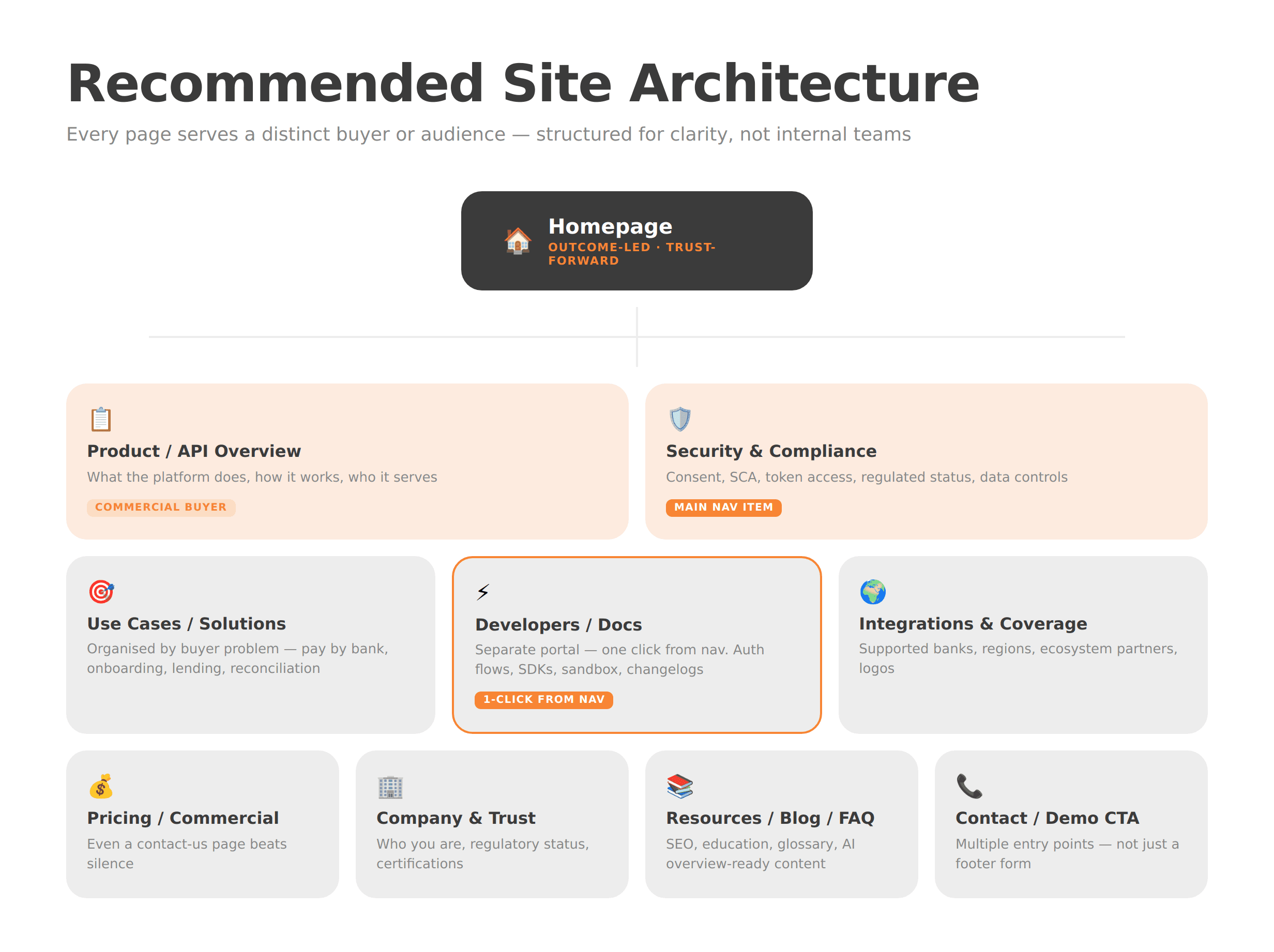
Page architecture is the backbone of clarity. If your navigation is built around internal team names or product-module labels that mean nothing to an outside buyer, the site will leak trust at every click.
A proven structure for an open banking platform website looks like this:
Homepage — outcome-led, audience-clear, trust-forward
Product / API Overview — what the platform does, how it works, and who it serves
Use Cases / Solutions — organised by buyer problem, not feature name
Security & Compliance — consent, authentication (SCA), encryption, regulatory status
Developers / Docs — a separate portal, accessible in one click from any page
Integrations / Supported Banks / Regions — coverage and ecosystem clarity
Pricing or Commercial Model — even a “contact us for pricing” page beats silence
Company / Trust / Regulatory Information — who you are and who regulates you
Resources / Blog / Glossary / FAQs — your SEO and education layer
Contact / Demo CTA — multiple entry points, not just a footer form
The guiding principle is simple: a developer should reach the docs in one click. A non-technical buyer should understand the product without ever needing the docs. Both journeys should feel intentional.
For a deeper look at how fintech-specific site architecture drives conversion, WSA’s work on fintech website structure and neobank website design offer useful reference points.
Step 3. Explain APIs Visually, Not Only Verbally
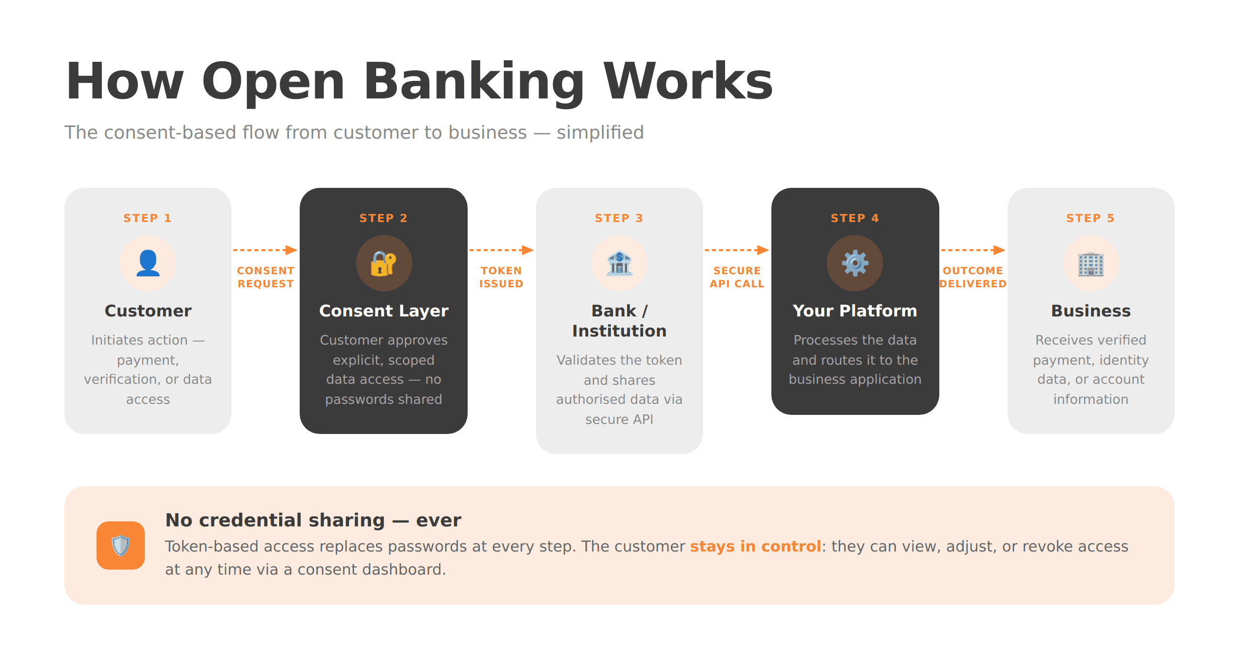
No amount of well-written copy will explain a three-party API flow as efficiently as a clear diagram. Fintech API website design that relies entirely on text is leaving comprehension on the table.
A simple visual showing the relationship between the end user, their bank, your platform, and the consent layer can eliminate a paragraph of copy and reduce buyer anxiety in seconds. The flow does not need to be technically exhaustive — it needs to be conceptually accurate and immediately understandable.
Open banking standards frame the product around five pillars: identity verification, information sharing, payment initiation, security, and analytics. Your website should translate those pillars into a single product story. Show what happens when a user consents. Show where the data goes. Show what the business receives at the end of the flow.
Explaining how open banking APIs work on a website is not about simplifying the technology. It is about making the technology’s value self-evident to a non-engineer in under 30 seconds.
Step 4. Make Security and Consent a Main Navigation Item
Security is not just a legal obligation to satisfy — it is a commercial differentiator to communicate. Buyers evaluating whether to integrate a third-party financial data platform are, by definition, anxious about security. If your security page is buried in the footer or folded into a generic “Trust” page, that anxiety will go unresolved.
Security and consent should sit in your main navigation. The page itself should cover:
How customer consent is obtained, stored, and managed
What data is accessed, and for how long
How strong customer authentication (SCA) works
How authorisation and token-based access replace credential sharing
Encryption standards and infrastructure security
Regulated or accredited status (FCA, CFPB, relevant national authority)
How users revoke or adjust access via a consent dashboard
FAQs addressing questions such as “Can you see my password?” and “Who has access to my data?”
API-based open banking access is more secure than screen scraping because it removes credential sharing in favour of token-based flows. But that fact is worthless unless your website says it clearly, in the buyer’s language. A dedicated consent dashboard page is one of the highest-trust assets you can build.
Step 5. Build Use-Case Pages Around Outcomes, Not Features
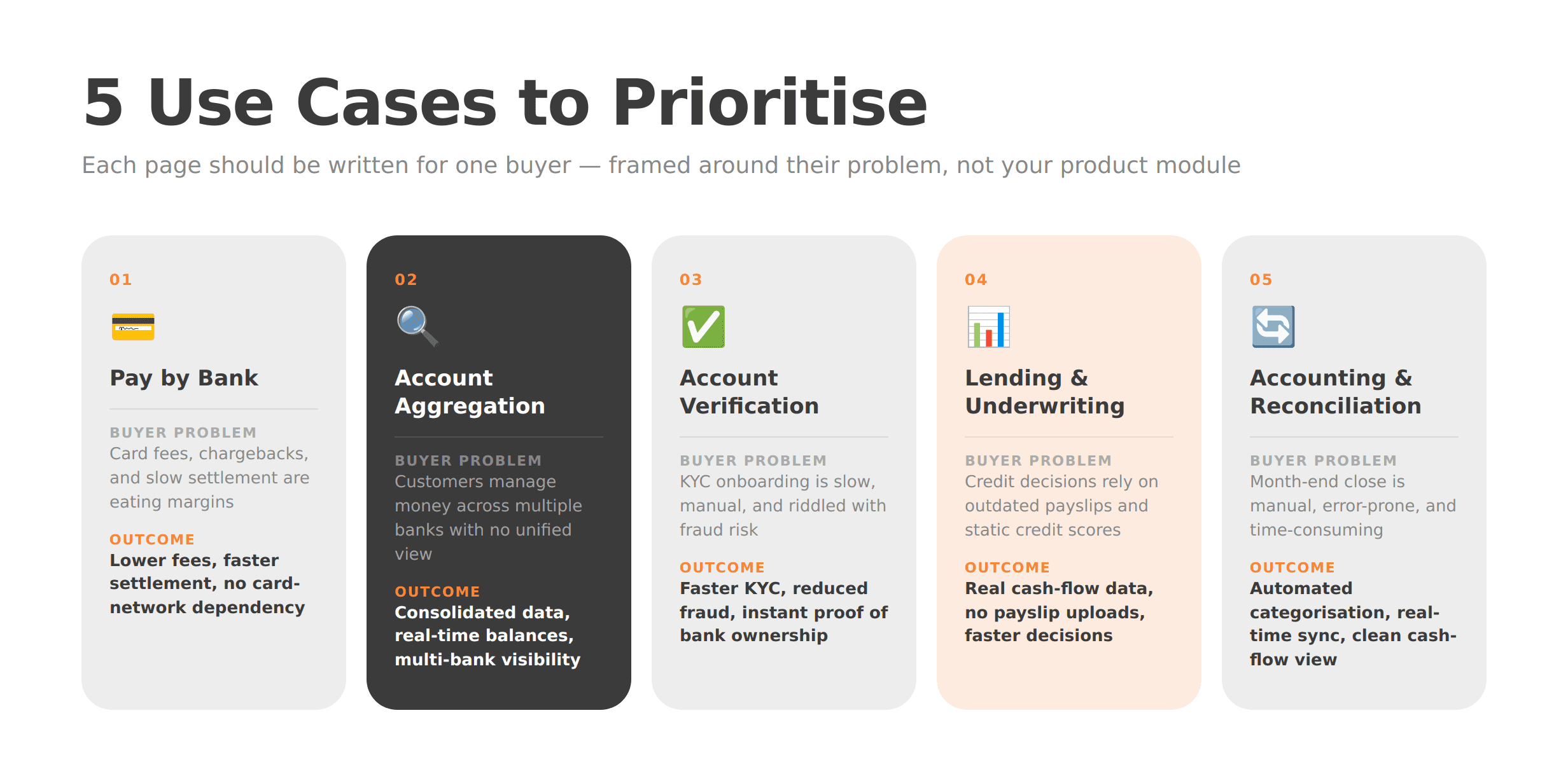
“Account information” and “payment initiation” are regulatory categories. They are not buyer motivations. Open banking use cases land better when they are framed around the problem the buyer is trying to solve.
Recommended solution pages, each built around a buyer outcome:
Pay by bank / account-to-account payments — lower fees, faster settlement, no card-network dependency
Account aggregation / financial visibility — consolidated data, real-time balances, multi-bank visibility
Onboarding / account verification / proof of bank ownership — faster KYC, reduced fraud, instant verification
Lending / underwriting / proof of income — real cash-flow data, no payslip uploads, faster decisions
Accounting / reconciliation / cash-flow management — automated transaction categorisation, real-time sync
Each page should follow a repeatable structure: the problem the buyer faces, the workflow your platform enables, the business benefit, a proof point such as a case study, logo, or compliance reference, and a clear CTA. Every page should feel like it was written for one specific buyer — because it was.
Step 6. Separate Marketing Pages From Developer Documentation
The single most common structural failure on API-first fintech websites is merging sales copy with implementation detail. The result satisfies neither audience.
Your marketing site should sell clarity, trust, and commercial value. It answers, “Why should we use this?” Developer documentation — covering auth flows, OAuth scopes, sandbox environments, sample API requests, webhooks, SDKs, changelogs, rate limits, and status pages — should live in a separate portal that answers, “How do we build with this?”
The two must be closely connected. A prominent “Developers” link in the main navigation, a docs CTA on the product overview page, and a status or uptime reference in the footer are all signals that you take technical evaluation seriously. But merging the two experiences creates a site that feels too technical for buyers and too vague for engineers.
For open banking specifically, the docs portal should be treated as a product in its own right — versioned, searchable, and maintained with the same rigour as the API itself.
Step 7. Design Trust Signals for a High-Sensitivity Category
Open banking involves customer financial data. That means the trust signals fintech buyers look for are not the same as those on a generic SaaS site. “Loved by 10,000 users” does not cut it. Procurement teams and compliance reviewers want evidence of regulated status, security rigour, and institutional credibility.
Trust elements that belong in the site structure, not just on the homepage:
Clear explanation of regulatory authorisation and market coverage
Supported banks, institutions, or ecosystem partners, with logos where possible
Security certifications or compliance framework references
Visible privacy policy and legal documentation links
Customer case studies or enterprise logos
Uptime status and support SLA references
A concise FAQ answering “Is this safe?” and “How does consent work?” in plain English
Trust in open banking web design is structural, not decorative. It is not a badge in the footer. It is the architecture of every page that handles a sensitive question.
WSA’s own positioning emphasises trust-centred UX, compliance-aware structure, and conversion-ready fintech websites — the right frame for any team building in this category. See the WSA portfolio for examples of how that translates in practice.
Step 8. Write for SEO, GEO, and AI Overviews From Day One
Search behaviour around open banking is increasingly shaped by AI-generated overviews and generative search results. That means your website needs to answer direct questions in clear, extractable language, not just rank for keywords.
Practical steps:
Add a glossary defining terms like API (Application Programming Interface), TPP (Third-Party Provider), AISP, PISP, SCA (Strong Customer Authentication), consent, pay by bank, and account aggregation
Include FAQ blocks on key pages, especially structure, security, and use cases, phrased the way real buyers search
Use entity-rich language naturally: PSD2, FCA, CFPB Section 1033, payment initiation, account information services, consent management
Build internal links from the homepage to product, use-case, security, blog, and docs pages
Structure every H2 as a direct answer to a buyer question
Knowing how to structure an open banking website for SEO and GEO is not a separate project from designing it well — it is the same project. Every section that answers a clear question is both a trust signal for buyers and a rankable asset for search.
Common Mistakes on Open Banking Websites
Even well-funded open banking platforms make these errors:
Leading with jargon instead of value — stuffing the hero with acronyms before the buyer knows what the product does
Hiding security and consent explanations — burying them in legal pages rather than featuring them prominently
Mixing docs and sales pages — creating a site that satisfies neither engineers nor commercial buyers
Organising navigation around internal team names — labels like “Core Infrastructure” or “Data Layer” that mean nothing externally
Using abstract fintech visuals with no product flow — animations that look impressive but explain nothing
Failing to clarify region, regulator, or coverage — leaving international buyers unsure whether the platform is relevant to them
Publishing generic copy that could describe any API company — no specificity, no differentiation, no memorability
Pre-Launch Checklist for an Open Banking Website
Before the site goes live, confirm the following:
Homepage message understood by a non-technical reviewer without explanation
Product / API overview page complete and outcome-led
Security and consent page reviewed by product and compliance teams
Docs, support, and status links connected and functional
Use-case pages mapped to ICP segments
Glossary and FAQ sections published
CTAs for sales, demos, and developers tested across devices
Analytics and conversion tracking configured
Mobile performance and Core Web Vitals checked
SEO basics, metadata, and internal links in place
Next Steps: Why Fintech-Specialised Website Partners Add Value
Complex API products need website partners who understand both the technology and the trust barriers buyers bring to the table. A generalist agency can build a fintech-looking website. A specialist can build one that actually converts the buyers your sales team is trying to reach.
WSA works with open banking platforms, embedded finance companies, and API-first fintechs to design websites that explain clearly, rank well, and support enterprise sales conversations from first click to signed contract. That means fintech-specific copywriting, SEO- and GEO-ready content architecture, compliance-aware design, and conversion structure built for high-trust categories — not adapted from a SaaS template.
If your current website is either too vague for serious evaluators or too technical for decision-makers, that is the problem worth solving first.
Book a free discovery call to talk through your website goals and what a redesign or new build could look like for your platform.
FAQ
What is the best structure for an open banking website?
A strong open banking website needs a homepage, a product and API overview, use-case pages, a security and compliance page, developer documentation, an integrations or coverage page, a company and trust section, a resource hub, and a contact or demo CTA. The essential design principle is to keep business explanations and implementation details separate while making both easy to reach from any page.
How do you explain open banking APIs on a website without too much jargon?
Start with the outcome, not the acronym. Explain what the API enables, who uses it, and how customer consent works before you introduce technical terminology. Support that with a simple three-step diagram showing the user, the bank, the platform, and the consent flow. Then provide a clear, visible path to documentation for technical evaluators who need more detail.
What should an open banking security page include?
It should cover consent — how it works, what it covers, and how long it lasts — alongside strong customer authentication (SCA), authorisation flows, token-based access, encryption standards, regulated provider status, and how users manage or revoke access via a consent dashboard. The goal is to leave every visitor feeling informed and in control, not overwhelmed by compliance language.
Should developer documentation live on the main marketing website?
Developer docs for open banking should be closely connected to the main site — accessible in one click from the navigation — but housed in a separate portal. The marketing site builds trust and commercial demand. The docs portal supports technical evaluation and integration. Merging the two creates a confusing experience for both audiences.
Which use cases should an open banking platform website highlight first?
Prioritise the use cases that are closest to commercial value and easiest to understand: pay by bank, onboarding and account verification, lending and proof of income, account aggregation, and accounting and reconciliation. The right order depends on your ICP. Start with the use cases that match your highest-value sales motion and work outward from there.
What makes open banking web design different from general fintech website design?
Open banking websites have to explain consent, data access, and security controls far more explicitly than a typical fintech site. They also serve multiple audiences simultaneously — commercial decision-makers, compliance reviewers, developers, and bank partners — without forcing any of them through the wrong journey. That dual requirement makes site architecture and messaging hierarchy more consequential than in almost any other area of fintech design.
Whether you’re launching something new or improving an existing platform, we’re ready to discuss your goals and explore the best way forward.


