•
•
Neobank Website Design: Homepage, Product Pages, and App Conversion Flow
A neobank website is not just “the site for the app.” It is the first trust checkpoint, the first layer of product education, and often the first conversion step in the onboarding journey. Users arrive with real questions: What is this? Is it safe? Is it for me? What happens next? The website has to answer all of them before the user sees a single in-app screen.
The strongest digital bank websites are built as part of the product funnel, not as a disconnected marketing layer — the same principle behind high-converting landing pages for fintech websites and a broader fintech conversion optimization framework for financial brands.
This guide is for neobank founders, digital-bank product teams, fintech marketers, and teams building a banking startup website who need to explain a complex financial product clearly and turn web traffic into qualified onboarding starts.
Key Takeaways
A strong neobank homepage should communicate the value proposition within seconds and reduce uncertainty before it causes drop-off.
Product pages should do more than list features — they should answer objections, clarify eligibility, and capture search intent a homepage never will.
The app conversion flow starts on the website. The handoff between web and app is where many neobanks quietly lose qualified users.
Trust, compliance, and accessibility should shape the UX from day one, not be bolted on during QA.
The best neobank websites are scalable content systems supported by clear analytics and web-to-app handoff logic that actually works.
What makes neobank website design different from generic fintech website design?
Neobank websites carry a greater trust burden and a greater responsibility to explain the product than most fintech websites because they ask users to move money, share identity data, and adopt a new primary financial interface.
A payments tool or expense-management platform is usually a secondary product layered on top of existing infrastructure. A neobank is asking to become the infrastructure. That changes what the website has to do.
Users assess legitimacy within seconds. They want to know whether the product is regulated, whether their money is protected, and whether the experience is worth the disruption of switching accounts. They are making a trust decision, not just a product decision.
At the same time, a banking startup website often needs to explain multiple products — personal and business, standard and premium — while keeping the homepage coherent. And unlike most SaaS products, the desired action is app-led, not form-led. That means the website and app have to work as a connected system, with the website handling qualification and the app completing onboarding.
These three pillars — homepage, product pages, and conversion flow — are what separate genuinely effective neobank website design from a site that merely looks modern.
Homepage design: what should a neobank homepage include?
The homepage has one job: help the right visitor understand what the product is, who it is for, and why it is credible — fast.
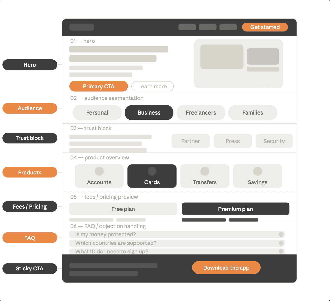
Neobank homepage design most often fails not because it looks bad, but because it is vague. Visitors can feel the brand, but they still cannot answer the question: “Is this for someone like me?” In practice, higher-converting homepages usually follow proven hero section best practices and a clear landing page structure built for fintech conversions.
A well-structured homepage should include:
An above-the-fold value proposition — the headline should name the product category, audience, and core promise. “The business account built for European freelancers” works. “Banking, reimagined” does not.
A primary CTA aligned with the product’s maturity stage — download the app, open an account, join the waitlist, or book a demo. Choose one primary action and make it visible before the scroll.
Visual proof of the product — real UI, real card renders, real app screens. Stock photography does not answer the question, “Does this actually exist?”
Audience segmentation — if the neobank serves personal users, business owners, and freelancers, the homepage should acknowledge that and route each group appropriately.
A trust block — security signals, safeguarding or deposit-protection context, partner logos, and press coverage. Trust signals buried in the footer do not do the job.
Fee or pricing clarity — “low fees” is weaker than a simple starting-from figure or a comparison table. Users who cannot find pricing on your site will look for it on a competitor’s.
FAQ and objection handling — common questions about eligibility, safety, and switching should appear on the homepage, not be buried in a support portal.
A persistent mobile CTA — the primary action should remain easy to reach throughout the scroll, especially on mobile.
The homepage should route users into the right product or onboarding path. Product pages do the detail work.
Product pages: how should a neobank explain each product clearly?
Product pages are where serious evaluation happens — and where most neobank websites underinvest.
Touchpoint | Main role | Key user question | What must be clear | Main failure point |
|---|---|---|---|---|
Homepage | Position the product and build trust | “What is this and is it for me?” | Value proposition, audience, trust signals, CTA | Vague messaging |
Product page | Help the user evaluate a specific offer | “How does this product work for someone like me?” | Benefits, pricing, eligibility, process, FAQs | Lack of specificity |
App store / onboarding entry | Turn intent into install or sign-up | “What happens next and should I continue?” | Message consistency, onboarding expectations, next step | Friction and message mismatch |
Web-to-app handoff | Move users across devices without losing intent | “How do I continue this on my phone?” | QR / link flow, deep link, fallback path | Broken transition |
Users land directly on product pages from organic search, paid campaigns, comparison articles, and press coverage. Each page needs to stand on its own as a complete decision-making surface, not as a fragment that assumes the visitor has already read the homepage.
A typical neobank website should have dedicated pages for personal accounts, business accounts, debit and virtual cards, international transfers and FX, savings and vaults, budgeting features, family or joint accounts, and any credit or lending products where relevant.
For every neobank product page, these modules should be present:
A clear headline tied to audience fit
Core benefits in plain language — what users actually gain, not just a feature inventory
A “How it works” section in three to five steps, from sign-up to active use
Fees, plans, and limits in a scannable format
Eligibility and geographic availability — if this is missing, support load rises
App screenshots or a visual walkthrough
Product-specific FAQs
A CTA matched to device context, with a secondary CTA for lower-intent users
Strong product page design improves both conversion and SEO because it answers intent-specific queries that a generic homepage cannot.
Someone searching for “neobank savings account interest rate” or “business account for non-UK residents” is ready to evaluate options. A well-built product page captures that moment; a vague homepage wastes it.
App conversion flow: how do you move users from website to account opening without losing them?
The app conversion flow is the most important element of neobank website design — and the one many teams handle worst.
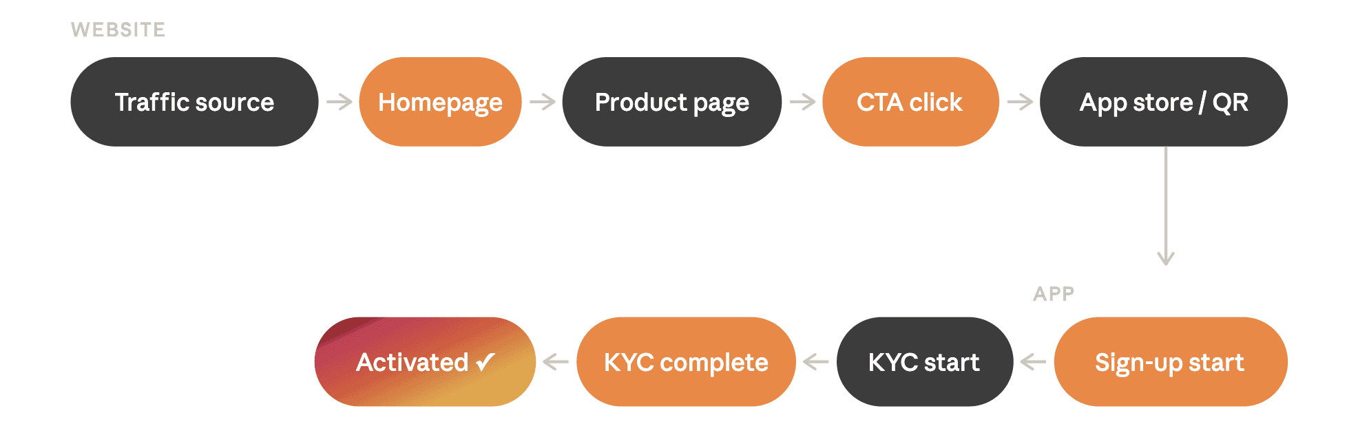
The full journey looks like this: traffic source → homepage or landing page → product page → app store or deep link → sign-up start → KYC start → KYC completion → first funded or activated state. The website owns the early stages, and its decisions shape everything that follows.
Mobile and desktop CTA logic must be different. A mobile user who clicks “Download the app” should reach the relevant App Store or Google Play page in one tap. A desktop user needs a bridge: a QR code, an SMS or email link, or a web-first onboarding route if the product supports it. Sending a desktop user to an app store page on a computer is a dead end that wastes qualified traffic.
App store alignment matters. The App Store or Google Play listing should reflect the same messaging, benefit language, and visual style as the website. When the website promises simplicity but the store listing feels confusing or inconsistent, trust erodes at exactly the wrong moment in the app install funnel.
Pre-qualification reduces KYC drop-off. Product pages should introduce eligibility requirements — ID type, residency, supported countries — before the user hits install. Surprising someone with a hard eligibility wall after download inflates install-to-sign-up drop-off and weakens the onboarding flow before it begins.
Deep linking closes the gap between web and app. Where supported, deep linking can route users who install the app directly into a pre-populated sign-up step, reducing friction and preserving attribution. Tools such as Branch and AppsFlyer support this, and the chain should be configured from the start rather than added as a post-launch retrofit.
Track beyond the CTA click. Many teams measure click volume and stop there. In reality, the funnel includes eight or more trackable events: store page visit, install, first open, sign-up start, KYC start, KYC completion, account activation, and first transaction. GA4 and GTM should capture the web-side events; app analytics should handle the rest. In practice, this is where a more structured fintech CRO framework becomes much more useful than simple click tracking.
For payment- and wallet-related flows, strong customer authentication (SCA) under PSD2 may apply to actions such as adding a payment card to a digital wallet or initiating electronic payments. The UX should not promise “one-tap” or “instant” setup when regulated verification is still required. Setting accurate expectations on the website reduces support volume during onboarding.
Compliance, accessibility, and trust signals: what must be built in from day one?
In digital banking, trust is designed through clarity. Compliance and accessibility are not add-ons; they are part of the user experience.
Every digital bank website should include transparent pricing, clear eligibility and regional availability, properly linked legal and compliance pages, plain-language disclosures around limits and rates, and accessible design that meets real standards rather than aspirational ones. At a minimum, users should be able to find privacy information, terms, AML/KYC notices, and the complaints process without effort.
For EU-facing products, accessibility is not a best-practice extra; it is a legal and operational consideration. The European Accessibility Act covers services including banking and applies from 28 June 2025, while DORA has applied to financial entities since 17 January 2025, reinforcing expectations around digital-service resilience and incident communication. Together, they make accessibility and resilience messaging part of core UX rather than post-launch compliance theatre.
What platform and CMS setup work best for a neobank website?
A neobank website should be built as a flexible, CMS-driven system — not as a static marketing page. The site will evolve with new products, regions, plans, and legal requirements, and the platform choice determines how costly that evolution becomes.
For many teams, Framer for financial brands or a more content-heavy setup explored in this best CMS for fintech websites guide can be a strong fit when the main need is a high-performance marketing and product-education site.
Custom development makes sense when the site needs to support web-first onboarding, complex localisation, dynamic pricing, or tight integration with app and backend systems. These are the kinds of cases where web development for financial brands matters more than a generic design-only approach.
Hybrid setups — a Framer or Webflow front end for marketing and product pages paired with a custom onboarding flow — are increasingly common and are often the right choice for early-growth neobanks.
The decision ultimately comes down to update frequency, product-page depth, localisation requirements, and how tightly the site needs to connect to app and onboarding systems. For teams weighing launch speed against long-term flexibility, custom fintech website vs template is often a more useful framing than “builder vs custom” alone.
Neobank website examples: what should you study and why?
When studying neobank website examples, focus on pattern recognition rather than aesthetic inspiration.
Evaluate each site on homepage clarity, product-page specificity, trust architecture, pricing transparency, desktop-to-mobile handoff quality, CTA-to-intent fit, and consistency between what the website promises and what the app and store listing actually deliver.
Brands such as Revolut, Nubank, and Monzo are useful reference points not because they are perfect, but because they have iterated at scale. Their product-page structures and conversion flows reflect real operational learning. Study the patterns — especially how each site answers “Is this right for me?” — rather than copying the visual style.
Common mistakes in neobank website design
Treating the website as branding only, rather than as part of the acquisition funnel
Sending all traffic to a generic homepage instead of relevant product pages or targeted landing pages
Writing product pages without pricing, eligibility, or process detail
Using the same CTA logic for desktop and mobile users
Hiding trust signals in the footer instead of placing them where uncertainty is highest
Forcing app download before the user has enough information to make a decision
Ignoring accessibility until launch week
Failing to track the funnel beyond the CTA click, which turns conversion optimisation into guesswork
Assuming a strong app can compensate for a weak website — it cannot
Pre-launch checklist for a banking startup website
Homepage messaging is audience-specific and clear within five seconds
Product pages exist for every major offer
Fees, limits, and eligibility are visible without contacting support
Legal and compliance pages are complete and correctly linked
CTA paths are tested on both mobile and desktop
QR code, SMS, and email handoff flows work end to end
App Store and Google Play pages align with website messaging
GA4, GTM, and event tracking are configured and verified
Accessibility review is complete
Regional content and localisation are checked
Support pathways and fallback flows are visible
Load speed and Core Web Vitals are within target range, especially on the homepage, product pages, and install-entry points.
Scale traffic only once this list is complete.
Next steps: why fintech-specialised partners deliver better results
Generalist agencies can make a fintech site look modern. Neobank website design demands more: an understanding of how financial-product messaging builds trust, how product pages should be structured for both conversion and SEO, how compliance-sensitive content needs to be handled, and how the web-to-app handoff should be instrumented.
Before any design or development work begins, it is worth clarifying:
the primary conversion event
the traffic split by device
whether onboarding starts on the web or in the app
which product pages are highest priority
how content, analytics, and legal inputs will be aligned during the build
To discuss your neobank website goals with a specialist team, book a free discovery call.
FAQ
How do you build a neobank website?
Start with three priorities: a clear homepage, strong product pages, and a smooth website-to-app conversion path. Define the primary conversion goal first, structure pages around real user intent, connect analytics early, and build the site as a scalable CMS rather than a static launch page. For early-stage teams, the broader structure logic is similar to what WSA outlines in its guide to a website for a fintech startup, but neobanks need tighter trust architecture and a better web-to-app handoff.
What pages should a neobank website include?
At a minimum: a homepage, individual product pages for each major offer, a pricing or fees page, a security or trust page, legal and compliance pages, and a clear onboarding or app-download path. If the product serves distinct audiences — personal, business, freelancers, families — separate pages for each segment are usually worth building.
Should users sign up on the website or in the app?
That depends on the product and the device context. Most neobanks convert best when the website educates and qualifies users and the app handles sign-up, but desktop users still need a bridge such as a QR code, email link, or web-first start. The right answer depends on how the onboarding system is built.
How do you design product pages for a digital bank?
A strong product page explains who the product is for, what it does, how it works, what it costs, what the eligibility requirements are, and what the next step is. It should function as a decision page rather than a feature inventory — converting qualified users while allowing unqualified users to self-select out before they reach install.
Can you create a bank website with Webflow or Framer?
Yes, in many cases. Both platforms are well suited to a banking startup website when the goal is a high-performance marketing and product-education site. The key is to treat them as part of a broader system that covers CMS, analytics, legal content, and app integration properly. WSA’s pieces on Framer for financial brands and the best CMS for fintech websites are good starting points.
Whether you’re launching something new or improving an existing platform, we’re ready to discuss your goals and explore the best way forward.


