•
•

The Fintech Landing Page Blueprint: Trust, Compliance & More Funded Accounts
Fintech traffic is expensive. A click from a paid campaign targeting traders, investors, or funded-account seekers can run anywhere from $8 to $80+—and too often it lands on a page that loses the visitor in under 10 seconds.
The problem is rarely the headline font or the hero image. It’s a trust gap. In financial services, users are being asked to share personal data, pass KYC, make a deposit, or buy a challenge. They make a judgment call in seconds:
Is this real? Is this safe? Do I qualify? What am I actually signing up for?
This blueprint treats compliance and trust not as legal overhead, but as the core conversion infrastructure of any financial services landing page. Follow the steps below to build a fintech landing page that earns confidence quickly, communicates constraints clearly, and moves more users to your one defined action.
Key Takeaways
Trust signals must appear before you ask for personal data, payment, or commitment.
Compliance improves conversion when it clarifies risk, eligibility, and product rules—not when it buries users in boilerplate.
More funded accounts come from clearer rules, less friction, and better measurement—not more animations.
Every fintech landing page should be built around one conversion event, with a clean analytics plan behind it.
Prop firm and CFD landing pages often require additional disclosures—treat these as structural page elements, not legal footnotes.
What “Funded Accounts” Means (and Why It Changes the Page)
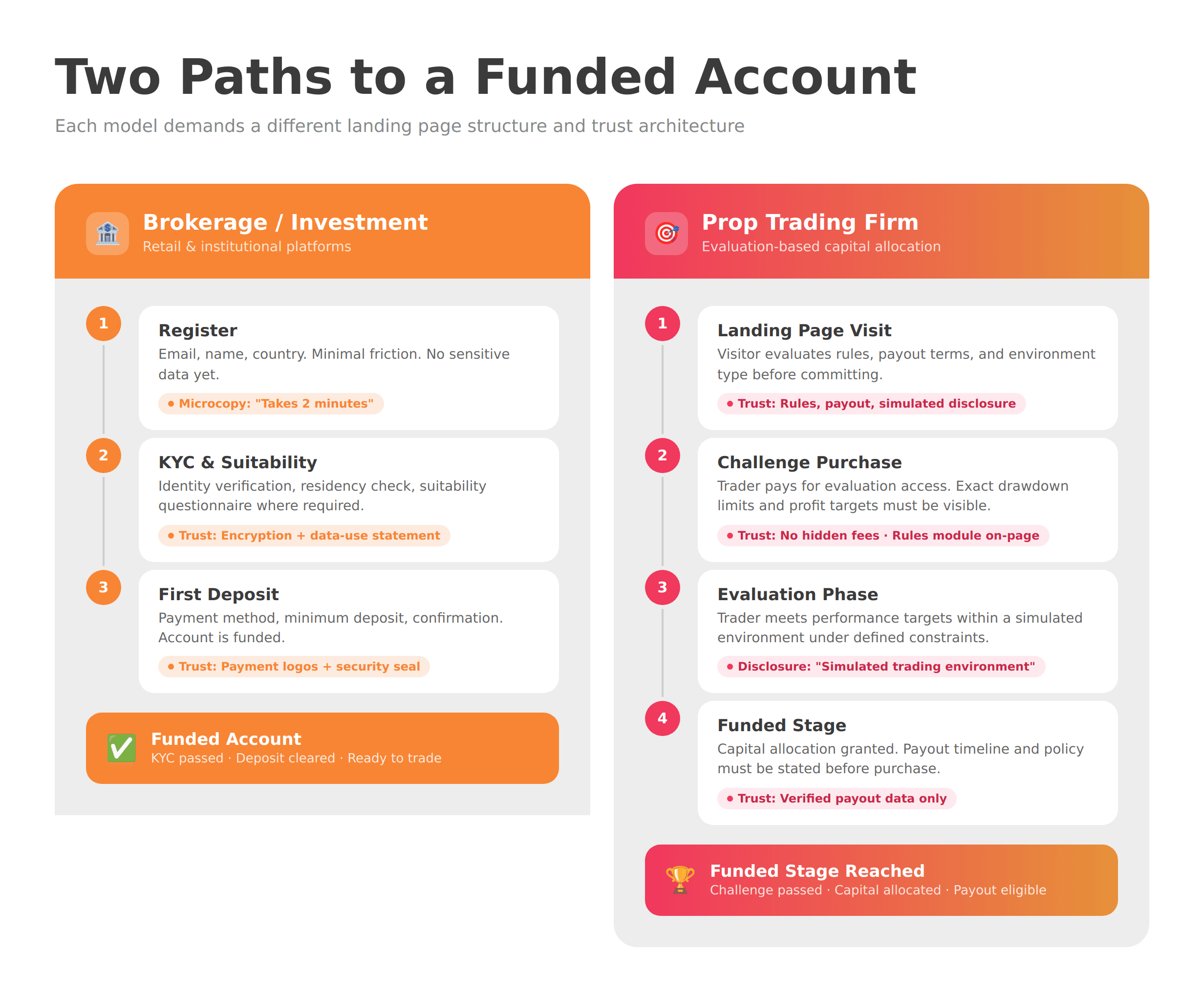
“Funded account” means different things depending on your business model—and each definition demands a different page structure.
In most brokerages, payments, and investment platforms, a “funded account” simply means a user has completed KYC, passed suitability checks where required, and made their first deposit. The conversion path is:
Register → Verify → Deposit
In the prop trading space, “funded” refers to a trader who has purchased an evaluation challenge, passed defined performance metrics, and been granted access to a simulated or live capital allocation. The conversion path is:
Landing page → Challenge purchase → Evaluation → Funded stage
Prop firm pages carry a heavier trust burden. Visitors want to know: What are the exact rules? What happens if I pass? Is the environment simulated or live? When and how do payouts happen? Can the rules change after I buy?
Leaving any of these unanswered doesn’t protect you—it costs you signups and increases refund disputes. Addressing them directly, clearly, and prominently is both a compliance move and a conversion move.
Step 1 — Pick One Conversion Goal and Design Around It
The single biggest structural mistake on fintech landing pages is trying to accomplish too many things at once.
Before writing a word or placing a block, define your one conversion event:
Book a discovery call
Start KYC / create an account
Make a first deposit
Buy a prop challenge
Download a guide (lead gen)
Multiple CTAs don’t create options—they create doubt. A visitor who sees “Get Started,” “Learn More,” “Book a Demo,” and “Download Our Guide” on the same screen doesn’t feel empowered. They feel uncertain about what kind of business this is.
Fintech landing page optimization starts here: one goal, one primary action, one path. Every section on the page should serve or support that single outcome.
Step 2 — Above the Fold: Answer “Is This Legit?” in 5 Seconds
Your hero section must pass a 5-second trust test before anything else can work.
The fintech landing page design principle is simple: before a user reads your feature list or testimonials, they’re scanning for signals that this is a real, credible, and relevant product. Your above-the-fold layout should answer four implicit questions immediately:
What is this? — A one-line value proposition in plain language (no jargon, no vague promises)
Is this for me? — Qualifying language that filters the right user in and the wrong user out
What do I do next? — A single, visible primary CTA
Can I trust this enough to take that step? — 1–2 credibility anchors near the CTA
Those credibility anchors might include your regulated entity name, a recognizable security/payment credential, a verifiable proof metric (e.g., “$X paid out to traders,” only if accurate and sourced), or a short social-proof statement.
Add microcopy near your form or CTA button: “Takes 2 minutes,” “We don’t sell your data,” or “Cancel anytime.” These small statements do measurable work in high-skepticism contexts.
Step 3 — The Trust Stack: What to Show (and Where)
Trust isn’t a single testimonial section—it’s a layered architecture distributed across the whole page.
Break your trust signals into four categories and place them deliberately:
Trust Layer | Examples | Placement |
|---|---|---|
Proof | Verified payouts, client logos (with permission), case study stats, review scores | Mid-page, near CTAs |
Transparency | Fees, spreads, rules, eligibility criteria, timelines | Near pricing/product sections |
Security | Encryption statements, payment provider logos, privacy policy links | Near forms and in the footer |
Legitimacy | Entity name, jurisdiction, licensing status (only if accurate), regulatory body | Header, footer, and near CTAs |
For prop firms specifically: disclose clearly whether the trading environment is simulated. This isn’t just a compliance measure—it can reduce post-purchase disputes, chargebacks, and negative reviews from traders who felt misled. A short, plain-language statement in the product section (e.g., “Evaluations are conducted in a simulated trading environment.”) often builds more trust than it costs.
Check the WSA fintech website trust checklist for a full breakdown of trust signals by page section.
Not sure which option fits your business?
From startup brokerages to established platforms, WSA delivers websites that convert traders, satisfy regulators, and scale across markets.
Step 4 — Compliance by Design (Not Compliance in the Footer)
Compliance isn’t a box to check—it’s a structural property of the page that affects where content lives and how it’s written.
This section is not legal advice. Always involve your compliance team or legal counsel when creating financial promotions. That said, here are the structural patterns that matter most for regulated fintech teams.
Clear, fair, not misleading. Financial promotions in most major jurisdictions must meet this standard. In the UK, the FCA’s financial promotions guidance sets out the framework. A landing page that omits key risks, overstates performance, or buries eligibility restrictions behind multiple clicks is unlikely to meet this bar.
Risk warnings: relevant, not reflexive. The FCA has published guidance on risk warnings for mainstream investments, addressing common misconceptions in the industry. Key takeaway: a warning should communicate the relevant risks for that product to that audience—not just satisfy a template. Generic boilerplate that doesn’t match your product can harm conversion without improving compliance.
High-risk investment promotions. Under FCA PS22/10, certain higher-risk products face stricter promotion requirements, including prominent risk warnings and additional “friction” in the consumer journey (for example, cooling-off periods where required). If your product falls under these rules, your landing page architecture needs to reflect it.
CFD promotions. If you’re promoting contracts for difference (CFDs), standardized risk warning patterns—including the percentage of retail client accounts that lose money—are a documented feature of compliance in both the EU (ESMA) and UK (FCA) contexts. This figure must be accurate, current, and prominently placed.
Jurisdiction gating. “Not available to residents of [X]” must be present—and ideally enforced technically (geo-IP gating or a country selector at form entry)—where your product is restricted.
Internal compliance workflow. Build a versioned copy approval process: draft → legal/compliance review → approved version archived with date. This is standard practice for broker website compliance and essential if regulators ever ask what was live and when.
Step 5 — The Fintech Landing Page Section Blueprint (Block-by-Block)
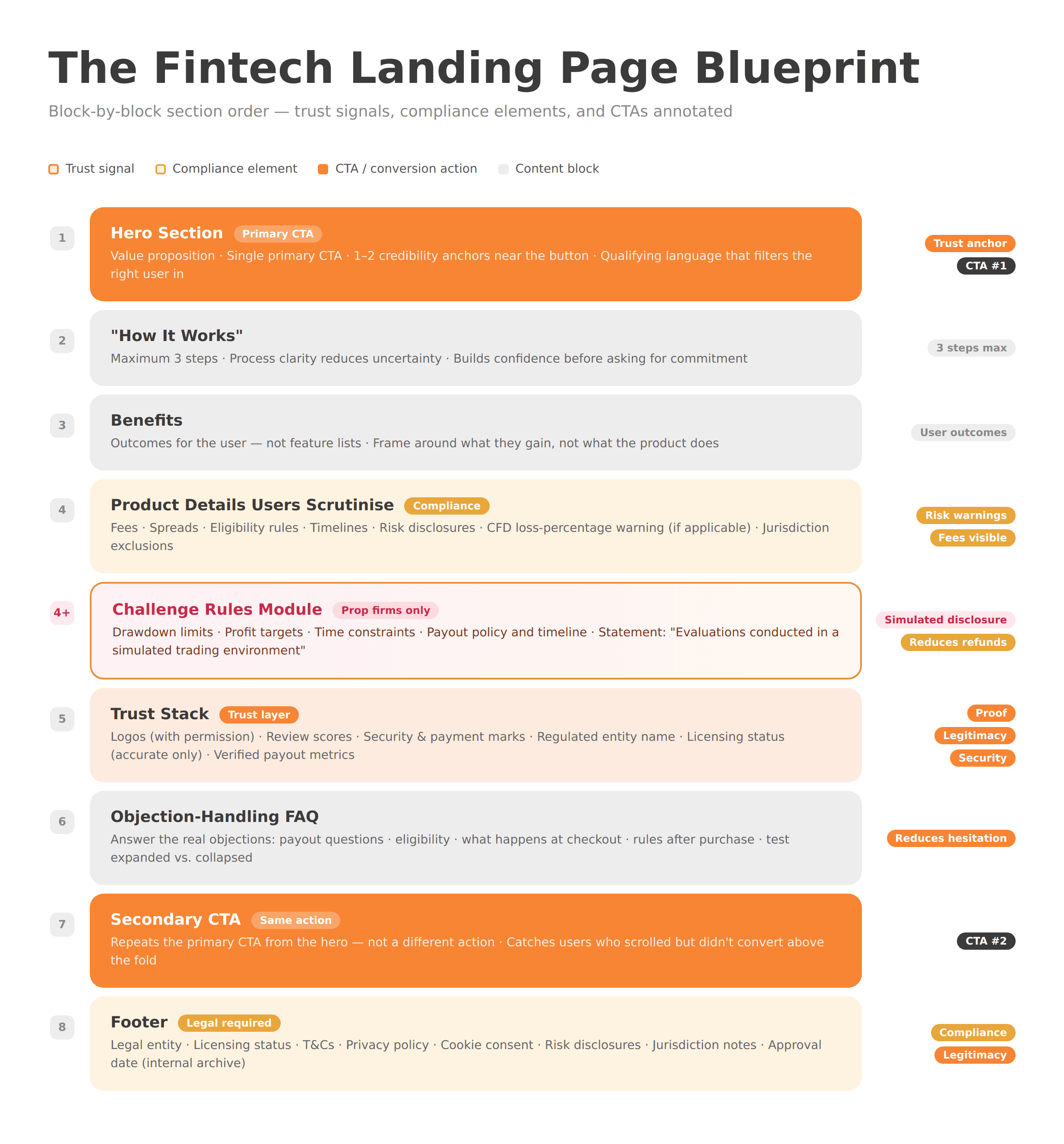
A high-performing fintech landing page follows a logical trust-and-clarity sequence—not a generic marketing template.
Recommended block order for most fintech landing pages:
Hero — Value prop + single CTA + 1–2 credibility anchors
“How it works” — 3 steps maximum; process clarity builds confidence
Benefits — Outcomes for the user, not feature lists
Product details users will scrutinize — Fees, rules, timelines, eligibility
Trust stack — Logos, reviews, security/payment marks, licensing info
Objection-handling FAQ — Address the real objections (see FAQ section below)
Secondary CTA — Same action as above the fold, not a different one
Footer — Legal entity, licensing, T&Cs, privacy policy, risk disclosures, jurisdiction notes
Prop firm variant: Add a dedicated “Challenge Rules” module between blocks 4 and 5. Include drawdown limits, profit targets, time constraints, payout policy and timeline, and a clear statement on the simulated trading environment. This module can reduce refund disputes and improve the quality of leads who buy—because they know exactly what they’re buying.
Step 6 — Remove Friction from the Funding Path (Forms, KYC, Payments)
The funding path is where most drop-off happens—and most of it is self-inflicted through bad form design.
For KYC onboarding landing pages, the principle is progressive disclosure: ask only what you need at this stage to complete this step. Don’t ask for tax residency on the first form if you only need an email to get someone started.
Key tactics:
Multi-step forms often outperform long single forms in fintech—each step feels like progress, not a burden.
Trust microcopy next to sensitive fields: “Your ID is encrypted and used only for identity verification.”
Mobile-first form UX: A large share of prop challenge buyers and first-time traders convert on mobile. Test on real devices.
Post-submit clarity: Tell users exactly what happens next. “You’ll receive a verification email within 2 minutes. Here’s what to expect during KYC.” Silence after submission creates anxiety and support tickets.
Step 7 — Measurement & Performance: Making CRO Possible
You can’t optimize what you can’t measure. Most fintech teams under-track or mis-track their landing pages.
For fintech conversion rate optimization (CRO), your minimum viable tracking stack should include:
GA4 + GTM: Tag CTA clicks, form starts, form submits, and purchases as discrete events. Don’t rely on pageview data alone.
Consent management: In the UK and EU, tracking must respect user consent. A non-compliant cookie setup can harm data quality and create regulatory exposure.
Heatmaps / session recordings: Tools like Hotjar or Microsoft Clarity reveal where users hesitate. Be cautious about PII capture—configure appropriately.
A/B testing: Tools like VWO or Optimizely let you test changes properly. Any test involving compliance-sensitive copy should go through the same approval workflow as production content.
GA4 + GTM tracking isn’t optional infrastructure—it’s the feedback loop that tells you whether your blueprint is working.
Step 8 — A/B Tests That Actually Move Funded Accounts
Run tests that challenge assumptions—not just cosmetic variables.
High-impact test ideas for financial services landing pages:
Headline clarity vs. clever/emotional framing
Proof metric placement: near CTA vs. mid-page
“How it works” above benefits vs. below
Challenge rules module: near pricing vs. separate page
FAQ expanded by default vs. collapsed accordion
FAQ ordering: lead with payout questions vs. eligibility questions
CTA language: “Start your evaluation” vs. “Get funded” vs. “Buy a challenge”
Risk warning placement: inline vs. sticky footer vs. below CTA
One-column vs. two-column form layout
Social proof format: star ratings vs. named case studies vs. payout screenshots
Hero with entity/license info visible vs. hero without
Jurisdiction gate at entry vs. at checkout
Document every test with a hypothesis, a sample-size target, and compliance review before launch.
Common Mistakes Fintech Teams Make on Landing Pages
Overpromising: Phrases like “guaranteed returns,” “best in class,” or “risk-free” aren’t just bad conversion copy—they may be misleading financial promotions.
Hiding fees and rules: Discovering a platform fee or a drawdown rule at checkout destroys trust and drives refunds.
Multiple competing CTAs: Users don’t know what to do next.
Trust signals buried in the footer: Legitimacy cues work only where users are making decisions—not 1,500px below the fold.
Generic risk warnings that don’t match the product: A boilerplate CFD warning on a prop firm challenge page confuses users and doesn’t address the actual risk profile.
No measurement plan: Launching without proper event tracking means you can’t iterate. You’re guessing.
Templates vs. Custom Fintech Landing Pages
The right build approach depends on your growth stage—and what your compliance requirements demand.
Webflow and Framer templates can be legitimate starting points for early testing, pre-launch validation, or lean teams without complex integrations. Both platforms offer design flexibility, strong performance baselines, and manageable CMS options.
Custom builds become necessary when:
Your compliance workflow requires version-controlled, auditable copy
You’re running multi-region pages with jurisdiction-specific content and gating logic
KYC or payment integrations require custom form architecture
Your brand, funnel complexity, or regulatory environment has outgrown template constraints
A good agency partner will tell you which approach you actually need—not just which one generates more work. See when a fintech landing page matters more than a full website for a breakdown of when to start with a landing page versus a full build.
Pre-Launch Checklist: Trust + Compliance + Conversion QA
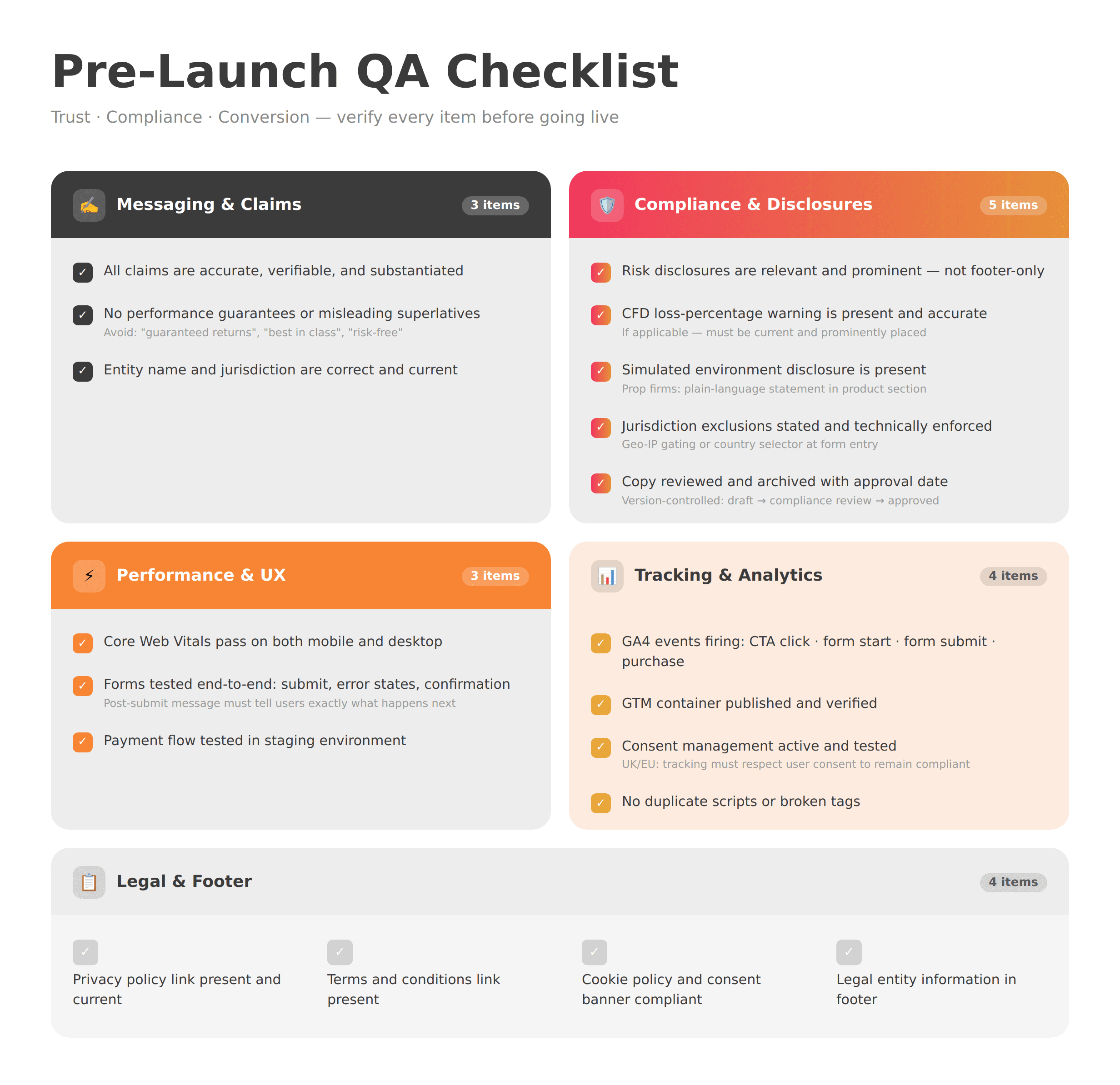
Before going live, verify every item on this list:
Messaging & Claims
All claims are accurate, verifiable, and substantiated
No performance guarantees or misleading superlatives
Entity name and jurisdiction are correct and current
Compliance & Disclosures
Risk disclosures are relevant to the product and prominent (not footer-only)
CFD loss-percentage warning is present and accurate (if applicable)
Simulated environment disclosure is present (prop firms)
Jurisdiction exclusions are stated and, where possible, technically enforced
Copy has been reviewed and archived with an approval date
Performance & UX
Core Web Vitals pass on mobile and desktop
Forms tested end-to-end (submit, error states, confirmation)
Payment flow tested in staging
Tracking
GA4 events firing correctly (CTA click, form start, form submit, purchase)
GTM container published and verified
Consent management active and tested
No duplicate scripts or broken tags
Legal & Footer
Privacy policy link present and current
Terms and conditions link present
Cookie policy and consent banner compliant
Legal entity information in footer
FAQ
What is a fintech landing page?
A fintech landing page is a single, focused page designed to convert a specific segment of financial services users—such as traders, investors, or funded account applicants—toward one defined action: registering, depositing, purchasing a challenge, or booking a demo. Unlike a full website, it removes navigation distractions and directs attention to one outcome.
What trust signals should a fintech landing page include?
Effective trust signals in fintech fall into four layers: proof (verified metrics, case studies, client logos with permission), transparency (fees, rules, timelines, eligibility), security (encryption statements, payment credentials, policy links), and legitimacy (regulated entity name, licensing status, jurisdiction). They should appear throughout the page—not only in the footer.
How do you keep a fintech landing page compliant and still high-converting?
Treat compliance as a clarity tool, not an afterthought. The FCA’s guidance on risk warnings for mainstream investments emphasizes that warnings should reflect the relevant risks for that product—not generic boilerplate. Risk communication that’s specific, clear, and well placed reduces user anxiety and improves decision quality. Work with your compliance team to make disclosures informative rather than defensive.
Where should risk warnings and disclaimers go on a fintech landing page?
For most regulated products, risk disclosures should appear near CTAs, near pricing sections, and in a persistent footer—not only buried in terms and conditions. For CFDs, the standardized loss-percentage warning should be prominent. For high-risk investment promotions under FCA PS22/10, specific placement and prominence rules may apply. Confirm requirements with your compliance team.
How do prop firms increase funded account signups from a landing page?
The biggest levers are: (1) rules clarity—publish exact drawdown limits, profit targets, and challenge conditions on the landing page; (2) payout transparency—use verified figures or clear timelines, not vague claims; (3) simulated environment disclosure—state clearly whether the environment is simulated or live; and (4) an objection-handling FAQ that answers the questions causing hesitation.
What platform is best for a fintech landing page: Webflow, Framer, or custom?
Webflow and Framer are strong choices for early-stage or lean builds: they offer design flexibility, solid performance, and fast iteration without heavy engineering overhead. Custom development is better for regulated environments requiring version-controlled compliance copy, complex KYC integrations, multi-jurisdiction logic, or advanced funnel requirements. The best platform is the one your compliance and product workflows can operate within consistently.
How long does it take to build a fintech landing page?
A simple, single-purpose landing page with no integrations typically takes 2–4 weeks from brief to launch. More complex pages—those requiring KYC integration, compliance review cycles, multi-region variants, or custom payment flows—commonly take 6–10 weeks. The biggest variables are content readiness, compliance review turnaround, and integration complexity.
Next Steps
A fintech landing page that converts isn’t just a design deliverable—it’s a compliance-aware, measurement-backed system that earns trust in seconds and removes friction at every step toward funding.
If you’re building or rebuilding a landing page for a brokerage, prop firm, exchange, or financial services product, WSA works exclusively in this space. We understand the trust architecture, compliance constraints, and conversion patterns that work in regulated environments.
Browse our projects to see how we build for fintech—or book a discovery call to talk through your specific conversion challenge.
Whether you’re launching something new or improving an existing platform, we’re ready to discuss your goals and explore the best way forward.


