•
•

Fintech Pricing Page Best Practices for High-Trust Products
Your product page looks great. Your onboarding flow is solid. But your pricing page is where the deal actually happens. For fintech companies, that moment carries more weight than in any other industry. Users aren't just choosing a plan. They're deciding whether to hand over banking credentials, payment data, or access to their company's financial infrastructure.
A generic fintech pricing page that just lists features and monthly fees won't close that gap. The design choices you make — how you show fees, where you place compliance badges, what your CTA says — determine whether a prospect converts or exits. Financial services pages achieve a median conversion rate of 8.4%, the highest of any industry. The companies hitting that ceiling share the same structural decisions on their pricing pages.
This guide breaks down exactly what those decisions are.
Key Takeaways
A fintech pricing page must establish trust before it can convert. Compliance signals and fee transparency are prerequisites, not afterthoughts.
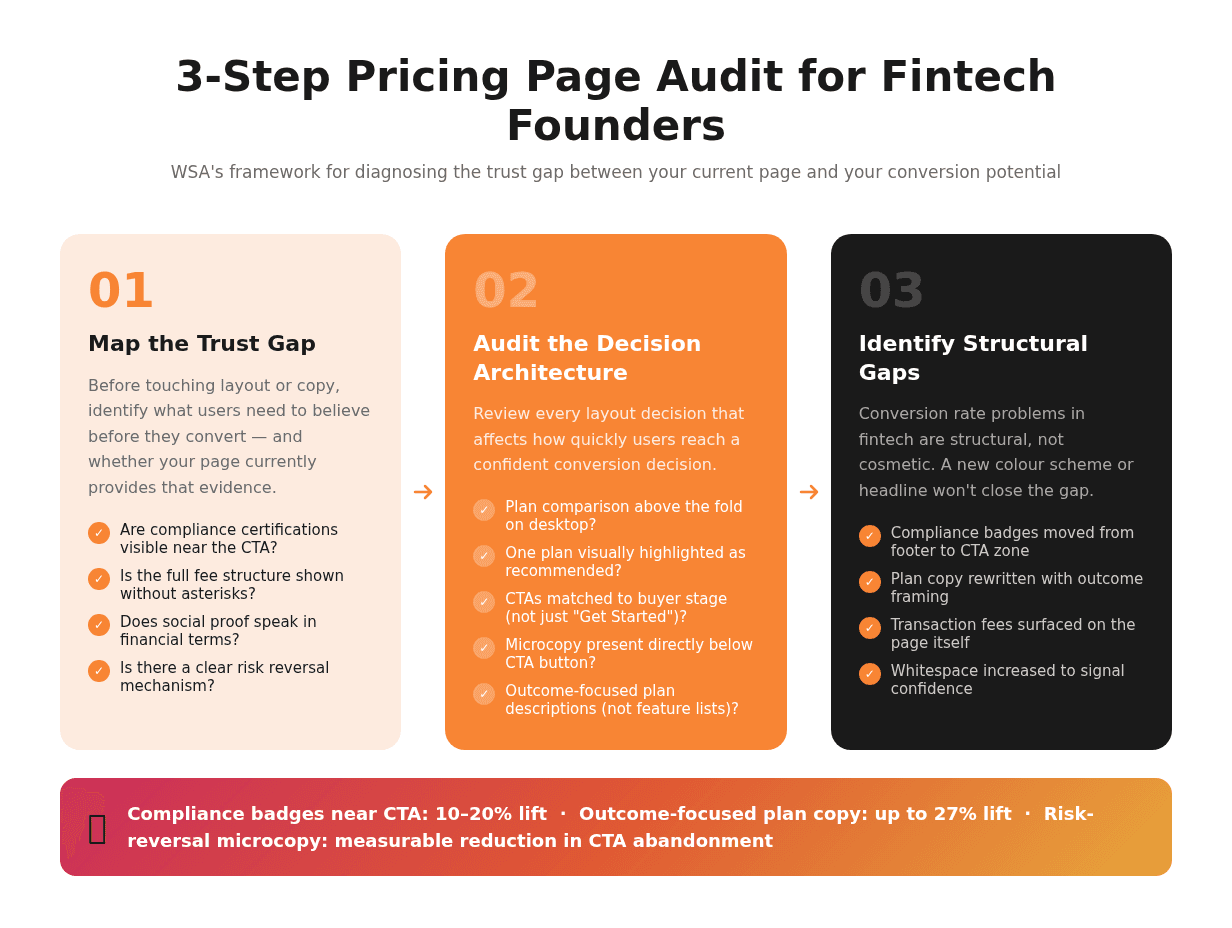
Displaying compliance certifications (SOC 2, PCI DSS, FDIC) within close proximity to your primary CTA can lift conversions by 10–20%.
Three-tier pricing with a clearly highlighted "Recommended" plan reduces decision paralysis through anchoring psychology.
Outcome-focused plan descriptions (what the user achieves, not what features they get) consistently outperform feature-list copy. One fintech SaaS saw a 27% conversion uplift after making this switch alone.
Social proof in fintech should speak in financial terms: "$4B+ processed", "99.97% uptime", "FDIC-insured up to $250K". Not user counts or star ratings.
Microcopy immediately below your CTA ("No credit card required", "Cancel anytime, no penalties") removes the final hesitation that keeps high-intent visitors from clicking.
What Makes a Fintech Pricing Page Different
A fintech pricing page carries a higher trust burden than a standard SaaS pricing page. In most software categories, a prospect who's unsure can sign up for a free trial and walk away without consequences. In fintech, signing up means connecting bank accounts, sharing tax identifiers, or giving a third party access to payment flows. The cost of a wrong decision feels much higher, even if it isn't.
This changes what a pricing page needs to do. Communicating value and making a compelling offer isn't enough. The page must first answer the implicit question every fintech prospect carries: Is this company safe enough to trust with my money and data?
Wise handles this well. Their pricing page leads with a fee breakdown: exact amounts, exchange rates, a comparison to traditional bank transfer costs, before they show a single plan or CTA button. Stripe shows API rate limits, uptime records, and security certifications alongside plan features. Neither company buries the hard details. Displaying that information prominently is the trust mechanism.
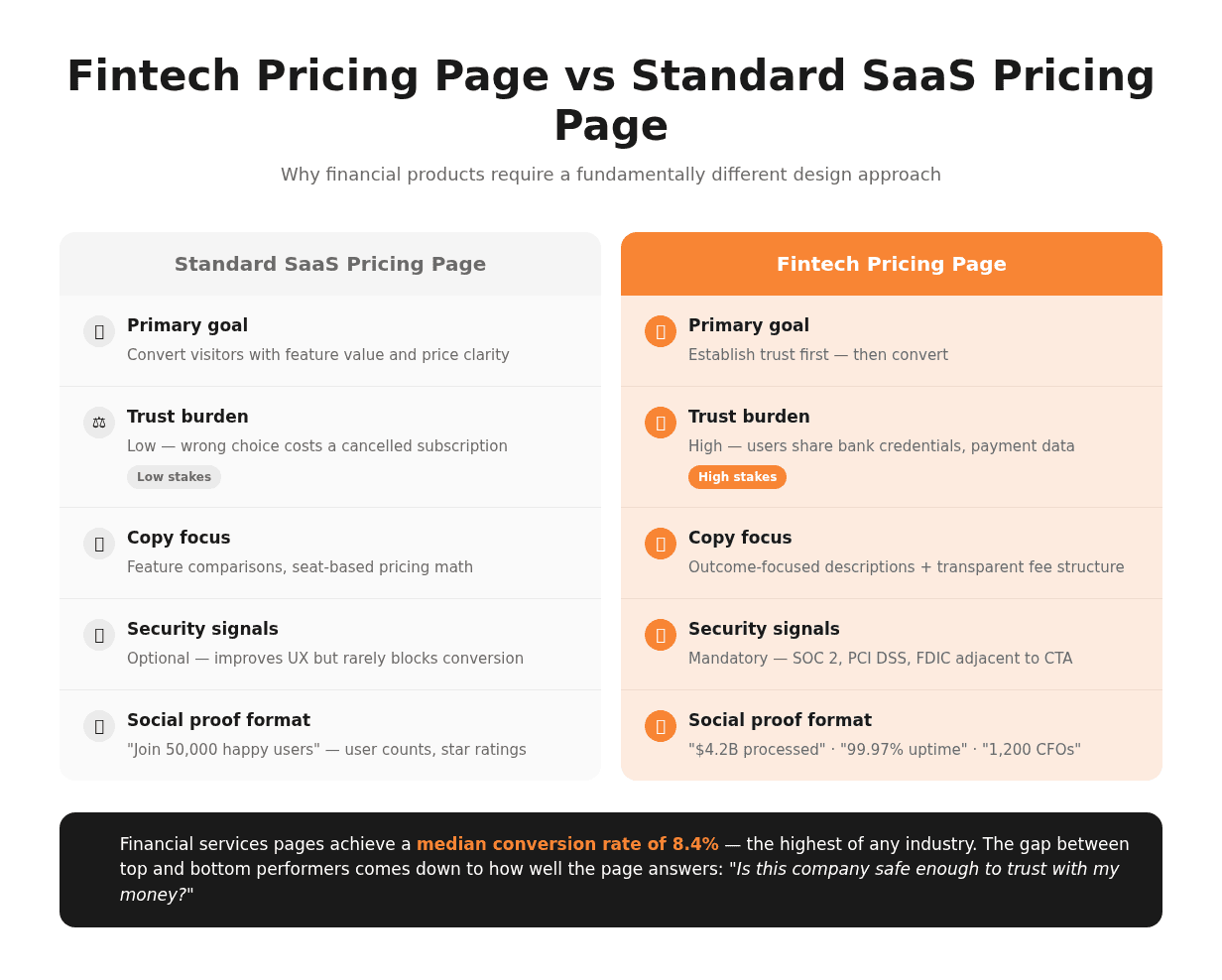
The Trust Gap That Generic Pricing Pages Miss
Most pricing pages are designed to convert — fintech pricing pages must first reassure. The trust gap is the distance between what a user knows about your product and what they need to feel confident enough to proceed. Pricing page trust signals exist to close that gap before the user reaches your CTA.
When users encounter a fintech product for the first time on a pricing page, fee transparency is the most immediate signal. Hiding fees behind asterisks, requiring a sales call for pricing information, or using ambiguous terms like "custom pricing" without explanation all trigger the same response: distrust. According to Nielsen Norman Group's research on B2B pricing pages, companies that display at least representative price ranges see meaningfully lower bounce rates and stronger lead quality than those that conceal pricing.
The gap widens when trust signals are absent altogether. A pricing page without visible security certifications, without social proof in quantifiable terms, and without microcopy that reduces commitment risk forces every visitor to resolve their uncertainty alone. Most won't.
Why Financial Products Need a Different Approach to Pricing UX
When a user sees pricing for a payment product or a lending tool, they're not evaluating features. They're calculating risk. This changes the UX problem entirely. A standard SaaS pricing page can lead with feature comparisons and cost-per-seat math. A fintech SaaS pricing page must address three questions in sequence before any plan comparison is useful:
Is this company legitimate and regulated?
Will I understand exactly what I'm paying and when?
What happens if something goes wrong?
Until those questions are answered, the plan comparison table is irrelevant to most visitors. Poor pricing UX in fintech doesn't just reduce conversions. It generates support tickets ("I didn't understand the fee structure"), increases early churn ("I didn't realise I'd be charged for X"), and damages trust before the product has had a chance to prove its value.
Does Your Pricing Page Answer the Three Questions Fintech Buyers Ask First?
WSA audits fintech pricing pages and identifies the trust gaps costing you conversions.
Core Elements of a High-Converting Fintech Pricing Page
The most effective fintech pricing pages share five structural decisions that separate high-performing financial product pages from generic SaaS pricing layouts. Compliance badges near CTAs lift conversions 10–20%. Outcome-focused copy lifts them further. These aren't small optimisations; they're the architecture that makes everything else work.
Transparent Pricing Architecture
Transparent pricing means more than listing a number. It means showing how that number is calculated, what it includes, and what additional costs might apply. This is the single highest-leverage element on a fintech pricing page.
The two most common mistakes: burying transaction fees in a footnote, and using vague language like "additional fees may apply." Both destroy trust precisely when the user is closest to converting. Instead, present a clear fee breakdown directly on the pricing page: monthly subscription costs, transaction fees, usage-based components, and any minimum commitments shown upfront.
Outcome-focused plan descriptions consistently outperform feature-list copy in fintech product pricing. A payment SaaS that reframed its plans from "Advanced API access, webhook support, 99.9% SLA" to "Process up to 50,000 transactions monthly with guaranteed uptime and dedicated support" saw a 27% conversion uplift without changing a single pricing figure. Users buy the outcome, not the capability list.
Key elements of transparent pricing architecture:
Monthly and annual costs shown side by side, with the annual saving clearly called out
Transaction fees or usage components visible on the page, not in a footnote
Outcome-focused plan descriptions (what the plan enables, not what it contains)
Plain-language explanation of any commitment period or cancellation terms
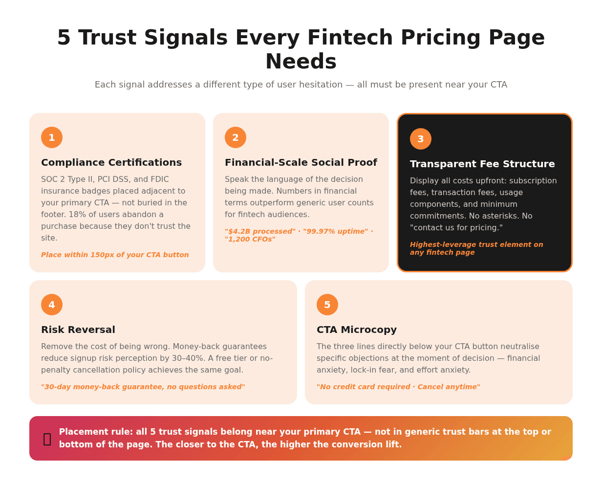
Trust Signals That Belong on Every Fintech Pricing Page
Trust signals on a fintech pricing page fall into three categories: compliance proof, social proof, and risk reversal. Each addresses a different type of hesitation.
Compliance proof includes certifications that demonstrate your product meets security and regulatory standards: SOC 2 Type II, PCI DSS, and FDIC insurance designation (where applicable). According to Baymard Institute research, 18% of users abandon a purchase because they don't trust the site. Users' perception of security is largely a gut-level response to visual signals. Compliance badges near your CTA directly address that response.
Social proof in fintech speaks in financial terms, not user counts. "$4.2B processed annually", "99.97% uptime across 36 months", "Trusted by 1,200 CFOs" outperforms "Join 50,000 happy users" because it speaks the language of the decision the user is actually making.
Risk reversal removes the commitment cost: a 30-day money-back guarantee, a no-questions-asked cancellation policy, or a free tier that lets users test core functionality before committing. Money-back guarantees typically reduce signup risk perception by 30–40%.
Plan Structure and Pricing Psychology
Three pricing tiers, with one clearly marked as recommended, work because of anchoring psychology. The highest tier makes the middle tier feel reasonable by comparison. The lowest tier confirms the middle tier's value by showing what's missing. This is good information architecture, not manipulation. Users make faster, more confident decisions when the option space is structured clearly.
Research shows that 80% of purchasing decisions in SaaS are based on perceived value, not price point. This is even more pronounced in fintech, where the cost of switching products is high and the upside of a good choice is measurable in business outcomes.
Two practical rules for fintech plan structure:
Highlight one plan visually. Use a border, colour difference, or "Most Popular" label. Neutral plan presentations produce lower conversion rates because they shift all decision effort to the user.
Match plan names to outcomes or customer segments. "Starter", "Growth", "Enterprise" is more useful than "Basic", "Pro", "Premium" because it maps directly to where the user sees themselves.
A note on usage-based pricing: three-tier comparison tables work for subscription and seat-based fintech SaaS. Usage-based or API-volume pricing models require a different approach, typically a pricing calculator rather than a comparison table. Force-fitting a column comparison onto a variable pricing structure creates confusion, not clarity.
Get an Expert Review of Your Fintech Pricing Page
WSA identifies the structural gaps between your current pricing page and the conversions you should be seeing.
How to Design a Fintech Pricing Page That Converts
Pricing page design for fintech is not about aesthetics — it's about decision architecture. Every layout choice either accelerates the user's path to conversion or creates friction that sends them looking for reassurance your page hasn't provided.
Layout, Visual Hierarchy, and Scannability
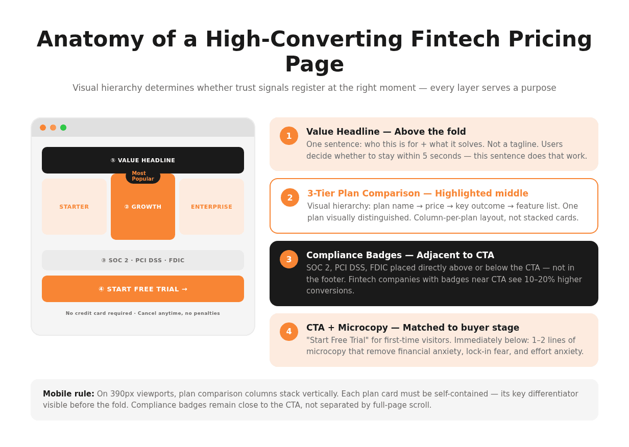
Users decide whether to stay on a pricing page in under five seconds. In that window, the page must communicate three things: what you offer, what it costs, and why you're trustworthy. The layout determines whether those things register in the right order.
Practical layout rules for fintech pricing page design:
Lead with your value headline. One sentence that names who this product is for and what it solves. Not your company tagline. Not a feature list.
Keep the plan comparison above the fold on desktop. If users have to scroll to see pricing, a meaningful percentage won't.
Use a column-per-plan layout. Horizontally comparable plans are easier to evaluate than vertically stacked cards.
Establish visual weight hierarchy: plan name, price, key outcome, feature list, CTA. Reversing this order reduces conversion rates.
Whitespace is a trust signal. Dense, cramped layouts feel like they're hiding something. Fintech pricing pages with generous spacing convert at higher rates because the layout itself signals confidence.
Pricing UX also means mobile-first consideration. On mobile, plan comparison columns stack vertically. Make sure each card is self-contained and the most important differentiators are visible before the fold on a 390px viewport.
CTAs That Match the Buyer's Decision Stage
A CTA that says "Get Started" tells users nothing. In fintech, CTAs must match the specific stage of the user's purchase decision. A prospect evaluating your product for the first time is not ready to commit. They need a low-friction entry point. A prospect who has already done their research needs a direct path to action.
Three CTA types mapped to buyer stage:
Exploration stage: "See a Live Demo" or "Try Free for 14 Days" — low commitment, high value signal
Evaluation stage: "Start Your Free Trial" or "Create Your Account" — implies reversibility
Commitment stage: "Upgrade Now" or "Get Full Access" — direct, for users already on a trial
Microcopy directly below the CTA button drives measurable fintech pricing page conversion improvement. "No credit card required" removes financial commitment anxiety. "Cancel anytime, no penalties" removes lock-in fear. "Setup takes under 5 minutes" removes effort anxiety. Each piece of microcopy neutralises a specific objection. In fintech, where objections are rooted in risk, this language does real work.
The Role of Compliance and Security Messaging
Compliance messaging on a pricing page is not a legal box to tick. It's a conversion asset. The right certifications, placed in the right positions, directly address the trust hesitations that prevent fintech prospects from clicking your CTA.
What to Show — and Where to Place It
The certifications that matter most for fintech pricing pages are SOC 2 Type II (security and availability), PCI DSS (payment card data handling), and FDIC insurance designation (for deposit products). Each speaks to a different type of user concern:
SOC 2 Type II: "Your data is stored and managed securely according to a third-party-audited standard."
PCI DSS: "Your payment data is handled in compliance with the card industry's highest security requirements."
FDIC: "Your funds are insured by the US government up to $250,000."
Placement matters as much as presence. Compliance badges placed in the page footer or a generic trust bar are noticed by far fewer users than badges placed adjacent to, or directly below, your primary CTA. Fintech companies that position their compliance certifications within close visual range of the CTA consistently see higher conversion rates than those that place them in generic trust bars.
Treat compliance badges the same way you treat risk-reversal microcopy: place them where the user's eye goes just before they decide whether to click.
How WSA Designs Pricing Pages for Fintech Brands
WSA's approach to fintech pricing page design starts with the trust architecture, not the visual layer. Before touching layout or colour, we map the trust gap: what does this user need to believe before they'll convert, and does the current pricing page provide that evidence?
In WSA's experience working with fintech founders and financial product marketing teams, the most common gap is between what the company knows about its own product's security and compliance profile and what's actually visible on the pricing page. Companies that hold SOC 2, PCI DSS, or banking-grade certifications frequently bury or omit them entirely. Companies with strong uptime records don't show them. Companies with favourable churn rates don't translate that into social proof.
WSA builds pricing pages on Framer and Webflow, which give fintech teams the CMS control to update plan features, pricing tiers, and compliance information without developer dependencies. This matters in a regulated market where product capabilities and pricing often change on short notice. See how we approach high-converting fintech landing pages and the broader fintech web design trends in 2026. If you're deciding between a custom fintech website build and a template solution, that decision shapes what your pricing page can and can't do.
Conclusion
A fintech pricing page is not a feature list with a price tag attached. It's a trust document that happens to contain pricing information. The companies getting the highest conversion rates — consistently above 10% — are the ones that design the trust architecture first: transparent fee structure, compliance certifications placed where users see them at the moment of decision, outcome-focused plan copy, and microcopy that removes the cost of being wrong.
If your pricing page was built by someone who understood SaaS conversion design but not fintech-specific trust dynamics, the gap between your current conversion rate and your potential one is structural. It won't close with a better colour scheme or a rewritten headline.
Start Your Fintech Website Project
WSA designs high-trust pricing pages for fintech companies that need to convert, not just inform.
FAQ
How do I design a fintech pricing page that builds trust?
A fintech pricing page builds trust through three structural elements: fee transparency, compliance signals, and risk reversal. Fee transparency means displaying your full pricing structure — including transaction fees, usage components, and any minimum commitment — directly on the page with no hidden terms. Compliance signals mean placing certifications like SOC 2, PCI DSS, or FDIC insurance designation adjacent to your CTA, not in the footer. Risk reversal means removing the cost of being wrong: a money-back guarantee, a no-penalties cancellation policy, or a free tier that lets users test before committing. These three elements address the core objections fintech users have before they'll convert, and they work in sequence — trust is established before the conversion attempt, not during it.
What trust signals should a fintech pricing page include?
The most effective trust signals on a fintech pricing page are compliance certifications, financial-scale social proof, and microcopy that removes commitment risk. Compliance certifications include SOC 2 Type II, PCI DSS, and FDIC insurance designation. Social proof should be expressed in financial terms: transaction volume processed, uptime percentage, number of regulated institutions using the product, not generic user counts. Risk-reversal microcopy includes "No credit card required", "Cancel anytime, no penalties", and "30-day money-back guarantee". All three categories should be placed near your primary CTA, not relegated to the footer. Placement adjacent to the CTA ensures trust signals are visible at the moment of decision.
How many pricing tiers should a fintech product offer?
Three pricing tiers is the standard for subscription and seat-based fintech SaaS products. It works because of anchoring psychology: the highest tier makes the middle tier feel reasonable, and the lowest tier confirms the middle tier's value by showing what's excluded. One tier should be visually distinguished as "Recommended" or "Most Popular" — neutral plan presentations produce lower conversion rates because they shift all decision effort to the user. Usage-based or API-volume products are an exception: they typically perform better with a pricing calculator than a comparison table, because forcing a column-comparison format onto a variable pricing structure creates confusion rather than clarity.
What is the ideal layout for a fintech SaaS pricing page?
The ideal fintech SaaS pricing page layout follows a clear visual hierarchy: a value headline at the top (who this is for, what it solves), the plan comparison above the fold on desktop, compliance certifications adjacent to the primary CTA, and risk-reversal microcopy directly below the CTA button. Use a column-per-plan layout for easy horizontal comparison. Establish visual weight from plan name to price to key outcome to feature list to CTA. On mobile, ensure each plan card is self-contained and shows its key differentiator before the fold on a 390px viewport. Generous whitespace is a trust signal in its own right — crowded layouts feel like they're hiding information, and in fintech that perception kills conversions.
How does pricing page design affect conversion rates in fintech?
Fintech pricing page conversion depends heavily on how well the page addresses user trust before making a conversion attempt. Financial services pages achieve a median conversion rate of 8.4% — the highest of any industry — but individual pages range from under 2% (broad awareness traffic, incomplete trust signals) to over 12% (warm retargeting, strong trust architecture). The highest-leverage design changes are: adding compliance certifications near the CTA (10–20% lift), switching from feature-list to outcome-focused plan copy (up to 27% lift in documented cases), and adding risk-reversal microcopy below the CTA. These are structural changes, not visual tweaks — they work because they address the specific reasons fintech users hesitate before converting.
Whether you’re launching something new or improving an existing platform, we’re ready to discuss your goals and explore the best way forward.


