•
•

High-Converting Landing Pages for Fintech Websites: Structure, Copy, and Data Insights
In fintech, a paid campaign is only as effective as the page it leads to. Growth teams invest heavily in traffic — yet many still send visitors to generic website pages that weren't built to convert. Research across brokers, payment platforms, and crypto exchanges consistently shows that pages structured around a single acquisition action convert at 2.4–2.8× the rate of multi-purpose product pages used as campaign destinations.
This guide covers the structural anatomy of a fintech landing page, compliance-aware copy, trust architecture, fintech UX best practices, and the analytics framework used by top-performing fintech websites.
Key Takeaways
High-converting landing pages for fintech websites are built around a single acquisition goal — not general brand awareness. Structure, not ad spend, is the primary conversion variable. Financial services pages achieve a median fintech website conversion rate of 8.4% (Unbounce Q4 2024) — the highest of any industry tracked.
Effective fintech landing page design integrates trust signals and compliance transparency throughout every section — contextually beside CTAs and forms, not only in the footer. Precise, verifiable copy outperforms vague claims every time.
Continuous fintech landing page analytics and A/B experimentation are what separate top-performing pages from average ones. Copy changes alone can produce 50–80% lifts — but only when landing pages are aligned with the broader fintech marketing funnel: ad creative, onboarding flow, and post-registration experience.
What Makes a Landing Page High-Converting in Fintech?
A high-converting fintech landing page is designed around a single acquisition objective — account registration, demo signup, or lead capture — with every element reinforcing that one goal. These are purpose-built pages stripped of navigation, structured to move a specific audience segment through a defined onboarding funnel.
Four elements drive fintech website conversion: a clear value proposition, a focused CTA hierarchy, credibility signals (licensing, partner logos, reviews), and a friction-reduced onboarding path. In payments, trading, crypto, and neobanking, perceived trust and regulatory transparency are the dominant conversion levers — and they are measurable. Unbounce's Q4 2024 Benchmark Report (57M conversions, 41,000 pages) puts the financial services median conversion rate at 8.4% — 27% above the cross-industry average of 6.6%. That is the baseline to beat.
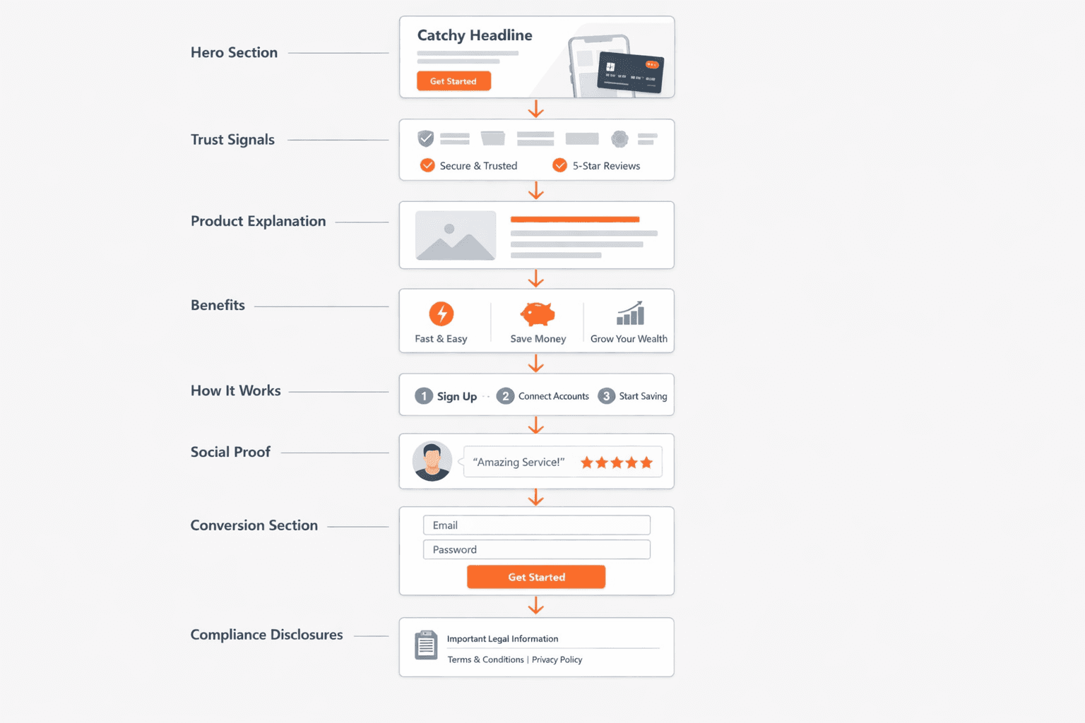
Core Structure of a Fintech Landing Page
The fintech landing page structure below follows the information architecture used by high-performing financial platforms. Each section plays a specific role in moving a visitor toward conversion.
Section | Purpose |
|---|---|
1. Hero Section | Headline, value proposition, and primary CTA above the fold |
2. Trust Signals | Licensing badges, regulatory references, partner and security logos |
3. Product Explanation | Clear, jargon-free description of what the platform does |
4. Benefits & Differentiators | Why this product is better, safer, or faster than alternatives |
5. How It Works | Onboarding steps, platform workflow, or key process overview |
6. Social Proof | Testimonials, usage statistics, case studies, media mentions |
7. Conversion Section | Signup form, lead capture, or demo booking CTA |
8. Compliance Disclosures | Risk warnings, regulatory disclaimers, legal footnotes |
Each section answers the question a visitor is already asking — in the order they naturally ask it. The hero: "What is this?" Trust signals: "Can I believe it?" Compliance disclosures: "What are the risks?" This is the logic of fintech website UX — not decoration, but a structured path to a conversion decision. Skipping or reordering sections breaks the psychological flow and costs conversions.
Platform and CMS choices directly determine how quickly teams can build, deploy, and iterate dedicated landing pages — a decision covered in depth when thinking through fintech website design for regulated financial products.
Writing Landing Page Copy for Financial Products
Fintech landing page copy operates under constraints SaaS copywriters rarely face: compliance. You cannot promise guaranteed returns, overstate regulatory approvals, or imply a financial outcome without a disclaimer. These constraints push toward specificity — and specificity converts better anyway.
Compliance-safe claims: Replace "guaranteed" or "risk-free" with concrete, verifiable statements — "regulated by FCA", "99.9% uptime", "used by 5,000+ institutions".
Transparent fee language: Financial landing pages that show pricing clearly consistently outperform those that bury or omit it.
Benefit-led headlines: Lead with outcomes ("Settle FX transactions 3× faster") rather than features ("real-time API processing"). In one documented CRO experiment on a payments platform, switching from a feature headline to an outcome headline produced a 78% conversion lift over 2,200 sessions — copy only, no design changes.
Friction-reducing microcopy: Copy around form fields ("We never share your data", "Takes 2 minutes") measurably lifts form completion rates.
Each jurisdiction adds its own layer of obligation — what FCA, CySEC, and ASIC each require of landing page copy is detailed in this broker compliance checklist.
Trust Signals That Improve Fintech Landing Page Conversion
Visitors on a fintech lead generation landing page are deciding whether to submit personal data, complete KYC, or move funds through a new platform. Baymard Institute identifies security concerns as the #1 cause of financial form abandonment. The architectural solution is deliberate placement of fintech landing page trust signals — contextually next to CTAs and forms, not only in the footer. The 10 elements that most consistently lift signup rates include both visible regulatory references and security certifications placed at the point of decision.
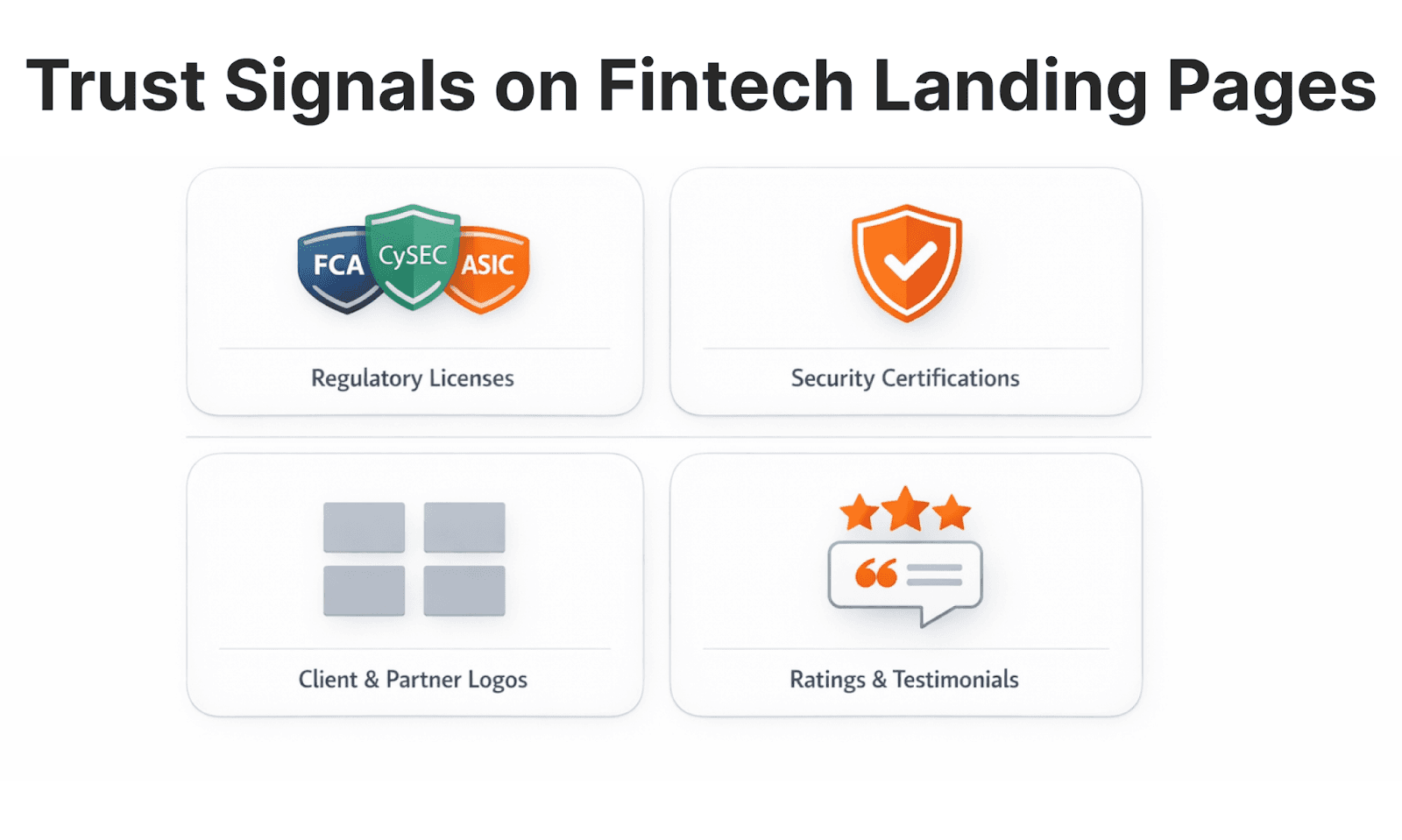
Regulatory licensing: FCA, CySEC, ASIC references above the fold and beside the signup form. Moving an FCA badge from footer to hero has been shown to lift broker page conversion from 2.1% to 3.4% with no other changes.
Security certifications: ISO 27001, PCI DSS, SOC 2 badges work especially well alongside forms.
Social proof: Named endorsements (company + title), Trustpilot/G2 scores, and partner logos from recognisable providers like Stripe help minimise risk perception at the point of decision.
Want a Landing Page That Converts?
WSA.design builds conversion-focused fintech websites trusted by brokers, exchanges, and financial platforms.
UX and Performance Optimization for Fintech Landing Pages
Fintech UX best practices treat every page layer — speed, layout, form, copy — as a conversion decision. These four principles have the most significant measurable influence on fintech website performance optimization:
Page speed: A 1-second mobile delay reduces conversions by up to 20%; 53% of mobile visitors abandon pages that take over 3 seconds to load (Google/Ipsos). Webflow and Framer are common choices for lightweight fintech campaign pages.
Mobile-first design: Mobile devices generated 62.54% of global web traffic in Q4 2024 (StatCounter/Statista) and 49.4% of Banking & Finance traffic specifically (Contentsquare 2024). Design forms and CTAs for small screens first.
Minimal form friction: Collect only the fields needed at signup; defer KYC to post-registration. Reducing a crypto exchange signup from 11 fields to email + password only lifted form completion from 18% to 54% — a pattern documented across multiple fintech onboarding projects.
Clear visual hierarchy: Headline, CTA, and one trust signal must be visible without scrolling — visitors scan before they read.
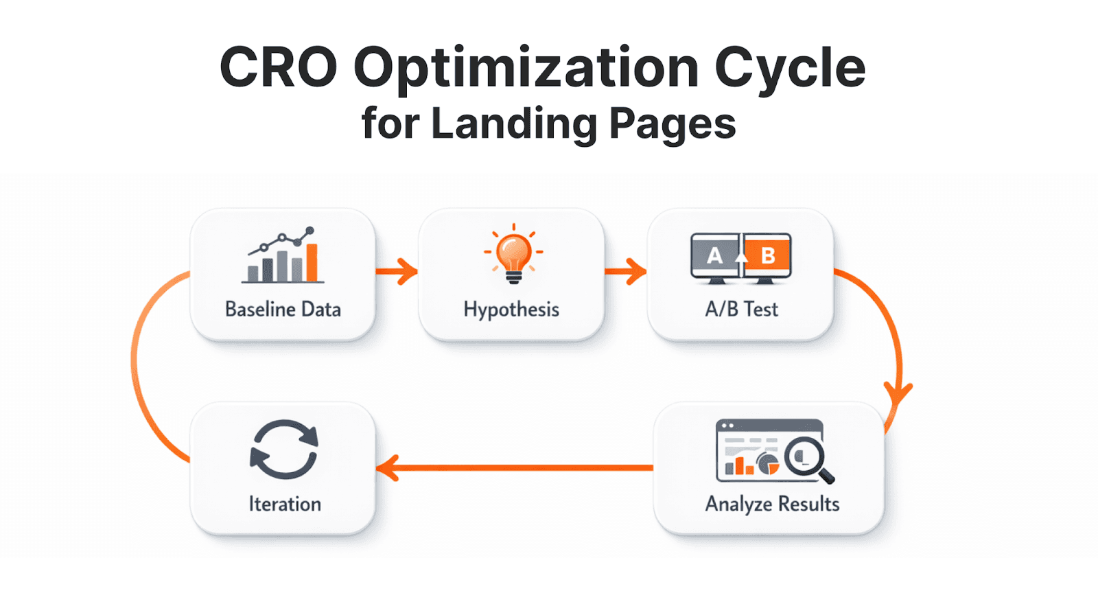
Using Data and Analytics to Improve Landing Page Performance
The difference between a 2% and 8% fintech conversion rate optimization result is fintech CRO strategy applied systematically. The core stack: GA4 for session behaviour and funnel drop-offs, Google Tag Manager for event tracking, Hotjar for heatmaps and session recordings, and Optimizely or similar for A/B testing. Monitor conversion rate, form completion rate, bounce rate, scroll depth, and CTA click rate — these five metrics show where users are falling off and what to test next.
Growth teams run structured cycles: baseline → hypothesis → A/B test → iteration. The copy variable consistently produces the highest lifts for the lowest cost. Landing page conversion in fintech compounds faster than most teams expect: a 20% lift on a page generating 1,000 leads/month is 200 extra leads — every month. Integration with HubSpot closes the loop between landing page performance and pipeline revenue.
Common Mistakes in Fintech Landing Page Design
The most common structural errors, with their conversion impact, are documented in this fintech UX audit guide:
Mistake | Impact |
|---|---|
Too Many CTAs | Competing actions reduce conversion on all of them |
Weak Trust Signals | Absent licensing info and generic images undermine credibility |
Unclear Product Explanation | Visitors don't understand what they're signing up for — they leave |
Hidden Compliance Disclaimers | Burying risk warnings creates regulatory and trust risk |
Slow Load Times | Google: bounce rate rises 32% as load time increases from 1s to 3s |
Generic Ad-to-Page Message | Mismatch between ad copy and headline breaks the acquisition flow |
Most of these errors stem from using the main website as a campaign destination. Fintech landing page optimization requires purpose-built pages — not redirects to homepages.
Fintech Landing Page Template: The 8-Step Conversion Framework
Whether you're building a fintech product landing page for a broker, exchange, or neobank, what most teams actually need is not a design file but a proven sequence of sections, each with a defined job — a fintech landing page template built around conversion logic, not visual preference.
Section | What It Must Do |
|---|---|
Step 1 — Hero | Outcome-focused headline, subheadline, single CTA. No navigation. Compliance badge visible. Communicate value + first trust signal in < 5 seconds. |
Step 2 — Trust Bar | FCA/CySEC/ASIC licence badges, ISO/PCI DSS icons, notable client logos. Appears directly below the hero. Reduces risk perception before the visitor reads further. |
Step 3 — Product Explanation | One short paragraph + 2–3 bullets. Answers: what does this do, who is it for, what makes it different. No jargon. |
Step 4 — Benefits | 3–5 benefit statements (not feature lists). Each answers: "What does this mean for me?" Frame around speed, cost reduction, or compliance confidence. |
Step 5 — How It Works | 3-step workflow or numbered list. Name the KYC step honestly if it exists. Surprises post-signup cause churn. |
Step 6 — Social Proof | Named testimonials with role + company, case study metrics, Trustpilot/G2 score. Place at least one testimonial directly above the conversion section. |
Step 7 — Conversion Section | Minimum required fields only. Add microcopy beside sensitive fields. Repeat a trust signal beside the submit button. |
Step 8 — Compliance | Risk warnings, regulatory disclaimers, jurisdiction restrictions. Present and accurate — but not visually dominant. |
[aa fast-fact]
This is a sequence, not a rigid layout. On mobile, Steps 2–3 may merge. The most commonly skipped step is Step 5 — How It Works. Visitors who understand the onboarding process before signing up show 30–50% higher activation rates post-registration.
[/aa]
Next Steps: Designing Conversion-Focused Fintech Landing Pages
High-performing fintech landing page design sits at the intersection of conversion strategy, regulatory knowledge, and technical execution. It is not a general UX problem — it requires an understanding of compliance constraints, trust architecture, and onboarding flow specific to regulated financial products.
Landing pages also don't perform in isolation. They need to be aligned with your broader fintech marketing strategy, the ad creative that drives traffic to them, and the onboarding flow that follows them. Getting that full stack right compounds results significantly faster than optimising a single layer in isolation.
Immediate actions:
Audit conversion data: Use GA4 to identify drop-off points, compare traffic sources, and establish your current baseline before making any changes.
Audit trust signals: Are licensing references visible above the fold and beside your signup form — not only in the footer? Contextual placement is the single highest-leverage change for most fintech pages.
Reduce form friction: Count your form fields. Defer KYC collection to post-signup where possible. Add reassurance microcopy beside sensitive fields. Then measure form completion rate before and after.
If you're working with a team that specialises in broker website design and conversion-focused fintech builds, the process above becomes significantly faster — both because the structural decisions are already informed by industry pattern recognition, and because compliance-aware UX is built in from the start rather than retrofitted.
FAQs
What is a high-converting fintech landing page?
A high-converting fintech landing page is a campaign-specific page built around one primary conversion action — signup, demo request, or lead form. It removes navigation distractions, emphasises trust signals and compliance transparency, and guides visitors through a friction-reduced onboarding flow. Every element is aligned to a single audience segment arriving from a defined traffic source.
What conversion rate should fintech landing pages target?
Per Unbounce's Q4 2024 Benchmark (57M conversions), financial services pages achieve a median fintech website conversion rate of 8.4% — the highest of any industry tracked. Individual pages range from under 2% (broad awareness traffic, complex products) to over 12% (warm email retargeting, minimal forms).
What makes fintech landing pages different from SaaS landing pages?
Fintech pages require stronger trust architecture, regulatory transparency, and compliance-constrained copywriting. Fintech landing page design must overcome genuine financial risk perception — visitors are deciding whether to share personal data or move funds. That requires a different level of credibility proof than a SaaS free trial page.
How can fintech companies improve their landing page conversion?
Improving fintech website conversion involves: (1) refining page structure — hero, trust bar, product explanation, proof, form in that order; (2) adding contextual trust signals beside CTAs; (3) simplifying forms and deferring KYC; (4) matching the ad message exactly to the page headline — message-match alone can reduce bounce rate by 25–40%; and (5) running systematic fintech CRO strategy experiments using GA4, GTM, and Hotjar. Prioritise highest-traffic pages first.
What tools are used for fintech landing page analytics?
Core fintech landing page analytics tools: GA4 for funnel tracking, GTM for event tagging, Hotjar for heatmaps and session recordings, and Optimizely for A/B testing. Together they cover the full fintech marketing funnel from first click to conversion.
Launch Your Licensed Brokerage with Confidence
We support brokers and fintechs through licensing, launch planning, and everything a regulated brand needs to go live.


