•
•

Fintech Services UI/UX Design: How Trust Is Built in Seconds
A fintech user decides whether to trust your platform before reading a single line of copy. Research from Google shows that users form a visual impression in under 50 milliseconds — and in financial services, that impression carries real weight. When someone lands on a payment platform, crypto exchange, or digital banking product, they're not just evaluating aesthetics. They're asking: Is this legitimate? Is my money safe here?
That judgment happens in 3–5 seconds, based entirely on layout, performance, hierarchy, and perceived security.
Your fintech website functions as a credibility filter for first-time users, a regulatory-facing signal for compliance teams, a conversion engine for sign-ups and inquiries, and a long-term growth platform for partnerships and investor relations.
This article explores how UI/UX decisions in fintech website design directly influence trust perception, compliance credibility, and conversion success, and what distinguishes professional-level financial services website design from those that quietly drain you of users.
Key Takeaways
Trust is established in 3-5 seconds through visual clarity, layout organization, and performance.
Regulated fintech UX needs to minimize cognitive friction and convey institutional strength from the very first scroll.
Compliance features such as licensing, disclosures, and regulatory badges need to be incorporated into the design hierarchy and not relegated to footers.
Website loading speed and Core Web Vitals directly affect perceived legitimacy.
Conversion-focused design increases both user sign-ups and investor confidence.
Specialized fintech web development consistently outperforms generic agency work in regulated environments.
Why First Impressions Matter More in Fintech Than Any Other Industry
The reason why UI/UX design is so crucial in the fintech space is that users seek legitimacy before they even consider the features offered.
Risk is an integral component of any financial decision. Be it opening an account for trading purposes or becoming a user of a neobank, or even considering using the services of a payment infrastructure company, users are naturally skeptical about the operations of these institutions. Traders, institutions, and even smart investors are highly perceptive about the red flags that signal instability in an organization.
Bad design does not only make an organization look unprofessional; it also sends out the message that the organization is unstable. A messy layout sends out the message that the organization is messy in real life too.
For example, in B2B fintech infrastructure, platforms like B2BROKER and B2BINPAY show how regulated fintech UX balances institutional authority with product clarity across complex multi-product ecosystems. These outcomes are the result of financial services website design decisions made with financial user psychology in mind.
The Core Elements of Trust-Driven Fintech UX Design
Trust-driven fintech website design combines clarity, performance, transparency, and security cues to reduce perceived financial risk within seconds.
1. Clarity and Hierarchy
The value proposition should be immediately obvious above the fold. Navigation must be clean and predictable. CTAs should be singular and purposeful. Jargon overload — especially in crypto or regtech products — creates friction and erodes trust among non-specialist audiences.
2. Visual Stability
A consistent typographic system and grid-based design communicate professionalism. Color schemes should convey stability, rather than excitement – too much neon and too much animation will undermine credibility. Fintech web design trends in 2026 are shifting toward restrained, data-forward aesthetics — B2TRADER and B2CORE are good examples of structured dashboards with minimal chrome that keep focus on data and action.
3. Transparency Integration
Licensing information, regulatory disclosures, fee structures, and contact details must be visible and accessible. Visible FCA, CySEC, or ASIC registration numbers, placed in the header or footer with institutional formatting, immediately shift how regulated platforms are perceived.
As a real-word example, Eqwire website surfaces compliance context at the right moments in the user journey without overwhelming the interface — a practical benchmark for payment platforms.
4. Behavioral Flow Optimization
Onboarding processes that feel logical and well-paced can help reduce abandonment. Multi-step registration processes should employ progressive disclosure of information to users. This means showing users only what is needed on a step-by-step basis. Multi-step registration processes with good indicators of registration progress can increase registration completion by significant percentages – this has been consistently proven by various platforms' experiments based on drop-off data.

Performance as a Trust Signal
Slow websites reduce trust before users consciously notice performance issues.
Core Web Vitals directly affect both search ranking and user perception. Key benchmarks: LCP under 2.5 seconds, CLS below 0.1, INP under 200 milliseconds. For fintech website design, sub-2 seconds is the practical standard. Research shows a one-second delay in page response can reduce conversions by 7% — a material impact for any platform processing sign-ups or investment inquiries.
Performance optimization in fintech web development involves CDN implementation, clean frontend architecture, image compression, lazy loading, and HTTPS enforcement. A platform that loads instantly signals engineering competence. One that loads in five seconds signals the opposite.
Designing for Compliance Without Sacrificing UX
Compliance visibility increases legitimacy in regulated fintech UX — but only when it's architecturally integrated, not appended.
Regulatory badges from the FCA, CySEC, ASIC, or FinCEN should be placed in the header, footer, and near sign-up forms. AML and KYC references should also be included as they can increase trust with sophisticated users.AML and KYC references, presented clearly, improve trust with sophisticated users who expect them.
The common mistake: treating compliance as a legal issue rather than a design decision. When legal content is dropped into a footer in 9px grey text, it satisfies neither users nor regulators. A detailed broker website compliance checklist covers disclosure and structural requirements per regulatory body.
Conversion-Focused Design in Financial Services
Conversion-oriented fintech website design ensures that trust signals are linked to specific actions.
The distinction between a good-looking website and one that converts often lies in its structure rather than its looks. Primary CTAs should appear above the fold and close to trust signals. Social signals such as client logos, assets under management, or transaction volumes should be close to conversion forms and not relegated to a separate page for testimonials.
Multi-step onboarding flows convert better than single long forms by reducing initial commitment. For platforms targeting traders specifically, the framework for building a high-converting forex broker website covers this architecture in detail.
Not sure which option fits your business?
From startup brokerages to established platforms, WSA delivers websites that convert traders, satisfy regulators, and scale across markets.
Common UX Mistakes That Instantly Undermine Trust
Several design decisions consistently damage credibility in regulated fintech UX — many are covered in the context of broker website UX problems:
Overuse of animations: Looping effects signal immaturity, not innovation.
Generic stock imagery: Photos of traders shaking hands detract from brand specificity.
Hidden fees or unclear pricing: If the user cannot find pricing, they will assume something is wrong.
Poor mobile UX: Unresponsive designs and small tap targets are a sign of old infrastructure.
Inconsistent branding: Variations in typography and colors are a sign of immaturity in operations.
Slow performance: Speed is directly tied to perceived legitimacy in financial services website design.
Overcomplicated navigation: Mega-menus induce paralysis by analysis.
Aggressive pop-ups on first visit: Triggered in seconds, they convey desperation.
Users rarely articulate these reactions consciously — they simply think "I'm not sure I trust this platform."
Mobile-First UX in Fintech Platforms
More than 60% of fintech web traffic arrives on mobile — making mobile UX a primary credibility signal in regulated fintech, not a secondary one.
A polished desktop experience paired with a broken mobile layout signals the team hasn't considered its actual user base. Mobile-first fintech web development requires touch-friendly elements (minimum 44px tap targets), simplified forms with autofill support, thumb-zone CTA placement, responsive typography, and performance benchmarked separately from desktop.
Institutional audiences evaluating a platform on mobile — at a conference or during a quick due diligence check — make credibility judgments based entirely on that experience. A cramped or broken layout is disqualifying.
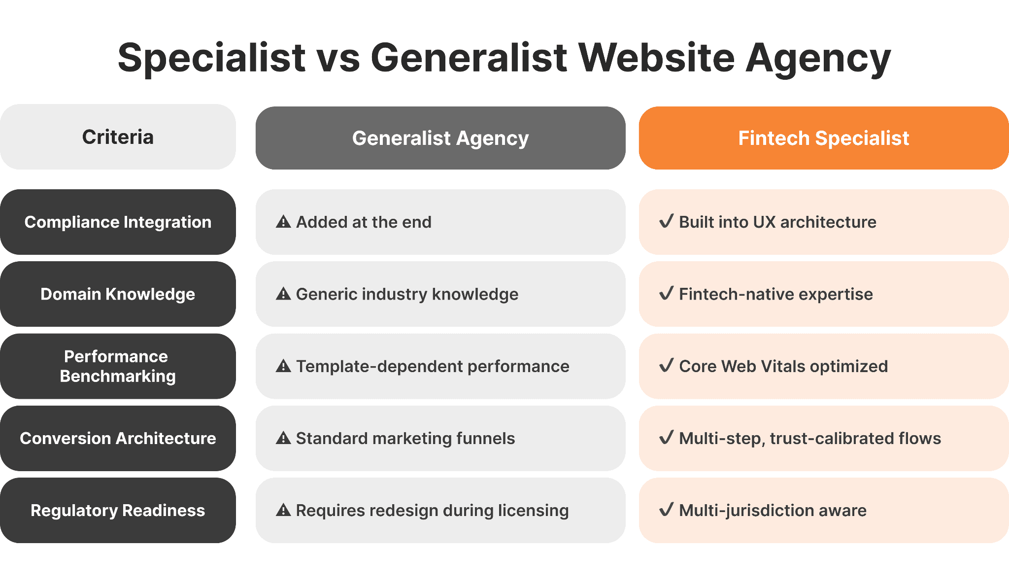
DIY vs. Specialized Fintech UX Agencies
Choosing between a generalist and a specialist fintech website design agency has material consequences.
A generalist works when: The risk of compliance exposure is low, the website is simple and informational, and there is in-house expertise in the fintech domain.
A specialist is necessary when: The platform is regulated, there is KYC/AML on the onboarding process, the website is investor/partner-facing, conversion rates have a direct impact on revenue, or multi-jurisdiction presence means different disclosure requirements.
Generalist agencies routinely miss compliance placement, regulatory language standards, and conversion architecture calibrated for skeptical financial users. The result is typically one or two redesign cycles within 18 months. A broker website redesign checklist helps evaluate whether a full rebuild or targeted redesign is the right move.
Pre-Launch Trust Audit Checklist
Before any fintech website goes live, verify each of the following:
Clear value proposition visible above the fold on desktop and mobile
Licensing and regulatory information displayed prominently and accurately
Page load time under 2 seconds, tested on real devices
Core Web Vitals (LCP, CLS, INP) passing Google's thresholds
SSL active and HTTPS enforced site-wide
Mobile UX tested across iOS and Android
Forms tested with real user workflows
Legal pages (privacy policy, terms, risk disclosures) accessible and complete
CTA clarity validated across all key landing pages
Why Specialized Fintech Website Design Drives Long-Term Growth
Specialized fintech web development helps reduce acquisition costs, accelerate regulatory timelines, and create a credibility advantage over the competition.
A high-trust fintech website converts the same traffic at a lower cost. Improved regulated fintech user experience reduces churn in the onboarding process. Being regulatory ready accelerates the licensing process and partner due diligence. .Strong brand perception attracts investors and partners evaluating dozens of competing platforms simultaneously.
FinTech website development agencies, such as WSA, builds trust-driven, conversion-focused, compliance-aware websites for payment providers, crypto exchanges, neobanks, trading platforms, and investment services — with performance, UX architecture, and regulatory readiness scoped from day one.
Is Your Fintech Website Building or Burning Trust?
Most fintech websites lose users before they read the first sentence. A 30-minute discovery call identifies exactly where your design is costing you credibility and conversions.
FAQs
How fast should a fintech website load?
Professional fintech websites should load in under 2–3 seconds, with sub-2 seconds as the target. Anything beyond 3 seconds increases bounce rates and damages perceived credibility. Use Google PageSpeed Insights to benchmark current performance.
What are the most important trust signals in fintech website design?
Visible licensing and regulatory numbers, SSL indicators, transparent fee structures, consistent UI, fast performance, social proof, and accessible regulatory disclosures. These work cumulatively — the absence of any one weakens the overall impression.
Does UX really affect conversion rates in financial services?
Yes, measurably. Clear navigation, reduced form friction, visible trust indicators near conversion points, and structured multi-step flows all drive sign-up or inquiry rates up. A one-second improvement in page-load time can drive conversions up by as much as 7%.
How do you balance compliance and UX in regulated fintech?
Compliance is a design consideration, not a legal afterthought. Regulator badges should live in the header or footer. Disclosures should be formatted and accessible. The CySEC, FCA, and ASIC compliance checklist outlines jurisdiction-specific requirements.
Why should fintech companies avoid generic website templates?
Templates don't account for compliance architecture, financial user psychology, or performance standards expected by sophisticated audiences. Credibility gaps typically force a full redesign within 12–18 months. The difference between a fintech agency and a generic studio explains exactly where that gap appears.
What is the biggest UX mistake fintech startups make?
Prioritizing visual trends over clarity, compliance, and conversion architecture. A website that looks impressive but lacks structured trust signals and logical behavioral flows will underperform — and in regulated markets, may damage relationships with licensing bodies and institutional partners.
Whether you’re launching something new or improving an existing platform, we’re ready to discuss your goals and explore the best way forward.


