•
•

Fintech SaaS Design: How to Turn Product Complexity Into Clear UX
This article provides UX design guidance for fintech SaaS platforms and does not constitute legal or regulatory advice. Regulatory obligations vary by jurisdiction; always consult qualified compliance counsel when designing financial systems.
Fintech UX design is the practice of structuring complex financial workflows, compliance requirements, and high-risk decision environments into clear, role-based, scalable interfaces that preserve regulatory visibility and user confidence.
There is a persistent myth in product design: that good UX means making things look simple. In fintech SaaS, this thinking causes real damage. Trading platforms, compliance dashboards, payment orchestration tools, and risk management systems are not simple products — and pretending they are creates friction, erodes trust, and loses enterprise deals.
Effective fintech UX design doesn't strip away complexity. It structures it. This guide is written for founders, CTOs, and product leaders building or redesigning complex B2B fintech platforms — covering the principles, patterns, and decisions that separate high-performing enterprise fintech UX from generic SaaS approaches.
Key Takeaways
Fintech UX design structures complexity — it does not eliminate it.
Strong fintech UX design principles reduce cognitive overload in data-heavy environments.
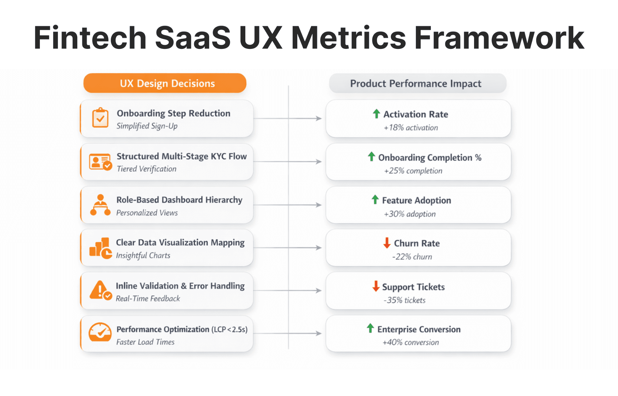
In regulated fintech, structured onboarding UX reduces abandonment by 20–40% when multi-step flows replace single-page compliance forms (based on internal project benchmarks across EU and US-regulated clients).
The best UX practices for fintech SaaS products balance functional power, compliance visibility, and usability.
Early regulated SaaS design decisions determine long-term scalability — retrofitting at Series B costs significantly more than building modular systems at MVP stage.
Why Is Fintech UX Design More Complex Than Other SaaS?
Fintech products combine dense financial data, regulatory workflows, and high-risk decision-making — making clarity mission-critical, not cosmetic.
Imagine a treasury manager approving a €2.4M transfer under time pressure. If liquidity thresholds and compliance flags are not immediately visible, hesitation increases. In enterprise fintech UX, hesitation equals risk — and risk at that scale has direct business and legal consequences.
Most SaaS products ask users to manage tasks or organize content. Fintech SaaS asks users to execute trades, verify identities, approve credit decisions, or move large sums through payment flows. The cost of poor UX is not a support ticket — it's a failed transaction, a compliance flag, or a lost enterprise contract.
Fintech UI UX design must account for several realities simultaneously:
Real-time financial data: Traders and payment operators work with live data that changes by the second. Latency and visual clutter directly increase error rates.
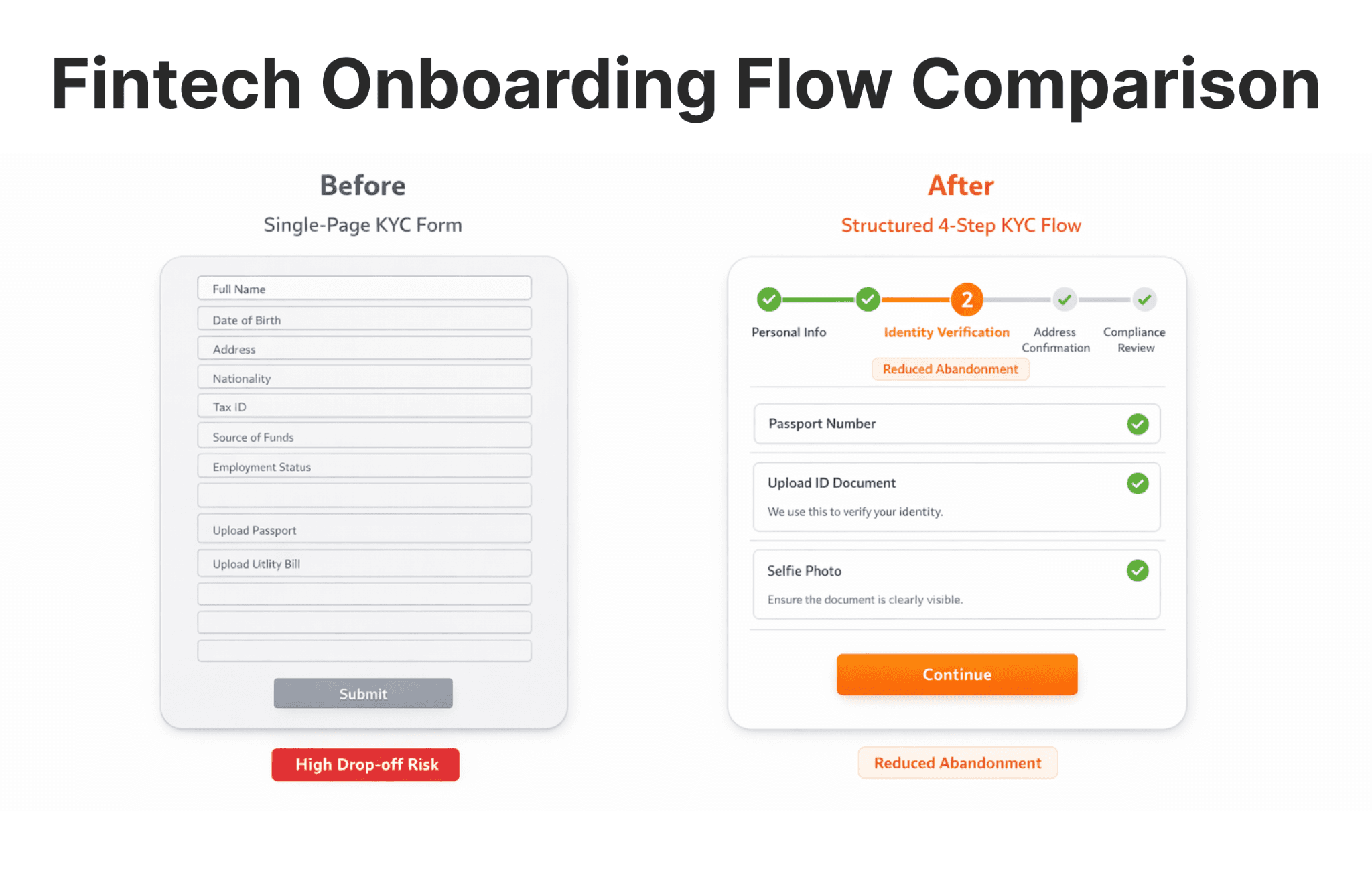
Multi-step KYC and compliance verification: Each step in document upload, identity verification, and sanctions screening is a dropout risk. For example, Platforms like B2CORE, B2BROKER's Trader's Room, and the back-office system address this by integrating KYC verification directly into the client onboarding flow — reducing setup friction for brokers managing hundreds of regulated accounts simultaneously.
Risk disclosures and regulatory visibility: Financial platforms under MiFID II, PSD2, and SEC regulations must surface disclosures clearly — not bury them.
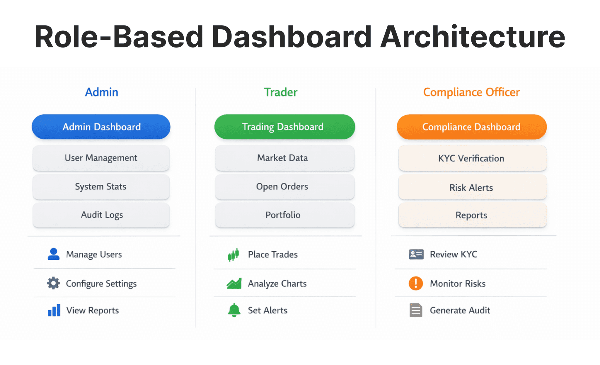
Role-based dashboards: A compliance officer, a portfolio manager, and a platform admin need entirely different views and permission layers within the same product.
Audit logs and reporting: Enterprise buyers and regulators require traceable, exportable records. Poor UX on these features directly kills procurement decisions.
Fintech product design UX must hold legal transparency and user confidence in the same frame — and most generalist SaaS agencies do not know how to do that.
How to Design Fintech UX for Complex Flows
Designing fintech UX for complex flows begins with mapping user roles, decisions, and regulatory checkpoints — before any interface design starts.
Skipping workflow architecture and jumping straight to UI produces interfaces that technically function but force users through illogical sequences. Here is how mature fintech teams approach B2B fintech UX for complex flows:
1. Workflow mapping before UI creation. Map every journey as a decision tree. For a KYC flow, identify every regulatory checkpoint, every conditional branch (individual vs. corporate, domestic vs. international), and every error state before any interface work begins.
2. Progressive disclosure. Progressive disclosure surfaces information contextually — showing advanced options only when a user's actions indicate they need them. For example, multi-asset trading platforms like B2TRADER manage this by layering order types, margin controls, and risk parameters progressively — preventing interface overload for new users without removing functionality for experienced traders.
3. Reusable financial SaaS UX patterns. Step indicators for multi-stage onboarding, collapsible detail panels for transaction records, inline validation for financial form fields — teams that build these pattern libraries early scale regulated SaaS design far more efficiently.
4. Clear hierarchy and contextual help. Hierarchy communicates priority. Primary actions should be visually dominant. Contextual tooltips and inline glossaries are critical in fintech, where terminology (margin call, liquidity ratio, T+2 settlement) cannot be assumed for all user roles.
5. Breaking large processes into structured stages. Compliance flows and institutional onboarding should never feel like a monolithic form. Divide them into named, numbered stages with clear progress indicators. For example, Interactive Brokers' institutional onboarding — widely cited as a benchmark for complexity managed well — uses this pattern to handle regulatory requirements across dozens of jurisdictions without overwhelming applicants.
How Do You Simplify Fintech UX Without Removing Critical Functionality?
To simplify fintech UX, reduce unnecessary cognitive load while preserving compliance and functional depth.
Simplification is not minimalism. It is editorial discipline applied to interface design. Here are the practical levers:
Guided onboarding with contextual education
Users who understand why they are completing a step are more likely to finish it. Adding plain-language explanations at each compliance stage reduces support volume and increases completion rates. In regulated fintech environments, structured onboarding UX has been shown to reduce abandonment by 20–40% when multi-step flows replace single-page compliance forms — based on internal project benchmarks across WSA's EU and US-regulated clients.
Smart defaults and pre-filled data
Where permitted by regulation, use verified data sources to pre-fill fields. If a user has already provided their company registration number, pulling their registered address automatically is a standard fintech onboarding flow tip that meaningfully reduces abandonment.
Clear validation feedback
Financial form fields — IBAN numbers, legal entity identifiers, tax ID formats — fail in specific ways. Inline, real-time validation that explains exactly what is wrong reduces friction and support load far more than generic error messages.
Role-based content filtering
Do not show compliance officers trading tools. Do not show traders audit log exports. Smart saas ui ux design limits visible complexity by surfacing only what each role actually needs. A practical example of this in action: B2BINPAY, a crypto payment infrastructure platform, maintains entirely separate dashboard environments for merchants processing payments and back-office teams handling reconciliation — the same underlying system, filtered by role to eliminate irrelevant complexity for each user type.
Building a Fintech Platform That Needs to Convert and Comply?
WSA designs and builds websites for EU, UK, and US-regulated fintech companies — onboarding flows, dashboard UX, and full Webflow and Framer builds.
What Are the Best UX Practices for Fintech SaaS Products?
The best UX practices for fintech SaaS products combine structured dashboards, intuitive data visualization, and visible trust mechanisms.
Dashboard hierarchy optimization
Every dashboard panel should answer a single question clearly. Prioritize the three to five metrics that drive daily decisions for each role — make deeper data available on demand. A good illustration of this principle: B2BROKER's liquidity infrastructure dashboards separate real-time position exposure from historical reporting precisely because mixing them creates cognitive overload for dealers under live market conditions.
Fintech data visualization UX Choosing the wrong visualization can cause misinterpretation — and in regulated finance, misinterpretation becomes liability. Tables, charts, and summary cards each serve different cognitive purposes:
Tables: precise comparisons and exportable records.
Charts: trends, distributions, relative performance.
Summary cards: single-value decisions (balance, available margin, pending approvals).
Visible trust mechanisms Security indicators, encryption status, two-factor prompts, and session management interfaces communicate safety to institutional buyers. In B2B fintech UX, trust UX directly influences enterprise procurement. See WSA's fintech website trust checklist for a pre-launch reference on what institutional buyers and regulators review.
Core Web Vitals and performance
For trading platforms and real-time payment dashboards, performance is product. Google's Core Web Vitals benchmark for acceptable load experience is LCP under 2.5 seconds — a threshold that directly correlates with SaaS retention in time-sensitive financial environments.
Consistent component systems
Fintech design systems with published Figma tokens reduce cognitive load, accelerate development, and prevent the interface fragmentation that degrades enterprise credibility as products scale.
Enterprise Fintech UX Audit Checklist
According to Google’s Web Vitals documentation, pages exceeding 2.5 seconds Largest Contentful Paint are classified as “needs improvement.” Before any redesign or launch, enterprise fintech UX teams should verify:
Does the onboarding flow exceed 5 steps without a progress indicator?
Are risk disclosures visible at each relevant decision point — not only in a footer?
Are dashboards differentiated by user role with filtered permissions?
Are all error states explicitly mapped, including edge cases in financial form fields?
Is audit log export accessible within 2 clicks for compliance officers?
Does the platform meet Core Web Vitals benchmarks (LCP < 2.5s) under realistic data loads?
Are design components consistent across all product modules?
If more than two answers are no, the platform likely has measurable activation or enterprise sales friction tied directly to UX gaps.
How Should SaaS UX Design Scale as Fintech Products Grow?
Scalable regulated SaaS design requires modular systems that support feature expansion without creating interface chaos.
Most fintech SaaS products do not fail at launch — they degrade over time as features accumulate without architectural discipline. Preventing this requires deliberate ux design for SaaS that anticipates growth:
Modular dashboard architecture: Configurable panel systems allow new features to plug in without breaking existing flows.
Design token systems: CSS variables governing color, spacing, and typography make large-scale updates consistent and fast.
Role-based permission UX layers: Design role frameworks that accommodate new user types without interface rebuilds.
Internationalization readiness: Variable string lengths, right-to-left text, date format differences, and currency display rules must be accounted for before geographic expansion — not after.
Performance with large datasets: Virtualized lists, paginated tables, and asynchronous data loading prevent degradation as transaction volumes grow.
Early fintech UX design decisions that ignore scalability create compounding technical and UX debt. This mirrors the broader infrastructure logic covered in how to launch a fintech company correctly from day one — architectural decisions made at the start determine the cost of every change that follows.
Common Mistakes in Fintech UI/UX Design
Even experienced product teams make these errors:
Overloading dashboards with excessive metrics: When everything is visible, nothing is prioritized — and error rates increase.
Designing onboarding as a compliance afterthought: KYC flows built by legal teams without UX input consistently underperform on completion rates.
Ignoring financial SaaS UX patterns: Reinventing step indicators, inline validation, and collapsible panels wastes development time and produces weaker results.
Prioritizing aesthetics over workflow efficiency: A beautiful dashboard requiring seven clicks to execute a core action is a liability, not an asset.
Hiding risk disclosures: Regulatory bodies penalize obscured disclosures — and users who find them hidden lose trust.
Treating fintech product design UX like a marketing website: SaaS platforms optimize for task efficiency, retention, and enterprise credibility. The design logic is fundamentally different from a conversion-focused landing page.
Fintech UX Design vs Generic SaaS UX Design
Fintech UX design differs from generic SaaS UX because it operates in regulated, high-risk, and trust-sensitive environments.
Dimension | Generic SaaS UX | Fintech UX Design |
|---|---|---|
Compliance visibility | Optional enhancement | Core structural requirement |
Risk communication | Rarely designed | Integrated into every critical flow |
Financial decision psychology | Not a factor | Central to interaction design |
Security indicators | Standard feature | Trust-critical, prominently designed |
Cost of user error | Support ticket | Failed transaction, compliance breach |
Data density | Moderate | High — requires specialized visualization |
Regulatory audit readiness | Not applicable | Directly affects enterprise sales cycles |
The consequence of applying generic SaaS thinking to a regulated fintech product is activation loss, enterprise deal friction, and regulatory exposure — a risk equally present in the forex brokerage website space, where generalist agencies consistently underestimate what compliance-first environments demand.
DIY Product Design vs Fintech-Specialized UX Partner
DIY works when:
Product scope is moderate and well-defined
In-house team has demonstrated fintech UX experience
Compliance workflows are simple and single-jurisdiction
You are at early MVP stage testing core assumptions
A fintech-specialized UX partner makes sense when:
Your platform includes trading interfaces, payment orchestration, or regulated onboarding
Activation or onboarding completion metrics are underperforming
Dashboard complexity is generating user complaints or driving up support costs
You are preparing for Series B, enterprise expansion, or entry into a new regulated market
Enterprise procurement trust is an active concern in your sales cycle
As a website studio agency, WSA focuses exclusively on fintech and financial services — working with EU, UK, and US-regulated clients across trading platforms, payment infrastructure, and brokerage products. WSA team process combines UX architecture, design systems, and fintech-specific interaction patterns with marketing website execution on Webflow and Framer.
Ready to Turn Your Fintech Platform Into a Clear, Scalable Product?
If your product is growing faster than your design system, or activation and onboarding completion are underperforming, let's talk.
FAQs
What are fintech UX design principles?
Fintech UX design principles focus on clarity, transparency, compliance visibility, structured workflows, and user confidence in high-stakes financial environments. They differ from general UX principles because they must account for regulatory obligations, financial risk communication, and the direct consequences of user error in monetary or legal contexts.
What are fintech UX best practices for onboarding?
Fintech onboarding UX best practices include progressive disclosure across structured stages, plain-language instructions at each compliance step, contextual education about regulatory requirements, minimized and pre-filled form fields where permitted, and transparent progress indicators. Structured onboarding UX has been shown to reduce abandonment by 20–40% versus single-page compliance form flows, based on internal benchmarks across WSA's EU and US-regulated client projects.
How do you simplify fintech UX in complex SaaS platforms?
To simplify fintech UX, structure workflows clearly before touching interface design, remove redundant inputs, apply established financial SaaS UX patterns, and filter visible complexity by user role. Simplification is not about visual minimalism — it is about removing friction without compromising compliance or functionality.
What makes the best SaaS UX design in fintech?
The best SaaS UX design in fintech combines structured dashboard hierarchy, strong fintech data visualization UX that matches data type to visual format, performance optimization aligned with Core Web Vitals benchmarks (LCP < 2.5s), visible trust and security mechanisms, and scalable component systems built for feature growth.
How does UX design for fintech impact activation and retention?
Strong UX design for fintech reduces friction in onboarding flows, improves task clarity across dashboards, and increases trust perception among enterprise buyers — directly lifting activation and long-term retention. Poor fintech UX does not just frustrate users; it creates measurable churn, enterprise sales friction, and compliance risk.
Whether you’re launching something new or improving an existing platform, we’re ready to discuss your goals and explore the best way forward.


