•
•

Top 10 Fintech Website Hero Section Best Practices for Higher Conversions
When a visitor lands on your fintech website, you have roughly five seconds to earn their trust. In a market where fintech website hero sections are often the first impression, those seconds determine whether visitors explore further — or leave immediately.
The challenge is especially sharp for crypto exchange website design, broker platforms, and investment services — where users arrive carrying high expectations around security, compliance, and product credibility. A poorly structured hero section does not just disappoint — it signals unreliability.
This guide outlines the top 10 fintech website hero section best practices used by high-performing financial platforms. Each principle is grounded in proven fintech UX design patterns designed to improve trust, reduce bounce rates, and increase conversions. Whether you are launching a new fintech platform or planning a fintech website design overhaul, these practices give you a clear framework to work from.
What Is a Fintech Website Hero Section?
A fintech website hero section is the above-the-fold area of a financial platform's homepage or landing page. It communicates the platform's value proposition, product interface, trust signals, and primary call-to-action — all within the first visible screen, before the user scrolls. For brokers, crypto exchanges, and trading platforms, it is the primary trust and conversion interface.
Key Takeaways
The hero section for fintech websites determines whether a visitor continues exploring or leaves within seconds.
Clear, specific value propositions outperform vague taglines in financial services website design.
Trust signals — regulatory badges, user statistics, and awards — are non-negotiable in regulated financial markets.
A single, well-placed CTA consistently outperforms multiple competing calls-to-action.
Mobile optimization and page speed directly impact both conversions and SEO rankings.
A well-structured high-converting hero section functions as the entry point to your entire conversion funnel.
Why the Hero Section Is Critical for Financial Services Website Design
The fintech landing page hero is not just a design element — it is a trust-building interface. Research from the Nielsen Norman Group indicates that users form first impressions of a website within 50 milliseconds. For financial platforms, this judgment is especially consequential.
Brokers and trading platforms are asking visitors to hand over personal data, funds, or time. If the hero section fails to quickly communicate who you are, what you offer, and why you are trustworthy, visitors will leave before reaching any other content.
Above-the-fold decision-making is a well-documented UX pattern. Everything visible before a user scrolls — headline, subheadline, product visual, and CTA — determines whether users engage at all.
The hero section is the entry point to a broader set of fintech UX design principles that govern every high-performing financial platform — from the top of the page to the final conversion step.
Unlike consumer apps or SaaS tools, fintech platforms must address:
Regulatory legitimacy — visible credentials confirming compliance for regulated brokers
Data security — clear signals that user funds and information are protected
Product clarity — accessible explanation of complex financial products
Audience positioning — differentiation between retail traders and institutional users
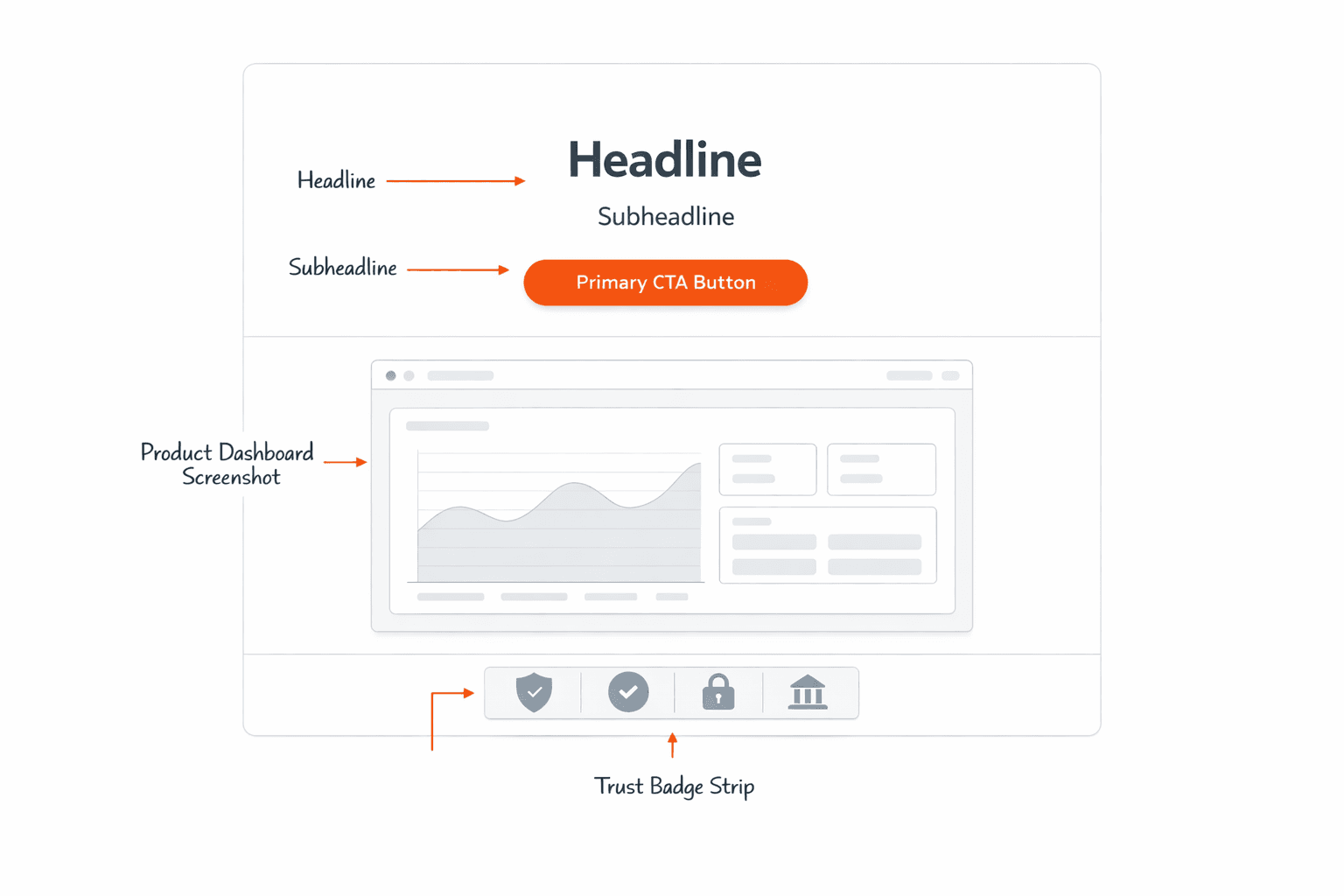
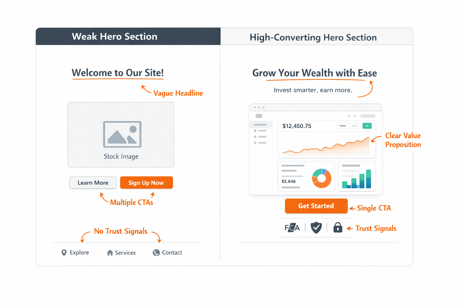
Best Practice #1: Communicate the Value Proposition Instantly
The headline of your fintech website hero section must answer three questions in under five seconds: What is this platform? Who is it built for? Why should I choose it?
❌ Weak headline: "The Future of Trading Is Here"
✅ Strong headline: "Institutional-Grade Trading Tools for Independent Forex Brokers"
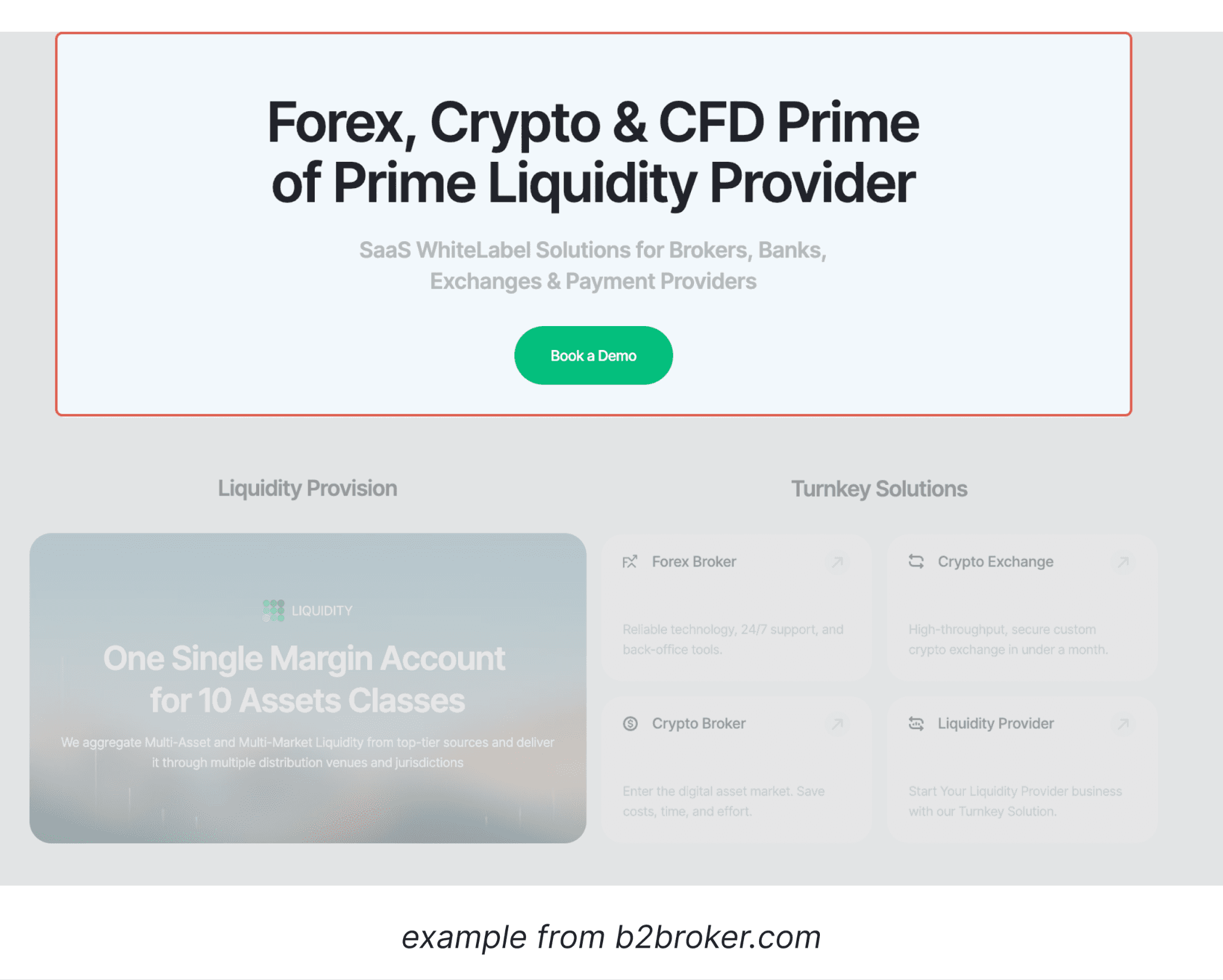
In fintech landing page design, specificity builds immediate credibility. B2BROKER's hero opens with "Forex, Crypto & CFD Prime of Prime Liquidity Provider" — naming the asset classes, business model, and provider tier in one line. Coinsbuy takes a similarly direct approach: "Digital assets processing. Built for scale." — two sentences that define the product and target audience without a single generic phrase.
Best Practice #2: Use a Supporting Subheadline to Add Context
The subheadline expands the headline without repeating it. It should add one layer of practical information: platform capabilities, supported asset classes, trading conditions, or a key differentiator.
[aa fast-fact]
Example: Headline — "Multi-Asset Trading Platform for Brokers and Liquidity Providers" / Subheadline — "Access 1,200+ instruments across Forex, CFDs, indices, and crypto — with tight spreads and deep liquidity."
[/aa]
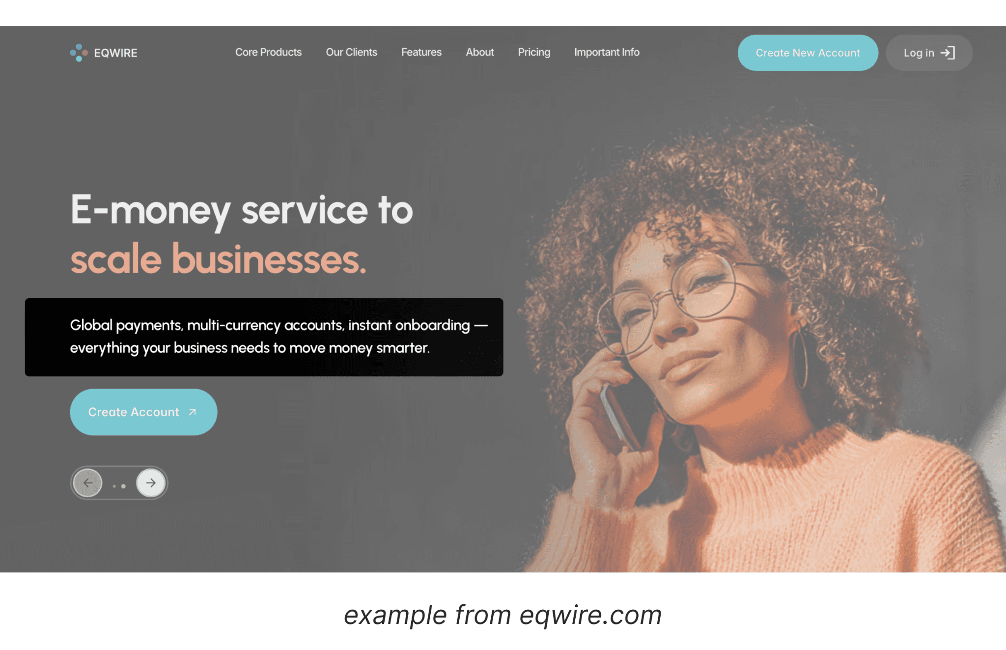
EQWIRE's hero pairs the headline "E-money service that makes dreams possible" with the grounding subheadline: "Simple, modern, and free from traditional financial barriers." Aspiration then practicality — in two lines. Revolut reverses the order, leading with a capability-dense subheadline (multi-currency accounts, stock trading, crypto) to anchor a headline that would otherwise read as too broad.
Either way, the combination gives users enough information to self-qualify — which is equally valuable in fintech conversion optimization.
Best Practice #3: Include a Clear Primary CTA
In financial services website UX, a consistent finding is that multiple CTAs reduce conversions. The hero section should contain a single, prominent call-to-action that matches visitor intent.
Effective fintech CTA options:
"Open a Live Account" — for warm, acquisition-ready traffic
"Start Trading Today" — direct and action-oriented
"Try the Demo" — lower commitment, ideal for cold traffic
"Create Your Account" — clear and instructional
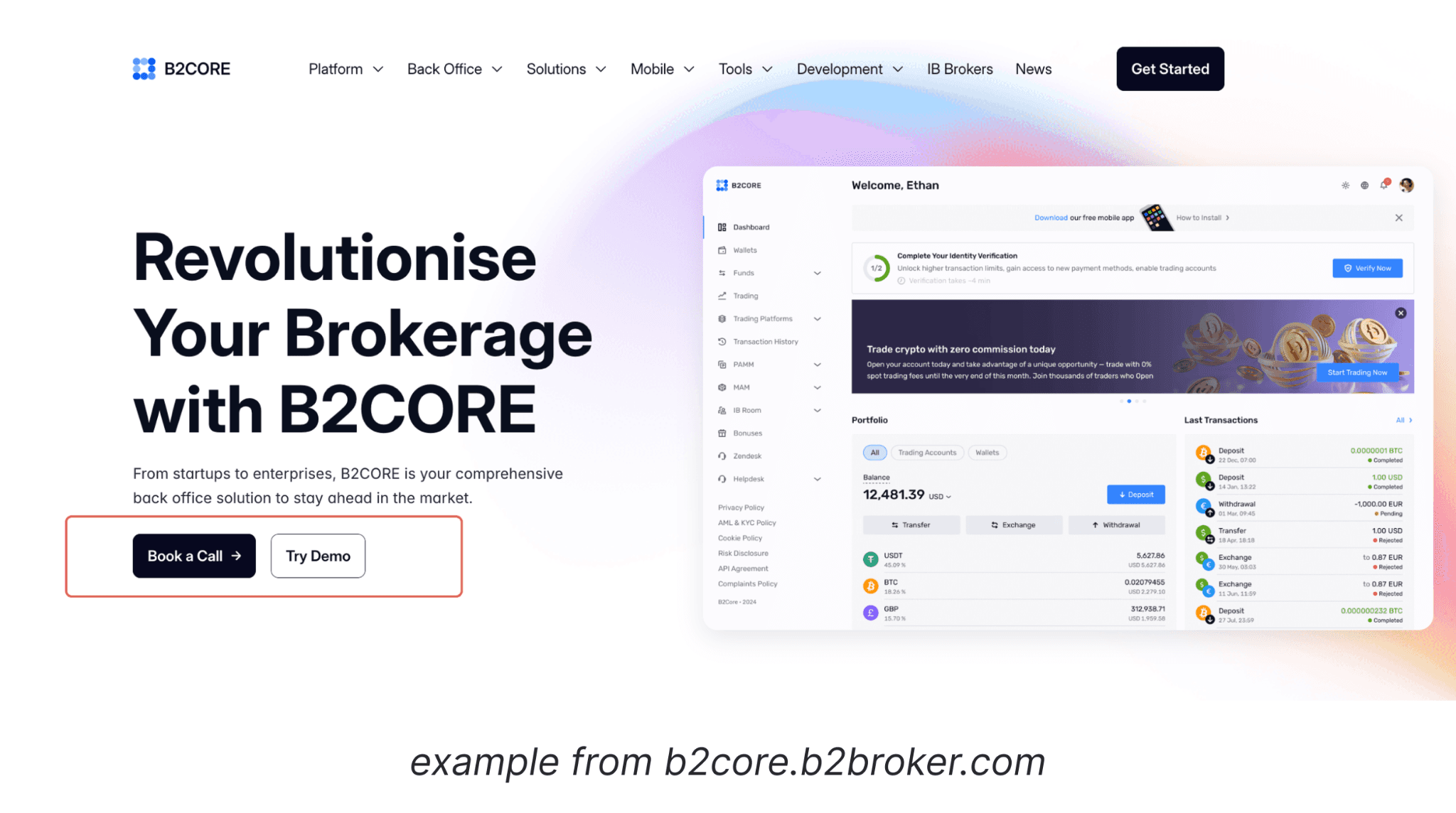
According to UX research from the Baymard Institute, CTA buttons need action-oriented language, strong color contrast, and a minimum 44px height for mobile usability. Stripe keeps a single "Start now" CTA dominating the hero — zero ambiguity, matched to developer and business audiences evaluating for the first time. B2CORE runs a primary-secondary pattern — "Book a Call" plus "Try Demo" — where the visual hierarchy between the two prevents decision paralysis while serving buyers at different stages.
Best Practice #4: Show the Product or Platform Interface
Abstract hero backgrounds and generic stock photography do not build confidence in fintech. Showing the actual trading interface, mobile app, or analytics dashboard creates immediate proof of product quality.
High-converting hero sections for trading platforms typically include:
A screenshot or device mockup of the actual trading platform interface
An animated preview of the platform used sparingly to avoid performance impact
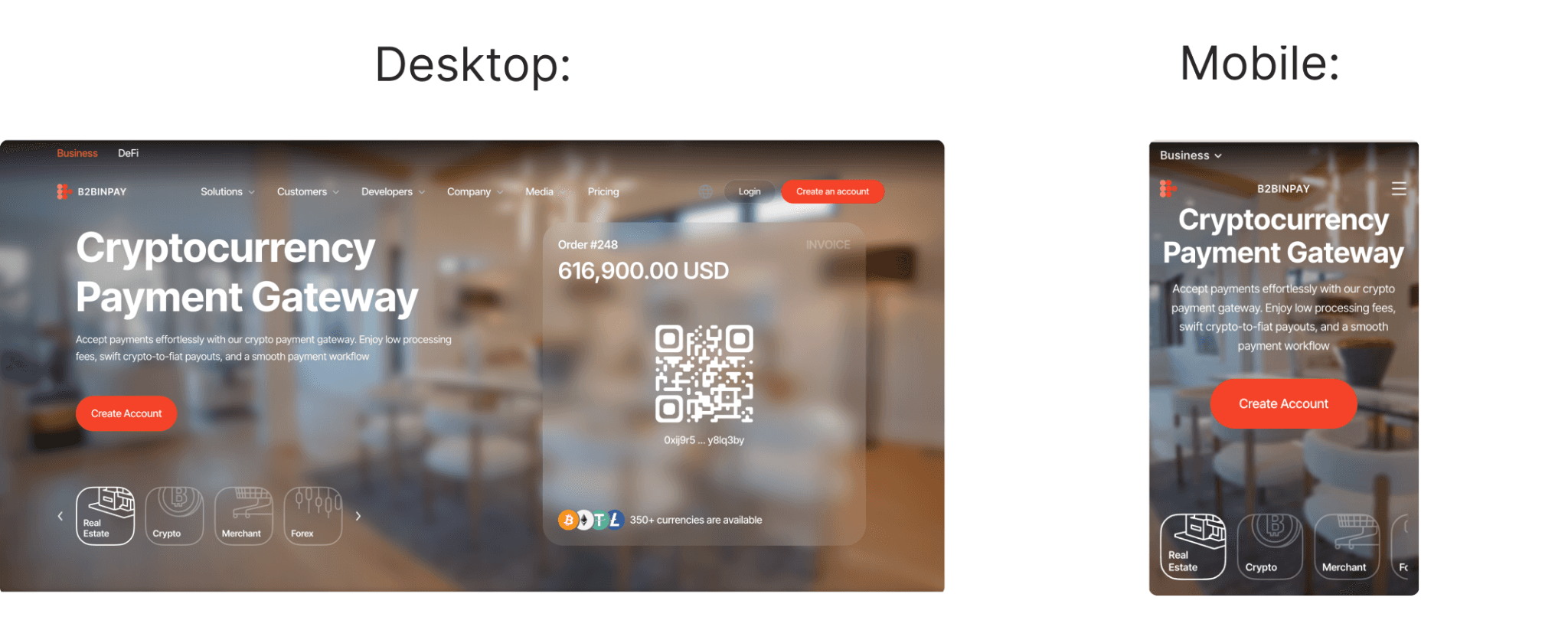
A split-screen showing desktop and mobile layouts side by side
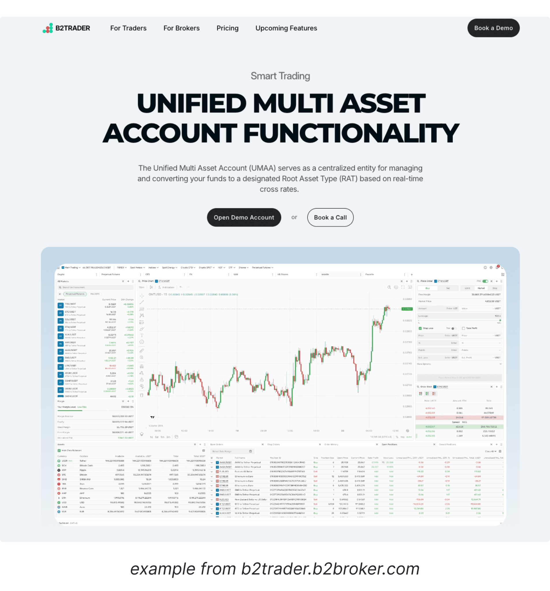
B2TRADER leads with a live render of its multi-asset trading terminal — charts, order panels, and instrument selectors visible before a line of copy is read. eToro shows its social trading feed and portfolio dashboard in the hero, making its core differentiator — community-driven investing — immediately visible to new visitors.
Best Practice #5: Add Immediate Trust Signals
Trust is the primary conversion factor in financial services website design. In the hero section or directly below it, platforms should display credibility indicators relevant to their target audience.
Common examples include regulatory badges from bodies such as the FCA, CySEC, or ASIC for regulated brokers; user milestones; award recognitions; tier-1 partner logos; and security certifications. Wise surfaces FCA regulation, a multi-million customer count, and real exchange rate transparency above the fold — each signal addressing a specific objection retail users bring to international transfers.
Trust Signal Type | Example |
|---|---|
Regulatory badges | FCA, CySEC, ASIC logos |
User statistics | "500,000+ registered traders" |
Industry awards | "Best Forex Broker 2024" |
Partner logos | Tier-1 liquidity provider names |
Security certifications | SSL, ISO 27001 |
These signals should be visible without scrolling on desktop. Even a single row of logos or a brief stat strip adds measurable credibility to the fintech landing page hero.
Planning a Fintech Website Launch?
We audit broker and crypto exchange websites to identify UX issues that reduce trader registrations — and build solutions around them.
Best Practice #6: Keep the Messaging Simple and Scannable
Fintech UX design research consistently shows that users scan rather than read. The hero section must be structured for scanning, not sequential reading.
Conversion research suggests headlines under 8–10 words typically perform better — shorter copy reduces cognitive load and increases message clarity before the eye moves to the CTA
Subheadlines should be 1–2 short sentences with a clear, specific benefit
Avoid long body text above the fold — it creates cognitive load and delays action
Use visual hierarchy — size, weight, and color contrast — to guide the eye to the CTA first
Cognitive load is a real conversion barrier. If the hero section presents too much simultaneously, visitors will fail to take any action — regardless of how strong the underlying product is.
Best Practice #7: Design for Mobile-First Experience
Mobile devices account for over 50% of global web traffic, and this figure continues to increase. Google's mobile-first indexing means the mobile version of your hero section directly influences SEO rankings and performance scores.
For a mobile-optimized fintech landing page hero:
Stack elements vertically: headline → subheadline → CTA → product visual
Ensure CTAs are at least 44px in height for reliable tap usability
Scale typography correctly — minimum 16px body text on mobile
Replace heavy background imagery with optimized mobile-appropriate assets
Test for overflow or horizontal scroll issues at 375px viewport width
Mobile optimization is not cosmetic. It is a direct conversion and acquisition requirement for any financial services website design.
Best Practice #8: Optimize for Speed and Performance
Page speed is both a Google ranking factor and a direct conversion variable. A one-second delay in load time can reduce conversions by up to 7%, according to Google research on page speed and revenue impact. For fintech platforms specifically, Core Web Vitals directly affect both search rankings and user trust — making performance optimization a commercial priority, not just a technical one.
For fintech conversion optimization, hero section performance should be the first technical priority:
Use next-gen image formats (WebP or AVIF) for hero backgrounds and product visuals
Minimize or defer JavaScript used for animations rendered above the fold
Deliver assets via a CDN to reduce latency for global trading audiences
Target a Largest Contentful Paint (LCP) score under 2.5 seconds as the baseline standard
Avoid auto-playing video backgrounds that inflate initial page load time
A fast hero section is the baseline for every other conversion optimization on this list.
Best Practice #9: Guide User Attention with Visual Hierarchy
Visual hierarchy controls where the eye travels and in what sequence. A well-structured fintech website design hero section typically follows this attention order:
Headline — largest element, highest contrast, first read
Subheadline — slightly smaller, secondary visual weight
CTA button — contrasting color, visually isolated from surrounding content
Product visual — draws attention but supports rather than dominates the layout
Trust signals — visible and credible but not competing with the primary action
When layout balance is off, users often focus on the wrong element or skip the CTA entirely. Eye-tracking studies consistently support strong visual hierarchy as a key driver of engagement on fintech landing pages.
Best Practice #10: Align the Hero Section with the Conversion Funnel
The hero section should reflect where the visitor is in their decision-making process. Different traffic sources require different approaches:
Cold traffic (acquisition pages): Lead with the value proposition and a low-commitment CTA such as "Try the Demo" or "Explore Features"
Warm traffic (remarketing or direct visits): Lead with specific differentiators and a higher-commitment CTA such as "Open a Live Account"
Campaign landing pages: Match the headline exactly to the ad copy that brought the visitor — misalignment is a primary cause of high bounce rates
This alignment principle is fundamental to fintech conversion optimization. Mismatched messaging between ad copy and the hero section is one of the most common — and most preventable — failures in broker website development.
Common Hero Section Mistakes on Fintech Websites
Avoid these patterns in financial services website UX:
Vague or abstract headlines such as "Empowering Your Financial Future" with no specific positioning
Multiple competing CTAs placed in the same visual zone — reduces decision clarity
No regulatory or trust signals visible above the fold on desktop
Overloaded animations that delay meaningful content rendering
Generic stock photography instead of actual product screenshots or interface visuals
Choosing a generic template that mirrors every competitor instead of a platform-specific conversion architecture
Desktop-only design that breaks layout or visual hierarchy on mobile screens
Low-contrast hero text that fails accessibility standards and reduces readability
Examples of High-Performing Fintech Hero Sections
Strong fintech website hero sections across brokers, exchanges, and investment platforms share recognizable structural patterns:
Clear product positioning: The headline immediately explains what the platform does and who it serves
Platform UI preview: A device mockup or screenshot of the actual product interface
Stat strip or badge row: Regulatory credentials or user milestones in a single compact row
Single high-contrast CTA: One action, clearly labeled, visually dominant over all other elements
Mobile-responsive layout: The visual hierarchy survives at 375px screen width without loss of clarity
These structural patterns are visible across live fintech and brokerage websites built around the same conversion architecture described in this article.
Next Steps: Building a High-Converting Hero Section for Your Fintech Website
The fintech website hero section is the most important single element on your page, but it functions as part of a broader conversion architecture. Beyond the hero, a high-performing fintech landing page also requires structured sections for features, social proof, pricing, and onboarding — each one aligned to the same user journey and conversion logic.
WSA.design specializes in building conversion-optimized websites for brokers, crypto exchanges, prop trading firms, and other financial services platforms. The studio covers fintech UX design, compliance-ready structures, SEO-optimized frameworks, and performance engineering across every project.
If you are planning a website launch or redesign, a complimentary discovery call is available to assess your current setup and outline a practical strategy.
Ready to Build a Fintech Website That Actually Converts?
WSA.design works with fintech companies to build high-performing websites from the ground up — optimized for trust, clarity, and trader acquisition.
FAQ: Fintech Website Hero Section Best Practices
What is the most important element of a fintech website hero section?
The headline and primary CTA are the two most critical elements. The headline must communicate the value proposition clearly and specifically within seconds. The CTA must present a single, low-friction next step. Without both elements working together, no amount of visual design will produce reliable conversions.
How many CTAs should a high-converting hero section have?
Ideally one primary CTA. A secondary CTA in a subdued visual style — such as "Watch Demo" — can support the primary without competing visually. Multiple dominant CTAs create decision paralysis and reduce the likelihood of any action being taken, a pattern well-documented in fintech conversion optimization testing.
Should a fintech landing page hero include regulatory information?
Yes. Regulatory badges and compliance signals should be visible in or immediately below the hero section. In regulated markets, users evaluate regulatory status before they evaluate product features. Hiding this information below the fold reduces trust at the most critical stage of the visit.
How does mobile optimization affect financial services website UX and conversion rates?
Significantly. If the mobile layout breaks the visual hierarchy — for example, by pushing the CTA below the fold or making the headline unreadable — conversion rates will drop regardless of copy quality. Fintech website design requires the hero section to perform correctly across all screen sizes, with mobile performance built in from day one, not retrofitted after launch.
What role do product visuals play in fintech landing page design?
Product visuals — trading dashboards, app screens, platform interfaces — serve as proof of product quality. They reduce skepticism by allowing users to evaluate the platform before committing to registration. Stock photography provides no equivalent value in fintech UX design and often signals a generic template that undermines credibility.
What makes a fintech landing page convert at a higher rate?
High-converting fintech landing pages combine five elements above the fold: a specific value proposition headline, a context-adding subheadline, a single dominant CTA, a product interface visual, and at least one credibility signal — regulatory badge, stat, or partner logo. Pages that include all five consistently outperform those that treat the hero as a design exercise rather than a conversion tool.
What should a trading platform hero section include?
A trading platform hero section should include: a headline that names the asset classes and target audience, a subheadline covering trading conditions or platform capabilities, a screenshot or live render of the platform interface, regulatory credentials visible above the fold, and a single CTA matched to the visitor's stage — "Try Demo" for cold traffic, "Open Account" for acquisition-ready visitors.
Launch Your Licensed Brokerage with Confidence
We support brokers and fintechs through licensing, launch planning, and everything a regulated brand needs to go live.


