Case Studies
A two-phase website redesign case study: how a visual refresh more than doubled click-through rate without adding a single visitor — and how the multi-page rebuild that followed multiplied organic reach twentyfold and took non-brand clicks from zero to 250 a month.
"We had a landing page that looked the part, and for a year it did almost nothing. Anyone who already knew our name found us; everyone else was searching for exactly the problems we solve and landing on somebody else's page. The rebuild is the first time the site actually brought us people."
Product Owner
EQWIRE
Organic clicks growth
+399%
x5
up from 1.88 clicks a day
Search impressions
835/day
x20
up from 41.8 a day
Google position
31.8 → 17.9
↑ 13.9
13.9 places closer to #1
Non-brand clicks
250/month
from zero
zero non-brand clicks before blog release
Overview
EQWIRE is an FCA-authorised electronic money institution offering multi-currency accounts to people and businesses that move money across borders. When WSA.design started work, its entire website was a single landing page.
The project ran as two separate releases, eleven months apart:
November 2025 — the visual refresh. A new hero, a new layout, sharper proof points. Same single URL, same site map, better design.
March 2026 — the blog. The first article went live on 6 March, a month ahead of the rebuild, so that content and structure would launch connected rather than retro-fitted.
April 2026 — the multi-page rebuild. The landing page was replaced by a structured site with a personal-and-business split, product pages, audience pages, pricing and a legal hub.
Thirteen months of Google Search Console data sit either side of those dates, which makes this an unusually clean natural experiment. Two redesigns, one property, one measurement window.
The short version of what it shows:
The visual refresh improved how many people clicked when they saw the site.
The rebuild changed how many people saw it at all.
That distinction runs through the whole case study, and it answers a question most fintech teams get wrong at the start: whether to begin with a landing page or a full multi-page site.
The Challenge
A one-page site can only rank for its own name
In September 2025 the property drew 1,219 impressions and 62 clicks a month. Almost every click came from someone typing the brand name. There were no informational queries, because there were no pages that answered any question.
This is a structural ceiling rather than a content problem, and it has three parts:
One page holds one primary keyword. Everything else it mentions is a secondary signal at best, competing with the main one.
One page holds one message. An EMI sells to freelancers, agencies, e-commerce operators, logistics firms, law firms and expats. Those audiences search in different words and judge the product on different things — and all of them were being sent to the same screen.
One page holds one conversion path. A finance director evaluating multi-currency accounts for a company and a freelancer opening a personal account need different next steps, and there was only one button.
EMI website structure exists to solve exactly this, and the site had none of it.
Non-brand traffic: zero, for seven months in a row
From August 2025 to February 2026 the site recorded no non-brand organic clicks at all. Not a low number — zero, seven months consecutively. Every visitor who arrived from Google already knew the company's name.
That single fact frames the whole project. A site with no non-brand traffic is not underperforming its market; it is absent from it.
6 months at exactly zero. The first blog article went live on 6 March 2026.
A visual refresh that fixed click-through and nothing else
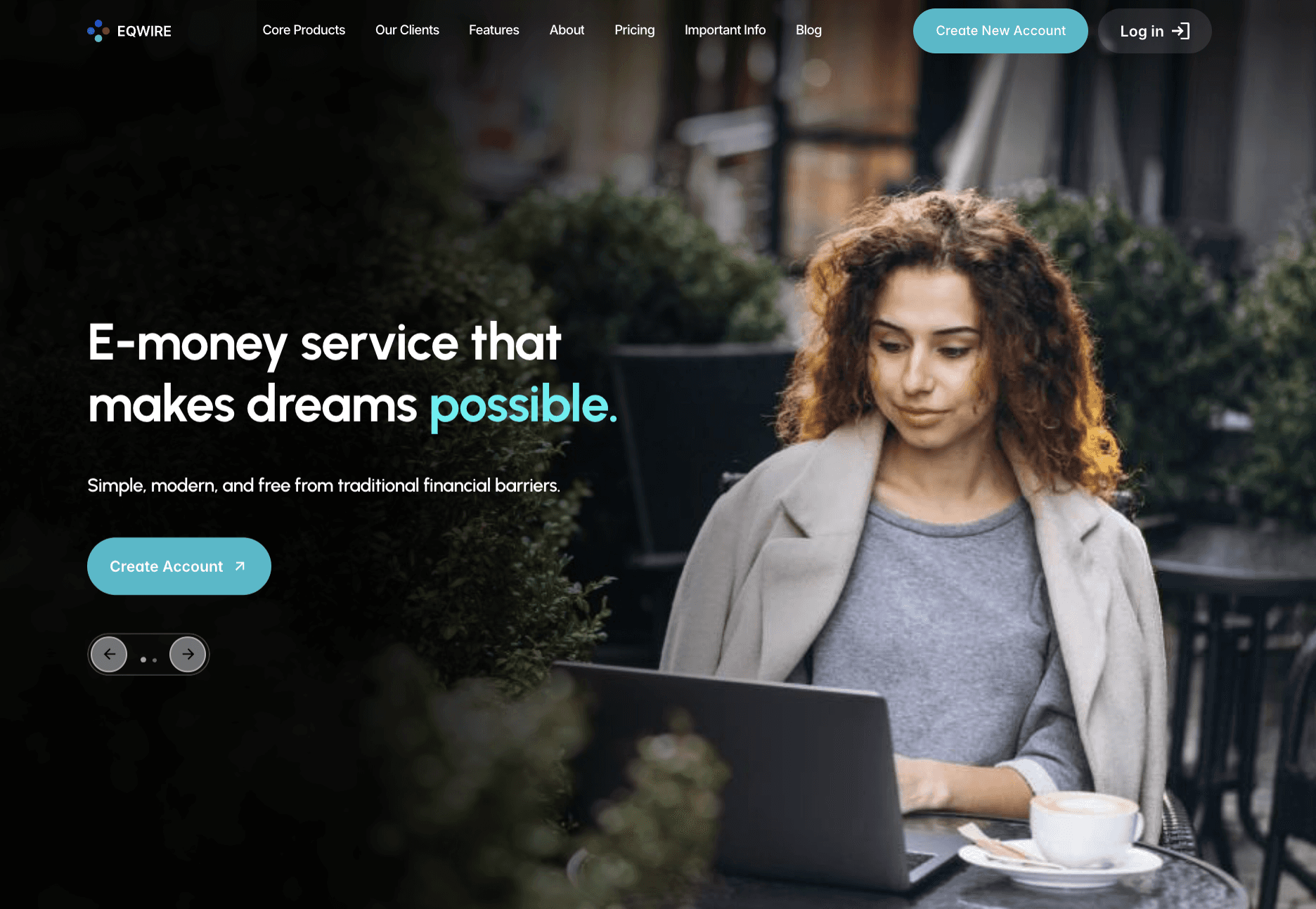
The November release was a design project, executed properly. The hero section was rewritten, the layout modernised, the regulatory proof points brought forward.

It worked on the metric design can move:
Click-through rate: 4.50% → 11.24% — it more than doubled. The page finally looked like a regulated financial institution, so more of the people who saw it clicked.
Impressions per day: 41.8 → 22.1 — down 47%. Nothing had been added for Google to index, and a page that converts better is still one page.
Clicks per day: 1.88 → 2.48. A 32% rise off a tiny brand-only baseline — the visual work moved this barely at all.
The finding worth carrying out of this
Visual quality changes conversion. Site structure changes reach. They are different jobs, measured by different metrics, and confusing them is how redesign budgets get spent on the wrong half of the problem.
If a stakeholder asks a redesign to "improve SEO", the useful follow-up question is which of the two they mean — because the answer determines whether the work is a design engagement or an architecture engagement.
The Strategy
1. One page per audience, not one page per feature
Feature pages describe the product. Audience pages describe the reader's situation — and people search for their situation, not for a feature name.
So the site was planned around who was arriving and why:
A split at the top of the navigation between personal and business users, so a freelancer and a finance director never land in the same funnel or read the same proof points.
A page per audience underneath that split, each opening on the visitor's circumstances rather than the product's feature list.
Product pages underneath the audiences, not above them, so the architecture matches how the decision actually gets made.
2. A blog to answer what a landing page cannot
Cross-border payments generate enormous informational search volume: how transfers clear, what a currency account is for, what a non-resident can open, which rails cost what.
A commercial page cannot answer those questions without losing its commercial job — and it should not try. The blog was scoped to do three things:
Capture informational demand that no product page can serve.
Build trust before the form. In a highly regulated vertical, the reader wants to understand the mechanism before they hand over identity documents.
Give the commercial pages something to be linked from, which a one-page site structurally cannot do.
3. Structure first, content second
Publishing into a one-page site would have wasted the articles: nowhere to link them, nothing for them to link to.
So the order was deliberate:
Architecture designed and built.
Blog started one month ahead of the rebuild, so the first articles were already indexed when the new structure went live.
Internal linking connected on day one rather than added later.
4. Build for a regulated product, not a generic SaaS
A multi-currency account is a YMYL product — Your Money or Your Life, in Google's own classification. The bar for demonstrating expertise, authority and trust is higher than it is for software, and the reader's bar is higher still: they are about to send money and upload identity documents to a company they found in a search result.
That changes six concrete decisions, none of which a generic web build would make:
Trust signals go above the fold, not in the footer. Authorisation status, safeguarding of client funds and the payment rails supported belong on the first screen, because they are the first questions a regulated-product visitor asks. This is how trust gets built in the first seconds of a fintech visit.
Legal documents get their own hub, not a footer dump. Terms, AML policy, complaints procedure, safeguarding explanation and privacy notice are documents a regulator, a partner bank and a cautious customer all look for — and they need to be findable, versioned and consistent.
Eligibility is stated, not implied. Who can open an account, in which countries, as an individual or a company. Vagueness here costs qualified applications and creates compliance risk at the same time.
The pricing page is a trust asset. In a category where hidden FX margins are the industry's reputation problem, transparent pricing does more for conversion than any persuasion technique.
The call to action sets the right expectation. "Open Your Account" ahead of a KYC flow is honest; "Get Started" is not, and the mismatch shows up as abandonment rather than as bounce.
Claims are written to survive review. Every regulatory statement on the site has to be defensible as written, which means copy is drafted with compliance in the loop rather than sent to them afterwards.
None of that is decoration. It is the difference between a site a regulated audience trusts and one they close — and it is the part of a fintech redesign that a generic web studio has no reason to know.
The migration itself was sequenced to protect existing rankings — which is why nothing that already ranked was lost in the move, including the legal pages that carried most of the pre-redesign impressions.
What Changed
The homepage: from a slogan to a search query
The old hero led with a brand promise. The new one leads with what the product is, in the words the market uses for it.
Four changes did the work:
The headline names the product category and carries the head keyword, instead of describing an aspiration.
The trust chips carry the regulatory facts a first-time visitor checks for, rather than adjectives.
The call to action is specific to the branch the visitor came in through.
The use cases below the fold describe situations, not features: receiving income from abroad, holding funds in more than one currency, paying local costs, moving money between countries.

Trust signals above the fold
On a fintech homepage the hero is not a place for a value proposition alone. Three facts sit directly under the headline, in plain language:
FCA authorised Electronic Money Institution — the authorisation, named, not gestured at.
Client funds safeguarded in accordance with FCA regulation — the mechanism, because "your money is safe" means nothing on its own.
Payments via Faster Payments, SEPA and SWIFT — the rails, which is how a business visitor works out in two seconds whether the product fits.
That is the whole fintech trust checklist compressed into one screen. A visitor who has to scroll to find out whether a payments company is regulated usually does not scroll.
From one page to a segmented site
The indexed footprint changed shape completely:
September 2025 | August 2026 | |
|---|---|---|
Pages, excluding blog | 16 | 26 |
— of which legal documents | 15 | 13 |
Blog articles | 0 | 88 |
The 16 URLs of September 2025 were the landing page and fifteen legal documents. There was nothing else to find. Twelve months later there is a rebuilt homepage, pricing, a legal hub, and product and audience pages sitting under the personal-and-business split.
The two openings, side by side
The clearest way to see what segmentation bought is to read the two first screens against each other.
Product first, with the head keyword in it. The subhead names the job — a regulated account for managing income and expenses — and the chips are regulatory: FCA authorised EMI, client funds safeguarded, payments via Faster Payments, SEPA and SWIFT. The button reads Create Account.
A situation, not a product. The subhead names three situations at once — living abroad, supporting family, managing expenses in more than one country — and the chips are benefits rather than credentials: hold multiple currencies, pay expenses across countries, one account for your global finances. The button reads Open Your Account.
Neither headline is better than the other. They are doing different jobs:
The homepage carries the product, the head keyword and the regulatory proof.
The audience page carries the scenario and the reader's own language.
On one screen you have to pick one of those jobs, and the old landing page picked the product — which is exactly why it only ever ranked for its own name.
What segmentation bought
For search engines: a set of distinct, specific pages to rank instead of one generic one. Every audience page entered the top six for the queries it was built for.
For visitors: a page that opens by describing their circumstances instead of the product's feature list.
For the funnel: a separate conversion path per branch, instead of one button for every kind of buyer.
The trade-off is honest and worth naming: the queries these pages own are narrow, so their own click volume is modest. They are the site's structure and its conversion layer, not its reach engine. Reach came from somewhere else.


The blog became the reach engine
The first article went live on 6 March 2026. By August there were 88, and the pattern was unambiguous:
94% of the site's total organic impressions came from blog articles.
Non-brand clicks went 16 → 60 → 134 → 175 → 250 across the five months after launch.
By July the blog was bringing more clicks than the homepage — the first month in the site's history when that was true.
Tools beat posts
One pattern is worth repeating on any fintech site. The single best-performing piece of content is not an article but an interactive tool, and it earns roughly eight times the click-through rate of the average article on the site, from a similar position.
The reason is simple: it solves the problem on the page instead of describing it. If a topic can be turned into a calculator, a checker or a comparison, that version will outperform the essay.
A dedicated home for the legal documents
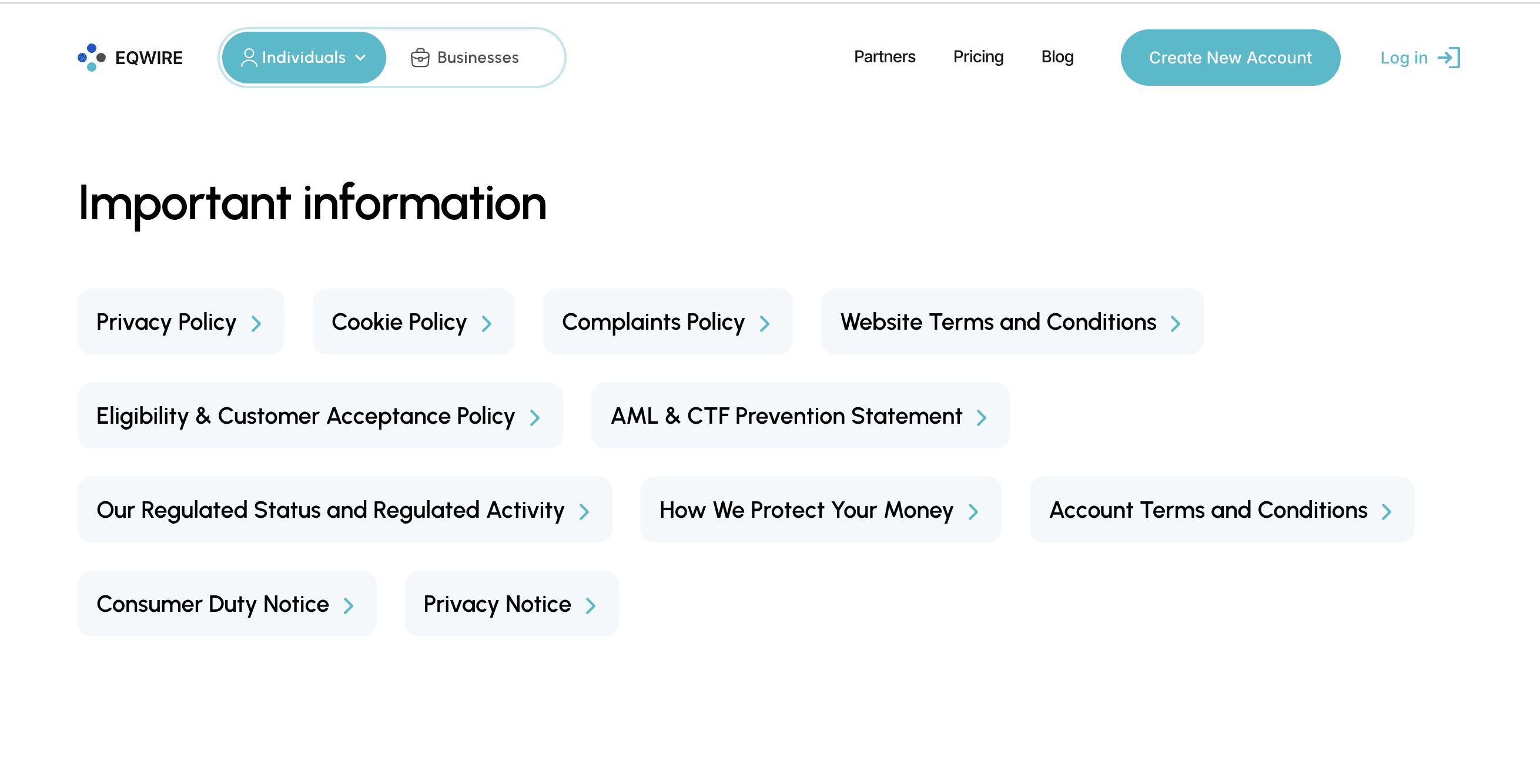
Fifteen flat legal URLs became a structured legal hub — and on a regulated site that is a product decision, not a tidying exercise.
Why it matters more here than on an ordinary website:
Three different audiences read these pages. A prospective customer checking safeguarding, a partner bank running due diligence, and a regulator confirming what is published. All three need to find the current version without asking anyone.
They carry the site's oldest indexing history. Before the rebuild, legal documents produced most of the property's impressions — which makes them the highest-risk pages in any migration, and the ones most often broken by one.
Consistency becomes maintainable. A change to a defined term now happens in one place instead of fifteen, which is the difference between a document set that stays compliant and one that drifts.
The hub itself becomes findable. A single, navigable entry point ranks for the document queries people actually type, instead of fifteen orphaned URLs competing with each other.
Impressions on the legal pages did not drop through the transition. For a fuller version of what belongs there, we keep a compliance-documents checklist for regulated sites.
Results
Three periods of Google Search Console data, each bounded by a release date: 14 July – 1 November 2025 before any redesign, 2 November 2025 – 5 March 2026 after the visual refresh, and 15 April – 31 August 2026 after the multi-page rebuild. All three are compared as daily averages, so windows of different length compare directly.
+399%
Organic Clicks Growth
Avg daily clicks: pre-redesign vs post-rebuild period
×20
Search Impressions
Avg daily impressions: 41.8 → 835.0, same periods
pos. 31.8 → pos. 17.9
Google Position
Impression-weighted average, same periods
+399% organic clicks
Average daily clicks went from 1.88 before any redesign to 9.39 after the rebuild — a fivefold increase measured across the two periods in full, not cherry-picked months.
The visual refresh accounts for almost none of it. Between the two releases clicks ran at 2.48 a day, a 32% rise off a tiny brand-only baseline and well inside the noise of a site with two indexed page types. The multi-page rebuild took the same metric up ×3.8 in one step, and August 2026 alone brought 446 clicks.
×20 search impressions
Average daily impressions went from 41.8 to 835.0 — and this is the metric that separates the two redesigns rather than combining them.
After the visual refresh impressions per day fell to 22.1, down 47%, because nothing had been added for Google to index. After the multi-page release they rose ×37.8 against that level. A better-looking page competes for the same handful of queries; more pages compete for more queries. That is the whole mechanism, and it is why "improve the design" and "improve organic reach" are not the same brief.
Position 31.8 → 17.9
Impression-weighted average position improved by 13.9 places, from deep on the third page of results to the second, with the homepage itself now inside the top ten.
Both releases contributed here, and in different ways. The refresh took the average from 31.8 to 20.2 by making a single page rank better for its own terms. The rebuild took it to 17.9 while simultaneously multiplying the number of ranked queries twentyfold — holding an average steady across twenty times the surface area is harder than improving it on one page.
Two notes on reading this number honestly:
It is weighted by impressions, not averaged across months. A simple monthly average would overweight months with almost no data.
It gets worse before it gets better, on purpose. Every batch of new articles enters the index at low positions and drags the average down for a month or two before climbing.
The phase 1 window closes on 5 March 2026, the day before the first blog article. Measured instead to the actual release date of 14 April, phase 1 would show 70.4 impressions a day — but two thirds of those came from blog articles published inside the window rather than from the visual redesign. Attributing them to the refresh would flatter it.
CTR fell, and that is not a regression
Click-through rate ran at 4.50% before any redesign, rose to 11.24% after the visual refresh, then fell to 1.12% after the rebuild. Only the middle number is about the design; the last one is about the query mix.
A brand-only site converts a small number of high-intent impressions — someone typing the company name is nearly certain to click.
A site with 88 articles collects thousands of informational impressions, where CTR is structurally low across every industry.
The absolute click count is the number that matters. Dividing a much larger numerator by a vastly larger denominator produces a smaller percentage and a much bigger business.
Why the month after launch looked like a loss
Clicks halved in May, the month after the rebuild went live. This is the part of a redesign that makes clients nervous, so it is worth walking through what actually happened:
April was the release month and carried a launch-driven brand spike, concentrated almost entirely on the homepage — 256 of April's 290 clicks landed on the homepage alone.
May looked like a collapse — total clicks fell from 290 to 140 — because that spike decayed, not because anything lost rankings.
Impressions rose in every single month through the transition: 8,565 → 13,409 → 31,053 → 27,040 → 39,189. Reach never dipped once.
The traffic that replaced the spike was better traffic. Non-brand blog clicks compounded month over month while the brand spike faded.
By August the total was 54% above the April peak, and more than half of it was non-brand.
A rebuild is not judged on the month after launch. This one took roughly eight weeks for the shape of the curve to appear and five months to more than double the pre-launch number.
Conclusion
Two redesigns, thirteen months, one clean conclusion: design work and structural work do different jobs, and only one of them grows organic reach.
The November refresh was good work. It more than doubled click-through rate, and on a site with the traffic to match, that alone would have been a strong result. But a single page has a hard ceiling on how many searches it can appear for, and no amount of design removes it.
The April rebuild raised the ceiling. More pages, each specific to an audience and a question, plus a blog to catch the informational demand that commercial pages cannot serve.
The results came without a single link built. No outreach, no paid placements. Impressions per day multiplied twenty times and clicks per day rose 399% on structure and content alone.
Three things to take from it if you are planning a redesign:
Decide which metric you are buying. Design moves CTR. Structure moves impressions. Ask which one the business actually needs before scoping the work.
Sequence content and architecture together. Articles published into a site with nowhere to link them are wasted effort.
Do not judge a relaunch in month one. Watch impressions and non-brand clicks, and give it two months before drawing conclusions.
If your site looks good and still does not grow in search, the problem is probably not the design. It is that there is not enough of it — and increasingly, not enough for AI search to cite either.
You can see how WSA.design approaches fintech redesigns or explore our offers.
FAQ
Does a website redesign improve SEO?
Only if it changes structure. In this project a visual redesign more than doubled click-through rate while impressions per day fell 47%, because the site still had one URL to rank. The multi-page rebuild multiplied impressions per day twentyfold. Design affects conversion; architecture affects reach.
Why do clicks drop after a website relaunch?
Usually because the launch itself created a temporary brand spike, and the following month looks like a fall when that spike decays. Here clicks halved in the first month after launch while impressions rose in every month — reach was growing while the spike faded. Judge a relaunch on impressions and non-brand clicks, not on total clicks in week four.
How long does a fintech website redesign take to show SEO results?
Roughly eight weeks for the shape of the curve to appear, and about five months for clicks to more than double against the pre-launch baseline. New pages have to be crawled, indexed and then earn positions, and new articles enter the index at low positions before they climb.
Is one landing page enough for a fintech product?
For a launch, sometimes. For search, no. A single page can rank for its own brand name and little else, because it holds one primary keyword, one message and one conversion path. If your audiences search differently — freelancers, agencies, logistics, legal, expats — each of them needs a page in their own words.
Can organic traffic grow without link building?
Yes. Nothing in this project came from outreach or paid links. The growth came from having pages that answered specific queries, and a blog covering the informational demand around the product.
What does a fintech website need that a generic website does not?
Trust signals on the first screen rather than in the footer — authorisation, how client funds are safeguarded, which payment rails are supported. A dedicated, navigable home for legal documents rather than a list of footer links. Explicit eligibility rules. Transparent pricing. Calls to action that name the real next step ahead of a KYC flow. And copy written so that every regulatory claim survives compliance review as written.
Why did click-through rate fall while traffic grew?
Because the query mix changed. Brand searches convert at very high rates and informational searches do not, so adding thousands of informational impressions lowers the average even as clicks multiply. A falling CTR alongside rising clicks is a sign the site has left its brand bubble.
Get Your Professional Website Today
Whether you’re launching something new or improving an existing platform, we’re ready to discuss your goals and explore the best way forward.